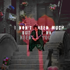
Icon Progression 2020
Here's my progression post for 2020! (click here for: [ 2019 LJ | 2019 DW ] [ 2018 LJ | 2018 DW ] [ 2017 LJ | 2017 DW ] [ 2016 LJ | 2016 DW ])
Every icon post is linked separately, by clicking on the icon if the link is not within the text. But you can also click on the month names for that month's calendar with links to all my posts. The links this year all go to DW (in previous years, they were mixed between LJ and DW).

->
->
January
I made three icon posts in January, but one was a fandom-specific repost, so it doesn't count. Leaves two challenge sets: I went far outside my comfort zone with one of them and iconned a lot of stock (icons 1+2). The other was more my traditional fare (3 and 4): bust crops, pastelized coloring, most of them without text. I did quite a lot of hairpainting in 2020, it was one of my resolutions to get better at it. (I don't think I did. Well, maybe a little better but nowhere near happy with it or confident about it.)
February
I started my
100fandomicons table in February (icon 1). The most unusual this month were the icons for the Guardian Icon Quotes Fest, which forced me to put text on my icons (2+3). :D The rest (4-6) were nothing special. I still do levels like that, always, so there are no particular trends or changes visible here, but I did have quite a few with text on them there, too:

March
March saw a huge icon drop post where the most remarkable icons are those I made for
iconcolors, almost all of them are textless. And my remakes post, which I was pretty happy with and which contains two rare-for-me animated icons.


April
Things were starting to get rough in April, and it shows in the slight decline in the number of icons, and a tendency to make easy textless ones. I only made a single set that month: a tropes set, which was fun, and made me use a little text, two Chinese, four English.

May
Two posts in May, an orgy set that I tried to make look like an orgy (icons 1+2), and a drop post for March (icons 3-5). The continuing lockdown obviously had a dampening effect on my iconmaking. The icon drop contains a few icons I didn't make for challenges but only for myself. Again, most icons were pretty easy for me, too: comfort iconing. :D

June
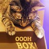
First, a Mystery Box set (icons 1+2) that was surprisingly text-heavy. I'm in love with two of them: one has text that looks like transparent glass, which I hadn't ever done before, and the other is done in gradient coloring, which I've increasingly developed a taste for because of
iconcolors, and which looks especially nice here with the white borders around the subject. Second, the icon drop for April (icons 3+4), containing over 50 icons - these mostly textless again. I especially like icon 3, also because I'd never made an icon in that style before - flat, with a sharp shadow and restricted coloring, and 4, one of half a dozen I made from the same texture, which all came out surprisingy different. Lastly, an LGBT set that was extremely vibrant in rainbowy colors, which I very much loved. Not my usual style, but a satisfyingly coherent set (icons 5-7).


July
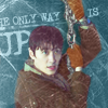
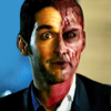
I started a year-long challenge for
historamedy365 in July, and posted my icons for it every month. It was also the start of my obsession with the Lost Tomb Reboot fandom, and I made lots of icons for that. The show is a fun romp in dark colors, and that is reflected in my icons: a little less pastel, lots of manual coloring to get the dark screenshots to work. (1+2). In the icon drop for May/June, the most complicated icons were those I made for
iconthat, with provided caps, which I rarely do, and which apparently inspired me that month. Everything else is still textless and pastel. (3-5) I'll skip the third post that month, it was all over the place and I can't see anything unusual in it.
August
August was vacation time and that resulted in six icon posts. Nothing interesting in half of them, but I still like the animated thing I made for my Wu Xie set. (icon 1) More dark (green) icons for Lost Tomb, mostly textless, but there were two more complicated ones in the mix (2+3). Then there was a remakes round at
fandom10in30, where I tried some more complicated things. It started my renewed fascination with the painted look (4+5). The icon drop for June contains my set for the comedy battle at icontalking, and I put a lot of effort into that. (6). The rest of the drop was expectedly textless and pastel. (I dont see any progress, but I sure see a pattern. :D) (7+8)


September
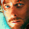
Four posts in September. The "having fun" icon was fun both in terms of its unusual design and its subject: a "hopping" Zhu Yilong. (1) The next one is my "best icon of 2020" as voted here. (2) It's part of the first somein30 challenge, which was exciting because I was forced to combine techniques. It resulted in some very cool icons, and it reminded me that blending is fun, and I tried that a few more times towards the end of the year. (3)
The icon drop for July looks unusally dark and sombre. Not sure why, maybe it was just that
iconcolors had dark palettes or that
iconthat had the theme nocturne. (4) I still love the animated Wu Xie icon (ha, another one), and I think it might be the icon I used most often since I started watching LTR. (5) The last post was a tough one for me, because it required an unchanged background. I don't hate the results, though. (6)


October
Four posts, the first was heroes and villains for
somein30. Those were extremely unusual compositions, and I'm proud of them (1-3). The next three sets contain nothing special, just happy colors and happy faces, 99% textless. (4-7) Noteworthy: everyone loved that yellow icon (5), and it's a lot sharper than my usual icons. I am not sure if that should tell me something. (I have another monitor where my icons look blurrier than on my normal monitor, maybe it's a monitor thing.)
November
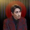
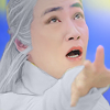
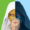
Five posts, oi. I'll specially mention the red one, because I love the coat and its hand-enhanced stripes. (1) Most of the rest are the same things again: busts of Zhu Yilong without text and in warm colors. (2-5) I was very busy in November, and iconing was comforting, but I didn't particularly challenge myself.

December
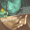
December saw surprisingly varied icon posts. The September/October icon drop has a lot of text-heavy icons (1+2) as well as some painted-look/pencil drawing ones (3+4). I can't really say I like the line-drawing ones I made in 2020, but it is an interesting style to fiddle with and perfect. Still a long way to go. :D
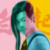
The somein30 challenge was to create a timeline of personal fandom history, and like all the other rounds was challenging and thus motivating and resulted in more text-heavy icons (5-7). It also helped me finish my 100fandomicons table, yay! The icon drop for November/December was more in line with the rest of the November icons: plain and textless. Unusual exception: my candy-colored
iconthat entry (8).

Closing Thoughts and Resolutions
2020 was an unusual year. (No shit.) I found comfort in iconmaking, and in some months that shows, with completely textless icons in warm colors that I find beautiful and that make me happy. My goals (to make more complex icons and find a hairpainting technique I like) were not really pursued with much effort. But I didn't completely lose sight of them, either. I may only have made very little progress, but I had fun. And I hit on a few other techniques that I would like to try more often again: blending and that painted or pencil-drawn look.
After 2019, I realized that it's hard for me to put text on cdrama icons because I don't think in quotes for those dramas. But I've now decided not to let that stop me and try harder. I like putting text on icons. So my new resolution for 2021 is to put text also on cdrama icons, even though that doesn't come easy or naturally. I've given up on the resolution for more complex icons, because I found that I didn't enjoy making them last year. I prefer the plain one-cap (mostly mid-crop portrait-type) icons, and I like putting work into coloring and textures and text, which is also a nice realization to have, I guess. Maybe I've finally found my style, who knows?
The number of icons in 2020 is pretty much equal to the previous years. I know you are all looking forward to the annual graph again! Here it is:

I didn't separate cdramas and other things, because I didn't make any other cdrama icons than Zhu Yilong or Bai Yu dramas. It was a good year for both! It got even more obvious that I am much more obsessed with Zhu Yilong than with Bai Yu, and he overtook Guardian this time, too. (By a lot.) If you split the Guardian icons in two, you could say that half the icons I made were of Zhu Yilong, another 25% of Bai Yu, leaving the remaining 25% to everything else. (If you'd asked me before this, I'd have said that more than half of my icons are of Zhu Yilong.)
Amongst the "Other" category, no single show got over 20 icons. Most of them only have one (1), which makes sense, because I worked with the goal of filling my 100fandomicons table.
My single most important resolution for 2021 is:
- Put text also on cdrama icons
I will also try and keep the blending and painted-look icons in mind, and the hairpainting is also still on my list.
x-posted from dw (comments:
)
Every icon post is linked separately, by clicking on the icon if the link is not within the text. But you can also click on the month names for that month's calendar with links to all my posts. The links this year all go to DW (in previous years, they were mixed between LJ and DW).
->
->
January
I made three icon posts in January, but one was a fandom-specific repost, so it doesn't count. Leaves two challenge sets: I went far outside my comfort zone with one of them and iconned a lot of stock (icons 1+2). The other was more my traditional fare (3 and 4): bust crops, pastelized coloring, most of them without text. I did quite a lot of hairpainting in 2020, it was one of my resolutions to get better at it. (I don't think I did. Well, maybe a little better but nowhere near happy with it or confident about it.)
February
I started my
100fandomicons table in February (icon 1). The most unusual this month were the icons for the Guardian Icon Quotes Fest, which forced me to put text on my icons (2+3). :D The rest (4-6) were nothing special. I still do levels like that, always, so there are no particular trends or changes visible here, but I did have quite a few with text on them there, too:
March
March saw a huge icon drop post where the most remarkable icons are those I made for
iconcolors, almost all of them are textless. And my remakes post, which I was pretty happy with and which contains two rare-for-me animated icons.
April
Things were starting to get rough in April, and it shows in the slight decline in the number of icons, and a tendency to make easy textless ones. I only made a single set that month: a tropes set, which was fun, and made me use a little text, two Chinese, four English.
May
Two posts in May, an orgy set that I tried to make look like an orgy (icons 1+2), and a drop post for March (icons 3-5). The continuing lockdown obviously had a dampening effect on my iconmaking. The icon drop contains a few icons I didn't make for challenges but only for myself. Again, most icons were pretty easy for me, too: comfort iconing. :D
June
First, a Mystery Box set (icons 1+2) that was surprisingly text-heavy. I'm in love with two of them: one has text that looks like transparent glass, which I hadn't ever done before, and the other is done in gradient coloring, which I've increasingly developed a taste for because of
iconcolors, and which looks especially nice here with the white borders around the subject. Second, the icon drop for April (icons 3+4), containing over 50 icons - these mostly textless again. I especially like icon 3, also because I'd never made an icon in that style before - flat, with a sharp shadow and restricted coloring, and 4, one of half a dozen I made from the same texture, which all came out surprisingy different. Lastly, an LGBT set that was extremely vibrant in rainbowy colors, which I very much loved. Not my usual style, but a satisfyingly coherent set (icons 5-7).
July
I started a year-long challenge for
historamedy365 in July, and posted my icons for it every month. It was also the start of my obsession with the Lost Tomb Reboot fandom, and I made lots of icons for that. The show is a fun romp in dark colors, and that is reflected in my icons: a little less pastel, lots of manual coloring to get the dark screenshots to work. (1+2). In the icon drop for May/June, the most complicated icons were those I made for
iconthat, with provided caps, which I rarely do, and which apparently inspired me that month. Everything else is still textless and pastel. (3-5) I'll skip the third post that month, it was all over the place and I can't see anything unusual in it.
August
August was vacation time and that resulted in six icon posts. Nothing interesting in half of them, but I still like the animated thing I made for my Wu Xie set. (icon 1) More dark (green) icons for Lost Tomb, mostly textless, but there were two more complicated ones in the mix (2+3). Then there was a remakes round at
fandom10in30, where I tried some more complicated things. It started my renewed fascination with the painted look (4+5). The icon drop for June contains my set for the comedy battle at icontalking, and I put a lot of effort into that. (6). The rest of the drop was expectedly textless and pastel. (I dont see any progress, but I sure see a pattern. :D) (7+8)
September
Four posts in September. The "having fun" icon was fun both in terms of its unusual design and its subject: a "hopping" Zhu Yilong. (1) The next one is my "best icon of 2020" as voted here. (2) It's part of the first somein30 challenge, which was exciting because I was forced to combine techniques. It resulted in some very cool icons, and it reminded me that blending is fun, and I tried that a few more times towards the end of the year. (3)
The icon drop for July looks unusally dark and sombre. Not sure why, maybe it was just that
iconcolors had dark palettes or that
iconthat had the theme nocturne. (4) I still love the animated Wu Xie icon (ha, another one), and I think it might be the icon I used most often since I started watching LTR. (5) The last post was a tough one for me, because it required an unchanged background. I don't hate the results, though. (6)
October
Four posts, the first was heroes and villains for
somein30. Those were extremely unusual compositions, and I'm proud of them (1-3). The next three sets contain nothing special, just happy colors and happy faces, 99% textless. (4-7) Noteworthy: everyone loved that yellow icon (5), and it's a lot sharper than my usual icons. I am not sure if that should tell me something. (I have another monitor where my icons look blurrier than on my normal monitor, maybe it's a monitor thing.)
November
Five posts, oi. I'll specially mention the red one, because I love the coat and its hand-enhanced stripes. (1) Most of the rest are the same things again: busts of Zhu Yilong without text and in warm colors. (2-5) I was very busy in November, and iconing was comforting, but I didn't particularly challenge myself.
December
December saw surprisingly varied icon posts. The September/October icon drop has a lot of text-heavy icons (1+2) as well as some painted-look/pencil drawing ones (3+4). I can't really say I like the line-drawing ones I made in 2020, but it is an interesting style to fiddle with and perfect. Still a long way to go. :D
The somein30 challenge was to create a timeline of personal fandom history, and like all the other rounds was challenging and thus motivating and resulted in more text-heavy icons (5-7). It also helped me finish my 100fandomicons table, yay! The icon drop for November/December was more in line with the rest of the November icons: plain and textless. Unusual exception: my candy-colored
iconthat entry (8).
Closing Thoughts and Resolutions
2020 was an unusual year. (No shit.) I found comfort in iconmaking, and in some months that shows, with completely textless icons in warm colors that I find beautiful and that make me happy. My goals (to make more complex icons and find a hairpainting technique I like) were not really pursued with much effort. But I didn't completely lose sight of them, either. I may only have made very little progress, but I had fun. And I hit on a few other techniques that I would like to try more often again: blending and that painted or pencil-drawn look.
After 2019, I realized that it's hard for me to put text on cdrama icons because I don't think in quotes for those dramas. But I've now decided not to let that stop me and try harder. I like putting text on icons. So my new resolution for 2021 is to put text also on cdrama icons, even though that doesn't come easy or naturally. I've given up on the resolution for more complex icons, because I found that I didn't enjoy making them last year. I prefer the plain one-cap (mostly mid-crop portrait-type) icons, and I like putting work into coloring and textures and text, which is also a nice realization to have, I guess. Maybe I've finally found my style, who knows?
The number of icons in 2020 is pretty much equal to the previous years. I know you are all looking forward to the annual graph again! Here it is:
I didn't separate cdramas and other things, because I didn't make any other cdrama icons than Zhu Yilong or Bai Yu dramas. It was a good year for both! It got even more obvious that I am much more obsessed with Zhu Yilong than with Bai Yu, and he overtook Guardian this time, too. (By a lot.) If you split the Guardian icons in two, you could say that half the icons I made were of Zhu Yilong, another 25% of Bai Yu, leaving the remaining 25% to everything else. (If you'd asked me before this, I'd have said that more than half of my icons are of Zhu Yilong.)
Amongst the "Other" category, no single show got over 20 icons. Most of them only have one (1), which makes sense, because I worked with the goal of filling my 100fandomicons table.
My single most important resolution for 2021 is:
- Put text also on cdrama icons
I will also try and keep the blending and painted-look icons in mind, and the hairpainting is also still on my list.
x-posted from dw (comments:
)