(no subject)
Kate Icon Tutorial;
Go from this
to this
Made in PSP7, but most likely transferable;
Firstly, get your base, I'm using a base of Kate, from Lost (credit to nixxie_)

Sharpen twice

then go effects > noise > edge preserving smooth, and have it set on '2'

Next, create a new colour balance layer ( Layers > new adjustment layer > colour balance )
with the following settings:
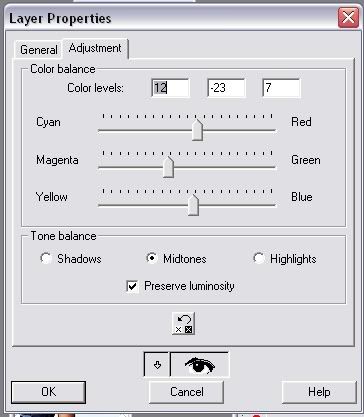
then, set your colour balance layer on soft light, opacity 50

Now, duplicate your base layer, and drag it over top of the colour balance layer, desaturate it (shift + h) and set that layer to soft lilght, opacity 50

And now, (in a seperate window) take the following texture (again, I dont know who this is by, if you know, please let me now so I cant give proper credit)
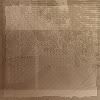
And use gaussian blur, with a radius of 10, to get this:
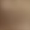
Now, create a new layer on the Kate icon, and paste the blurred texture into it, and set the blend mode on multiply, opacity 56
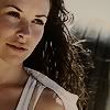
Duplicate that multiplied layer, and change the duplicates blend mode to screen, opacity 18

Now, Duplicate the screened layer, and change the duplicates blend mode to soft light, opacity 100

That looks like a pretty icon, just needs a bit of text.... but I couldent think of what to write, what font to use, yadda yadda (text and I dont get one, hence why I usually use text brushes xD )
So, merge your icon (or flatten it, whatever you wanna call it ^^) And create a new layer and use the following brush (in black)

jsut made on the spot by me ^^;

Now, duplicate your base layer and drag it so its above the brush layer, and lower the opacity so you can see the brush below it, and move it untill you have the part you want in the rectangular part in the brush (I hope that made sense..)
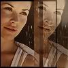
Next, take your rectanglular selection tool thingy-ma-bob, and go through and delete all the parts that arn't in the rectangular part of the box were aiming for
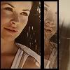
Now you can bring the opacity back up to 100
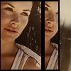
Now, merge the layers, and again take the rectangular selection tool, and select around the brush, and paste it as a new image:

Next, create a new layer over your newly cropped icon, and use the following brush (in white)
(Made by me, text 'I'm here without you, your still on my lonely mind' from 3 doors down, here without you..its what I was listening to at the time :P )
I rotated the brush left, and moved it so in was on the black line down the icon, and sharpened twice, and ta-da!

If you have any trouble, or are confused about anything, feel free todrop me a comment and I'll try my best to help :)
Other Icons made with same/similar technique:
(some are still half finished, but what the heck xD)
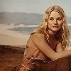
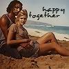
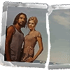
You are welcome to use any of the icons from the tutorial, as long as you credit either honerbright or throw_elijah
Join this community
(Graphic Master List) ( Text Master List)
Go from this
to this
Made in PSP7, but most likely transferable;
Firstly, get your base, I'm using a base of Kate, from Lost (credit to nixxie_)
Sharpen twice
then go effects > noise > edge preserving smooth, and have it set on '2'
Next, create a new colour balance layer ( Layers > new adjustment layer > colour balance )
with the following settings:
then, set your colour balance layer on soft light, opacity 50
Now, duplicate your base layer, and drag it over top of the colour balance layer, desaturate it (shift + h) and set that layer to soft lilght, opacity 50
And now, (in a seperate window) take the following texture (again, I dont know who this is by, if you know, please let me now so I cant give proper credit)
And use gaussian blur, with a radius of 10, to get this:
Now, create a new layer on the Kate icon, and paste the blurred texture into it, and set the blend mode on multiply, opacity 56
Duplicate that multiplied layer, and change the duplicates blend mode to screen, opacity 18
Now, Duplicate the screened layer, and change the duplicates blend mode to soft light, opacity 100
That looks like a pretty icon, just needs a bit of text.... but I couldent think of what to write, what font to use, yadda yadda (text and I dont get one, hence why I usually use text brushes xD )
So, merge your icon (or flatten it, whatever you wanna call it ^^) And create a new layer and use the following brush (in black)
jsut made on the spot by me ^^;
Now, duplicate your base layer and drag it so its above the brush layer, and lower the opacity so you can see the brush below it, and move it untill you have the part you want in the rectangular part in the brush (I hope that made sense..)
Next, take your rectanglular selection tool thingy-ma-bob, and go through and delete all the parts that arn't in the rectangular part of the box were aiming for
Now you can bring the opacity back up to 100
Now, merge the layers, and again take the rectangular selection tool, and select around the brush, and paste it as a new image:
Next, create a new layer over your newly cropped icon, and use the following brush (in white)
(Made by me, text 'I'm here without you, your still on my lonely mind' from 3 doors down, here without you..its what I was listening to at the time :P )
I rotated the brush left, and moved it so in was on the black line down the icon, and sharpened twice, and ta-da!
If you have any trouble, or are confused about anything, feel free todrop me a comment and I'll try my best to help :)
Other Icons made with same/similar technique:
(some are still half finished, but what the heck xD)
You are welcome to use any of the icons from the tutorial, as long as you credit either honerbright or throw_elijah
Join this community
(Graphic Master List) ( Text Master List)