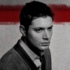
Tutorial: Jensen Ackles Magazine ad
This was requested by unfamiliargirl from my tutorial request post. I've done two others, the first and the second. Feel free to visit the post to request another.
From this:
to
This icon was made in PS CS2. If you can translate it to something else more power to you. I also tried to find where I got the image I used in this icon. I know someone asked me about it earlier in the week and I said I got it from some fansite. But I've gone back and checked so I could credit the source and I have no idea where I found this image. I'm thinking I must have picked it up from someone's picspam somewhere along the way on LJ.
I probably included some steps that other people could avoid and make the icon just as well, but whatever.
1) Crop, copy/paste your picture to a new image. Go wherever your soul takes you.

2) Duplicate the base, set to screen. I set my duplicate to 60% opacity, 78% fill because of the lightness of the image. This will vary from icon to icon, if at all. Sharpen.
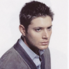
3) Between the base and screened duplicate I added an exclusion layer, #040e16, 100%.
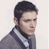
4) Curves layer on top of the screen layer. I more than likely hit "auto" and then fiddled with the numbers if I didn't like the way it turned out.
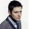
5) Gradient map set to soft light, #a78f79 to #684d35.
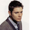
6) Colour balance layer. I upped the blues a little on every tone balance, upped the reds and greens a little in shadows, lowered the cyan and magenta in midtones just a LITTLE in highlights.
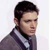
7) Selective colour layer. In the reds I upped the yellow quite a bit, in yellows I upped the reds, magentas and blues. I left the greens and magentas alone but upped the blues and cyans in the well, blues and cyans. I also fiddled with the whites and neutrals a little.
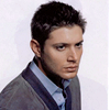
8) Duplicate the base and drag it to the top. Set it on soft light, 100%. Sharpen if necessary.
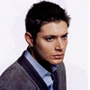
9) Flood fill a new layer with black, set to colour on 100%.
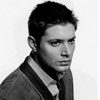
10) Brightness/contrast layer. I set the brightness to +12, the contrast to +16. This will vary from icon to icon. It also eliminated the shadows from the other side of the magazine page from the scan.
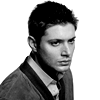
11) Added a texture by sanami276. Set to multiply, 100%.
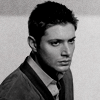
12) Duplicated the texture, multiply 100%, erased the bit over Jensen so he wouldn't be so dark.
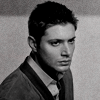
13) Under both of the texture layers I added a new layer and used a brush set on multiply, #9e0b0e, 100%. I erased the bit over Jensen's head and called it done. This is the brush I used:

Unfortunately, while I have tried to go back and link to specific things when I add people to my resource post when I upload them to my PS it's not always indicated who made them. So I credited the person in my resource post, but I can't remember who made this specific brush. :|
Anyway, the resulting icon:


From this:

to

This icon was made in PS CS2. If you can translate it to something else more power to you. I also tried to find where I got the image I used in this icon. I know someone asked me about it earlier in the week and I said I got it from some fansite. But I've gone back and checked so I could credit the source and I have no idea where I found this image. I'm thinking I must have picked it up from someone's picspam somewhere along the way on LJ.
I probably included some steps that other people could avoid and make the icon just as well, but whatever.
1) Crop, copy/paste your picture to a new image. Go wherever your soul takes you.

2) Duplicate the base, set to screen. I set my duplicate to 60% opacity, 78% fill because of the lightness of the image. This will vary from icon to icon, if at all. Sharpen.

3) Between the base and screened duplicate I added an exclusion layer, #040e16, 100%.

4) Curves layer on top of the screen layer. I more than likely hit "auto" and then fiddled with the numbers if I didn't like the way it turned out.

5) Gradient map set to soft light, #a78f79 to #684d35.

6) Colour balance layer. I upped the blues a little on every tone balance, upped the reds and greens a little in shadows, lowered the cyan and magenta in midtones just a LITTLE in highlights.

7) Selective colour layer. In the reds I upped the yellow quite a bit, in yellows I upped the reds, magentas and blues. I left the greens and magentas alone but upped the blues and cyans in the well, blues and cyans. I also fiddled with the whites and neutrals a little.

8) Duplicate the base and drag it to the top. Set it on soft light, 100%. Sharpen if necessary.

9) Flood fill a new layer with black, set to colour on 100%.

10) Brightness/contrast layer. I set the brightness to +12, the contrast to +16. This will vary from icon to icon. It also eliminated the shadows from the other side of the magazine page from the scan.

11) Added a texture by sanami276. Set to multiply, 100%.

12) Duplicated the texture, multiply 100%, erased the bit over Jensen so he wouldn't be so dark.

13) Under both of the texture layers I added a new layer and used a brush set on multiply, #9e0b0e, 100%. I erased the bit over Jensen's head and called it done. This is the brush I used:

Unfortunately, while I have tried to go back and link to specific things when I add people to my resource post when I upload them to my PS it's not always indicated who made them. So I credited the person in my resource post, but I can't remember who made this specific brush. :|
Anyway, the resulting icon:
