Tutorial: Supernatural promotional photos
This is my second tutorial from my request post. Feel free to make a request, if you want. This one was also requested by smidgy06. I'm not sure which one, spefically, she was asking for in that post so I'm going to do both. The first tutorial from the requests can be found here.
Please don't follow this tutorial step-for-step to make a new icon. If you use it and submit the icon to a contest or something people will think you're a douchebag because it's basically cheating. Use this as a way to get tips and hints or just to figure out how to do certain things. There are probably other, easier ways to do what I produce here but it's the only way I know. *shrugs*
This tutorial is for PS CS2. If you can translate it to PSP more power to you but as far as I know it can't be.
From this
to this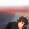
(credit to supernaturalcentral.com for the photo, obvs)
1) Crop, copy/paste, drag- whatever. Fiddle with your base the way you want it.
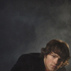
2) Duplicate the base, set to screen 100%.
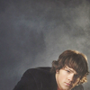
3) Exclusion layer, 100%, #091926.
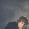
4) Duplicate the base again, set to soft light 100%.
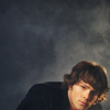
5) Selective colouring layer. I won't give the exact numbers because they won't work with the same effect on any other icon but this one. I only fiddled with the yellows, though, because I don't really like yellow-ish skin. I upped the reds and the blues to fix that. There's very little change.

6) Curves layer. In all honesty I usually hit the "auto" button and if it's too green/yellow for my liking I fiddle with the results. I can't remember if I had to fiddle here but the outcome is a darker, more defined icon.
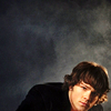
7) Another selective colour layer. I fiddled with all the colours but magenta and black. I upped the blues, and tried to take more of the yellow out of Jared's face.
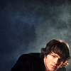
8) Yet another selective colour layer. I only focused on the neutral here. I upped the red, green and blue, trying to make the icon lighter in the background but keep the blue. I used the eraser on Jared because I didn't want HIM to be lighter and blue.
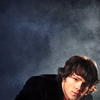
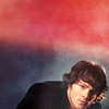
9) I added a texture, flipped and some erased to suit my needs, set on screen at 100%. The texture was made by me, please credit marishna if using.
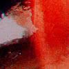
-->
10) I duplicated the texture, screen 100%.
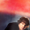
11) Duplicated that layer one more time, luminosity 100%.
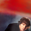
12) I added a new texture, flipped and erased again, set on lighten 100%. This texture was made by wash_when_dirty.
-->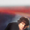
13) Duplicated that layer, set on screen 100%.
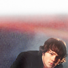
14) Duplicated the base one more time, soft light, opacity 56%, fill 54%. Sharpen this layer if you feel it needs it, but don't go overboard. I like crisp, detailed icons but not crunchy ones. Throw text on it, if you so see fit, and you're good to go!

Feel free to friend this journal to keep on top of icons, more tutorials and resources!

Please don't follow this tutorial step-for-step to make a new icon. If you use it and submit the icon to a contest or something people will think you're a douchebag because it's basically cheating. Use this as a way to get tips and hints or just to figure out how to do certain things. There are probably other, easier ways to do what I produce here but it's the only way I know. *shrugs*
This tutorial is for PS CS2. If you can translate it to PSP more power to you but as far as I know it can't be.
From this

to this

(credit to supernaturalcentral.com for the photo, obvs)
1) Crop, copy/paste, drag- whatever. Fiddle with your base the way you want it.

2) Duplicate the base, set to screen 100%.

3) Exclusion layer, 100%, #091926.

4) Duplicate the base again, set to soft light 100%.

5) Selective colouring layer. I won't give the exact numbers because they won't work with the same effect on any other icon but this one. I only fiddled with the yellows, though, because I don't really like yellow-ish skin. I upped the reds and the blues to fix that. There's very little change.

6) Curves layer. In all honesty I usually hit the "auto" button and if it's too green/yellow for my liking I fiddle with the results. I can't remember if I had to fiddle here but the outcome is a darker, more defined icon.

7) Another selective colour layer. I fiddled with all the colours but magenta and black. I upped the blues, and tried to take more of the yellow out of Jared's face.

8) Yet another selective colour layer. I only focused on the neutral here. I upped the red, green and blue, trying to make the icon lighter in the background but keep the blue. I used the eraser on Jared because I didn't want HIM to be lighter and blue.

9) I added a texture, flipped and some erased to suit my needs, set on screen at 100%. The texture was made by me, please credit marishna if using.

-->

10) I duplicated the texture, screen 100%.

11) Duplicated that layer one more time, luminosity 100%.

12) I added a new texture, flipped and erased again, set on lighten 100%. This texture was made by wash_when_dirty.

-->

13) Duplicated that layer, set on screen 100%.

14) Duplicated the base one more time, soft light, opacity 56%, fill 54%. Sharpen this layer if you feel it needs it, but don't go overboard. I like crisp, detailed icons but not crunchy ones. Throw text on it, if you so see fit, and you're good to go!

Feel free to friend this journal to keep on top of icons, more tutorials and resources!