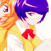
Icon Colouring Tutorial

>>

13 Main steps
Difficulty: Easy
Translatable: Yess
Uses: Levels, curves, colour balance, and hue/saturation layers
Best for: images with harsh-ish lines
(^if not, result may end up looking a bit too strong in contrast etc.)

Step One~ Grab a base :3

Step Two~ Prepare your base any way you like as long as it has enough brightness, and contrast. I simply prepared mine by duplicating the base 2 times . First one was set to screen and second duplicate was set to softlight.

Step Three~ New fill layer: FFCCCC set to colourburn with its opacity lowered to 40%

Step Four~ New Fill layer: 0C1024 set to exclusion.

Step Five~ Add these three softlight layers:
A6EE9C softlight
ED9CEE softlight 95%
9CD2EE softlight 50%
Your icon must look pretty crappy right now but don't worry we'll fix that soon.

Step Six~ Looks pretty washed out right now doesn't it ? Duplicate your base and drag it all the way to the top. Set this layer to softlight 100%

Step Seven~ New Levels adjustment layer. Input the following settings:
RGB: 21, 0.97, 255
RED: 17, 1.00, 247
GREEN: 0, 0.93, 255

Step Eight~ New Curves adjustment layer: Input the following settings:
GREEN: Input: 165
Output: 175
Lower the opacity of this layer to 61%

Step Nine~ New Colour Balance layer: Input the following settings:
Midtones: +16, -9, -7
Shadows: +4, -13, +12
Set this layer to colour and lower its opacity to 70%

Step Ten~ New Hue/Saturation layer: Input the following settings:
Red: 0, 44, 0

Step Eleven~ New Fill layer: 2C2C2C and set it to exclusion at 55%

Step Twelve~ Duplicate your base and drag it all the way to the top . Set this layer to softlight at 40%

(Optional) Step Thirteen~ For my other examples, by now they became a little too light so what I did with them is that I duplicated my base and dragged it all the way to the top and set it to luminosity 20-39% . With this icon I did not have to do that and just left it the way it is, but you may have to do this step if your result ends up becoming too light in the end.

Step Fourteen~ Time to enhance the reds a little more . Make a new hue/saturation layer. Again, we'll only be upping the saturation and not toughing the hue and lightness settings.
Master: +5
Reds: +8
And you're basically done ! I advise not to thoroughly follow this tut exactly, but to experiment
along the way and use this as a guideline to recieve a unique effect of your own :)
Hope you enjoyed, and I <3 seeing results :)
Other results (some may have minor tweaks):

>>


>>


>>
