#18 - Dante Tutorial
Going from:

to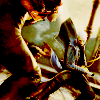
Very simple. Translatable.
Begin with base:

Duplicate base and set to SCREEN. Desaturate that layer. Now, it depends on your icon, but I duplicated that desaturated SCREEN layer twice so it looked like this:
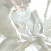
It should look practically white. Although I recommend messing with the amount of SCREEN layers at the end of the tutorial so it's easier to see the final product.
Now duplicate the desaturated SCREEN layer and change the blend mode to SOFTLIGHT:
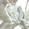
Create a new layer filled with #ded6c2 and set the layer to MULTIPLY 100%:

>
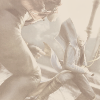
Create a new layer filled with #e8c1c8 and set the layer to SOFTLIGHT 100%:

>
Duplicate the base layer (DON'T DESATURATE), drag it to the top, and set the layer to SOFTLIGHT:

Create a new layer filled with #958f8f and set the layer to COLOR BURN 100%:

>
Duplicate the COLOR BURN LAYER:

Now duplicate the base layer (DON'T DESATURATE), drag it to the top, and set the layer to SOFTLIGHT:

Now, since this icon was a bit dark, I decided create another layer filled with #f5f5f5 (practically white) and I set that layer to SOFTLIGHT:

>
And it's done!
If your icon is too dark, duplicate some of the SCREEN layers. If it looks too red, or saturated or whatever, you can desaturate one of the non-desaturated duplicated SOFTLIGHT base layers.
For example, on this icon I desaturated the first non-desaturated SOFTLIGHT duplicated base layers:

(base) >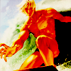
>
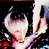
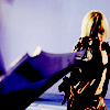
Other examples:

>

>

>

>
This one I had to duplicate the SCREEN layer EIGHT TIMES (but it turned out nice):

>
I really like comments and results, and don't be scared to ask questions!
And yes, if you ever saw it, this is a lot like my Angel Tutorial, but this one is a lot darker and has that burned look.
-Kelsey

to

Very simple. Translatable.
Begin with base:

Duplicate base and set to SCREEN. Desaturate that layer. Now, it depends on your icon, but I duplicated that desaturated SCREEN layer twice so it looked like this:

It should look practically white. Although I recommend messing with the amount of SCREEN layers at the end of the tutorial so it's easier to see the final product.
Now duplicate the desaturated SCREEN layer and change the blend mode to SOFTLIGHT:

Create a new layer filled with #ded6c2 and set the layer to MULTIPLY 100%:

>

Create a new layer filled with #e8c1c8 and set the layer to SOFTLIGHT 100%:

>

Duplicate the base layer (DON'T DESATURATE), drag it to the top, and set the layer to SOFTLIGHT:

Create a new layer filled with #958f8f and set the layer to COLOR BURN 100%:

>

Duplicate the COLOR BURN LAYER:

Now duplicate the base layer (DON'T DESATURATE), drag it to the top, and set the layer to SOFTLIGHT:

Now, since this icon was a bit dark, I decided create another layer filled with #f5f5f5 (practically white) and I set that layer to SOFTLIGHT:

>

And it's done!
If your icon is too dark, duplicate some of the SCREEN layers. If it looks too red, or saturated or whatever, you can desaturate one of the non-desaturated duplicated SOFTLIGHT base layers.
For example, on this icon I desaturated the first non-desaturated SOFTLIGHT duplicated base layers:

(base) >

>

Other examples:

>


>


>


>

This one I had to duplicate the SCREEN layer EIGHT TIMES (but it turned out nice):

>

I really like comments and results, and don't be scared to ask questions!
And yes, if you ever saw it, this is a lot like my Angel Tutorial, but this one is a lot darker and has that burned look.
-Kelsey