Ginormous text tutorial
Here is a repost of The Text Tutorial, requested by about a gazillion people. We will be going over the different methods of using text in Photoshop and in GIMP, effects you can use to make text look better or more readable, and you can download some of my favorite fonts here. :)
Apologies for any mistakes - please correct me if you find them - and I hope this helps!
Program(s)+version: Photoshop CS3, GIMP
Involves: Text tools, layer styles
Translatable: Yes, mostly
Steps: This tutorial doesn't show how to get from point A to point B, so there aren't really steps...
Difficulty: Beginning/Intermediate
TABLE OF CONTENTS
Text in Photoshop
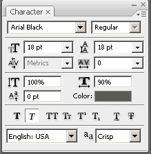
This is Photoshop's Character box. If you can't see it, go to Window > Character and it will show up. I will go over how to use everything in it, with examples, so nobody misses any tricks. Screencap of where to find the text box in Photoshop.
First row (helpful location screencap)
First is the menu where it says "Arial Black" at the top. Click on that and you will get, if you're addicted to downloading fonts like me, a list of about a gazillion fonts. How to choose among them? We'll come back to that.
Next to the "Arial Black" box it says "Regular." This is a drop-down menu that will let you choose among, usually, italics, strong (bolded) text, and regular/normal. Some fonts have special variations; this is where they will show up. I never touch this menu, except in very rare cases when every font I do is somehow stuck in italics (it's because italics was chosen in the menu - an easy problem to fix), because there are simpler ways to do italic or bold text, which we'll get to in a minute.
ETA: becs1024 says: "it's a bit of a faux-pas to click the "bold" button and have Photoshop artificially bold a word if a bold version of the typeface is available under that drop-down menu. Each member of the "font family" (bold, italic, bold italic, condensed, etc.) is designed individually, but using the buttons on the palette, though more convenient, just modifies the pixels. True, it doesn't make much of a difference, but it's a good thing to know."
Second row (helpful location screencap)
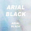
The box with the two capital Ts and its menu, on the left half, is the font size menu. Font size can be measured in many ways - among them em, px, pc, mm, in, and pt - but we will be focusing on pt, or points, which is how text is measured in text editors like Microsoft Word or Notepad. Needless to say, this menu determines how big the text is.
Example: The top "ARIAL BLACK" text is set to 18pt, and the bottom text is set to 8pt.
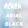
The menu on the right side of this row is the line-height menu. This determines how big the space is between lines of text, and it, like the font size menu, is also measure in pt.
Example: Both "ARIAL BLACK"s are set to 18pt size font. In the top one, the line height is set at 8pt, and in the bottom one, the line height is set at 30pt.
Third row (helpful location screencap)
On the left side, the A|V picture with the menu that says "Metrics" is...well, honestly, I have no idea. And I don't use it, so let's just skip it. :P
ETA: becs1024 says: "The "Metrics" thing is called the kerning tool, which controls the space between individual letters (rather than the whole word, which is what the tracking, or letter-spacing, tool is for). To kern, just set your cursor (rather than highlighting anything) between two letters and increase or decrease in the menu. It helps to correct uneven letter spacing."
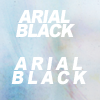
On the right side we have the letter-spacing menu. This determines the space between each individual letter. In the drop-down menu you can choose from anything between -200 (which will make the letters really squished together) to 200 (which will make them really far apart), but you can also type any number you want into the box.
Example: The letter spacing of the text at the top is set to -50, and that of the text at the bottom is set to 200.
Fourth row (helpful location screencap)
On the left side, the T with the vertical arrow determines how vertically stretched the text is. This is measured not in pt but in percentage. So if you type in 150%, the text will be stretched vertically, as if someone were pulling it from the top and bottom.
Example: The vertical stretching, for lack of a better term, of the top text is 150% and the bottom is 50%.
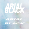
The menu on the right side does the same thing, only horizontally.
Example: The horizontal stretching of the top text is 150% and the bottom is 50%.
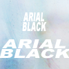
I don't use these nearly as much as I should - they can be very useful.
Fifth row (helpful location screencap)
Honestly, I have no clue what the thing on the left side does. I clicked on it and it doesn't appear to do anything at all. *shrugs* On the right side we have the Color box. Click on it and you can choose the color of the text. We'll discuss choosing color a bit later.
ETA: becs1024 says: "The tool to the left of the color selector is designed to move the lowercase characters in your word relative to the uppcase letter (that's what the picture is illustrating, anyway). However, all you have to do is highlight some of the letters in your word, and that tool will move them up or down relative to the established baseline. I'm not sure what the practical application is, but it's fun to play with."
Sixth row (helpful location screencap)
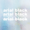
This is the fun row! :D In order from left to right, we have buttons to make text bold, italic, CONVERT TO ALL CAPITAL LETTERS, convert to small capital letters, make superscript, make subscript, underline, and strikethrough.
Examples:
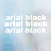
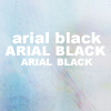
Seventh row (helpful location screencap)
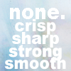
In the seventh row, we have the options to change the language (which we won't be discussing) and to change the anti-aliasing style of the text. Anti-alias is a term that means something like "smoothing the edges so that whatever it is being anti-aliased doesn't look ugly and pixelated."
There are five options here. "None" means there will be no anti-alias style and the edges, especially around the curvy parts of the text, will be pixelated. You will have to look closely at the example image to discover the differences, as they aren't always readily apparent, but sometimes changing the anti-alias style can make a great deal of difference. Sometimes, for example, text looks better using a "Strong" anti-alias rather than making it bold.
Example:
The last bit (helpful location screencap)
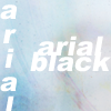
The last part is the little icon thingy in the very top right corner. It's just a menu that gives redundant options. The most useful part of this menu is the very first option that says "Change text orientation." If you want to change your text from going horizontally to going vertically, this is the option for you.
Example:
Text in GIMP
This is where to find the text tool in GIMP. Clicking it will bring up this box, the equivalent of Photoshop's Character box:
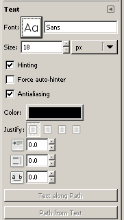
As you can see, the text options in GIMP are pretty limited. The big button in the first row, if you click on it, will allow you to choose which font you want to use. The next row determines the font size and how you measure it (in the drop-down menu on the right). I have no idea what Hinting is (on second glance, it appears to be another type of anti-aliasing... help, anybody?). You can turn anti-aliasing on or off, as in Photoshop, but there is only one kind of anti-alias style, not four. You can also choose the color of the text and justify it (aligned left, center, or right).
The little boxes below the justification line are probably what will be most useful to you. The first box determines how many pixels the first line of text is indented, as at the beginning of a paragraph. The second box determines the line-height, and the last box determines the letter spacing.
I'm surprised to find that there doesn't appear to be any way to make text bold, italic, and so on. Does anyone know how to do this in GIMP?
ETA: planetgal471 says, "As for making text bold, italic, etc., in the font drop-down menu in gimp, each mode of the font is listed as a separate font. So you would choose "Arial Bold" instead of "Arial" from the drop down menu" and recommends the plug-in FreeType.
Choosing a Font
Okay, this is the part where you get to scroll through your huge list of fonts, trying the ones you're familiar with, resorting to clicking on random ones when that doesn't help, tearing your hair in frustration at how huge the list is....
Um, whoops. *shuts up*
Right. Choosing a font largely depends on the icon in question. Think about the picture you're using. Is it from a fantasy fandom like Merlin or Legend of the Seeker? Use a medieval-looking font. Is it from a futuristic/sci-fi fandom like Star Wars? Use a futuristic-looking font, or a sans-serif font (which will double for "futuristic" in a pinch). Do you want the icon to look elegant and formal? Use a classic serif font like Times New Roman or Trajan. Do you want it to look cute and playful? Use a font that resembles handwriting, or a fun one like Jokerman or Oh Ashy.
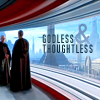
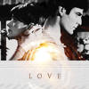
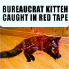
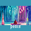
Examples: The first icon uses a handwriting font (I forget what it's called. *failsauce*) to make it happy and playful, thus matching the picture. The second icon uses a sans-serif font that matches the clean lines of the room. The third icon uses Trajan for a classic, romantic feel. The fourth icon uses the same font (Impact) as lolcat pictures do, which makes this recognizable as a lolcat icon. The fifth icon uses a font that helps make it look peaceful.

There isn't really much more I can tell you about this, honestly. You just have to scroll through your own lists and choose something. However, I made a list of the fonts I use all the time and provided download links for you:
My font list & downloads
And now that you have a bunch of awesome fonts, let's play with them. :D
Making Text Look Pretty
Color
What color the text is can make or break an icon. If you only take one thing away from this tutorial, it should be this:
The color of the text should ALWAYS match the color of the icon.
By "the color of the icon" I don't mean all icons are monochromatic. If you're working with an icon with whitish highlights, using that whitish (or whatever else) color is great, even if it's nowhere else on the icon. The purpose of matching the color of the text to that of a color in the icon makes the text "flow" with the overall look of the icon.
Examples:
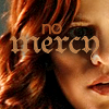
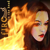

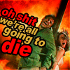
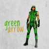
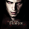
If you want unobtrusive text, the right color can make it blend into the background (but hopefully still be readable).
Examples of unobtrusive text:
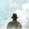
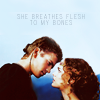
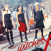


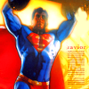
If you want text that makes an impact as soon as you see it, you can use color - one very common trend nowadays is to use big white (or nearly white, to match the colors in the icon) Georgia, Times New Roman, or Arial Black text to make a striking contrast with the icon.
Examples of the big white text trend:


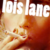
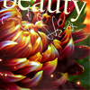
Rules are made to be broken, though, and if you use color right, you can come up with some pretty striking icons. Some knowledge of the color wheel, and what colors are complimentary and which are opposites, can be helpful here. As you can see in the examples below, some text uses color picked from the icon and some uses complimentary colors based off that, as in the second and third icons. The complimentary (matching) colors don't have to be from the icon - there's no pink in the third icon's base picture - but it works because, together with the green butterfly, it establishes a pastel color palette that goes with the pastel-ish blue of the picture.
Examples:


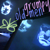
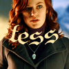


Also note that making one or two words a different (complementary, please!) color can produce a striking effect and draw attention to them, as emphasized words.
Rotation
Rotating text is often a good idea. It can make an icon suddenly much more interesting, give it a bit of kick. If the icon picture itself is rotated, rotating the text to match the picture is good. Rotating the text the opposite way can also work, although that's trickier.
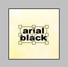
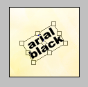
To rotate text in Photoshop, first make sure you have some text. Then either press Ctrl-T or go to Edit > Free Transform. You will get a box around the text (second picture). The cursor will now look like a little arrow, or a pair of arrows if it's around one of the corners of the box. Click on the space anywhere outside or inside the box and drag up or down, and the text will rotate in that direction. Press Enter or click the check mark in the upper right corner, and you're done.
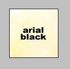
>
>
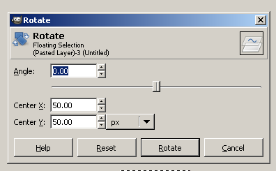
To rotate text in GIMP, go to Layer > Transform > Arbitrary Transformation (screencap here). This will bring up a box in which you can either drag the slider or input a number, both of which will rotate the text (or anything else). Then click Rotate, and you're done.
Examples of rotated text: The first and fifth are rotated in opposition to the picture; the second is as well but it follows a natural line (the black part). The fourth icon is rotated together with the text. In the last icon, only the top line of text is rotated, providing a contrast with the bottom line.


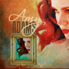
Yes, my natural inclination is to lean down on the left. Shut up. :P
Warping
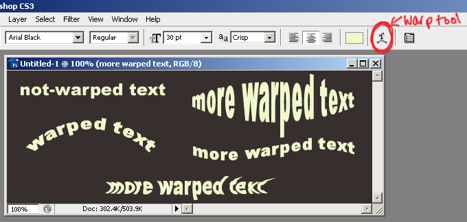
The warp tool can be extremely useful sometimes. What it does it bends the text in certain ways - a lot of ways, actually. I don't think there's any equivalent in GIMP, sorry. This is where to find the warp tool, and some examples:
Clicking on the warp tool brings up this box:
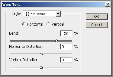
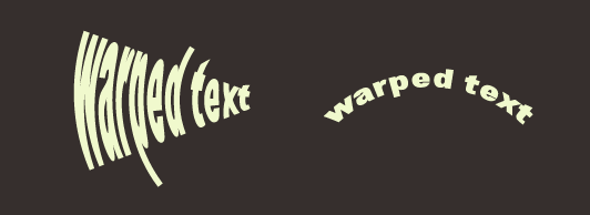
Where it says "Style: Squeeze" is a drop-down menu of a bunch of presets. Click on one or another, and it will make your text look pretty weird. :) Most of the presets are pretty easy to mimic yourself by adjusting the sliders below. As for the horizontal/vertical option: the text on the left is set on Arc, Vertical, Bend +50%, while the text on the right is set on Arc, Horizontal, Bend +50%. I recommend playing around with the sliders to get a feel for what they can do.
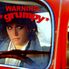
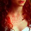
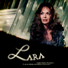
Guess I should show you how warped text looks in some icons, eh? ;) Yes, I use it mostly on the "Arc" preset. Anything else looks pretty strange in a little tiny icon.
Examples of warped text:



Layer Styles
Layer styles are one of the most useful tools in Photoshop. To get to them, click Layers > Layer Style > Blending Options, or double-click on the highlighted layer, shown here:
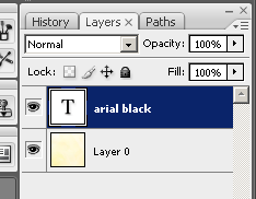
Make sure you don't click on the big "T", which will highlight the text on the icon, or on where it says "arial black", which will let you change the name of the layer (without changing what the text actually says on the icon). With the exception of those two areas, anywhere in the highlighted area will do. So now you've got this box:

Since this isn't a Layer Styles tutorial - there are loads of things you can do with them, and I can't possibly cover them all without going totally insane - we're only going to talk about the most useful layer styles for text on icons. Click on Drop Shadow, at the far left.
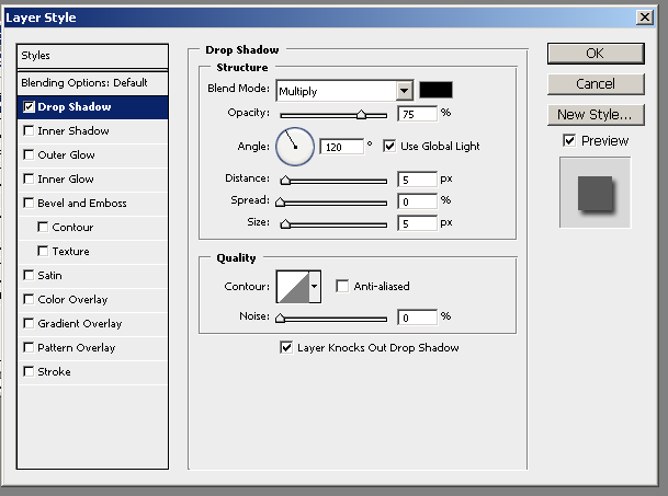
Drop Shadow makes a shadow beneath the text, as if it were hovering in the air over the layer beneath it. You can change the opacity (making it more or less transparent = more or less visible), the angle at which the shadow falls, the distance (how far from the text the shadow is), and the spread and size (how big and spread-out the shadow is). I recommend playing around with the settings to experiment and find out what you like.
I use Drop Shadow primarily to make text more readable, especially if it's over a busy picture. For example:
Examples:


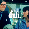
It's very hard to tell that there's a drop shadow in these icons. To get this effect, I usually lower the Distance to 0 and the Opacity to 30% or so, and raise the Spread and Size values so that the shadow is spread out and less obvious. Changing the color of the shadow is also very helpful in making it unobtrusive - just pick a color from the icon, where the shadow is going to go.
Drop Shadow can also be used to make this kind of shadow, which is pretty popular (geez, I thought I had done more like this, but apparently not):
Examples:


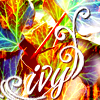
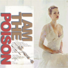
HOWEVER. Fiddling with the settings can get kind of annoying, and there's an easier way to do this. Duplicate your text layer (in Photoshop, just press Ctrl-J), change the color of the bottom text layer to black or something dark, and drag it a couple of pixels in any direction you want. Presto! You've got a nice shadow.
Here's another tip - you can change the shadow into a nice light glow if you so desire. Just change the blending mode from Multiply to Screen and choose a light color. You're done - and you don't even have to go to Outer Glow! :D
Okay, so much for shadows and glows. Now click on Stroke, on the far left.
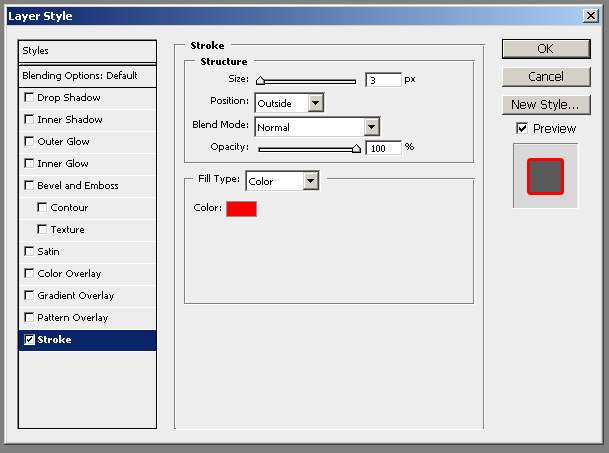
This is what puts the line of color around text, and it's very useful indeed.
Examples:

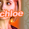
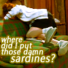
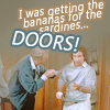

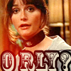
Here are examples of what changing the Stroke size and position do:
Examples:
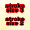
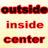
I typically use settings of Stroke size 2 and position outside, and only change the color and sometimes the opacity. As mentioned somewhere above, if you use complimentary colors that are based on the colors in the icon, this will look very good indeed, but black is a good default.
I don't think there's any equivalent in GIMP, but you might try duplicating the text, making the lower layer one size bigger, and changing the color - it's possible that will mimic the effect of Stroking the text.
*dirty-minded fangirly giggles at "stroking the text"*
Edit: There is a way to do it in GIMP! saavikam77 (thanks, hon!) says: Select the text layer and right click on it (in the toolbox). Select "Text to Path" from the drop down menu. Go to the Paths Dialogue Box, select the text layer and right click on it, and select "Stroke Path" from the drop down menu. This pops up a window with various options.
To change the Stroke color in GIMP htbthomas (thanks!) says,
--duplicate text layer
--Text to Selection (right clicking on Text Layer to find that)
--right-click selected text in image--> Select--> Border --> 2 px and feathering
--right-click again on selected text in image--> Edit--> Fill with FG color (or BG color)
--move the filled layer under the original text layer
Combining Effects
I don't think there's anything else I can guide you through with regards to text. If there's anything I've missed in Photoshop or GIMP, please, point it out. As I've said, I don't know nearly everything there is to know about Photoshop, and I know hardly anything about GIMP.
So where to go from here, now that we know how to get all these effects? Play around with them and combine them. Here are some icons I've done that show just a small portion of what can be achieved with various text tools:
Examples of using two or more fonts together:
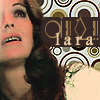
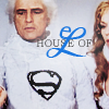
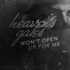

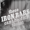
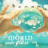
Examples of using different font sizes together:

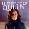
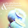
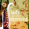
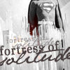
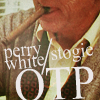
Examples of using different colors together:


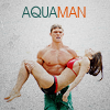

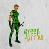

Examples of using textures over or under text:
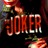

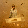


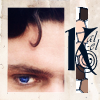
Taking a look at various typography sites and downloading fonts can be very inspiring if you're stuck.
Q & A
saavikam77 asked about making different colors/fonts/sizes in one block of text in GIMP. As far as I can tell, there doesn't appear to be any way to do this. :( If anyone else knows how, please tell us!
ETA: moony_blues writes that "there isn't a way to do that in one block for the GIMP. It's annoying, but you have to manipulate GIMP's text manually, either by using Text to Path or manually manipulating the perspective of the layer. Same thing with bevels and glows. If you want to know what you can do with text in the GIMP, run a google search for "GIMP text effects" and you can get some pretty helpful results."
kassandrajones asked about readability with cursive/script fonts. I think readability depends in large part on anti-aliasing, letter spacing (sometimes, with small text sizes), and how one saves icons. Saving as a PNG file gives you the best quality; saving as a JPG gives lower quality, and if you're saving the file over and over again as you make changes...well, the quality gets worse every time.
I recommend saving as a PNG file and using anti-aliasing. If that doesn't help, show us some examples and we'll figure something out.
htbthomas asked about keeping text from getting pixelated, especially in animated GIFs. The same answer as the one above applies here - save as PNG and use anti-aliasing. As for animated GIFs, I'm not the person to ask - there are a load of people who are much better at making GIFs than I am. I recommend princessbloomy.
More questions? Please ask! :D
The original tutorial post is here.
Apologies for any mistakes - please correct me if you find them - and I hope this helps!
Program(s)+version: Photoshop CS3, GIMP
Involves: Text tools, layer styles
Translatable: Yes, mostly
Steps: This tutorial doesn't show how to get from point A to point B, so there aren't really steps...
Difficulty: Beginning/Intermediate
TABLE OF CONTENTS
Text in Photoshop
This is Photoshop's Character box. If you can't see it, go to Window > Character and it will show up. I will go over how to use everything in it, with examples, so nobody misses any tricks. Screencap of where to find the text box in Photoshop.
First row (helpful location screencap)
First is the menu where it says "Arial Black" at the top. Click on that and you will get, if you're addicted to downloading fonts like me, a list of about a gazillion fonts. How to choose among them? We'll come back to that.
Next to the "Arial Black" box it says "Regular." This is a drop-down menu that will let you choose among, usually, italics, strong (bolded) text, and regular/normal. Some fonts have special variations; this is where they will show up. I never touch this menu, except in very rare cases when every font I do is somehow stuck in italics (it's because italics was chosen in the menu - an easy problem to fix), because there are simpler ways to do italic or bold text, which we'll get to in a minute.
ETA: becs1024 says: "it's a bit of a faux-pas to click the "bold" button and have Photoshop artificially bold a word if a bold version of the typeface is available under that drop-down menu. Each member of the "font family" (bold, italic, bold italic, condensed, etc.) is designed individually, but using the buttons on the palette, though more convenient, just modifies the pixels. True, it doesn't make much of a difference, but it's a good thing to know."
Second row (helpful location screencap)
The box with the two capital Ts and its menu, on the left half, is the font size menu. Font size can be measured in many ways - among them em, px, pc, mm, in, and pt - but we will be focusing on pt, or points, which is how text is measured in text editors like Microsoft Word or Notepad. Needless to say, this menu determines how big the text is.
Example: The top "ARIAL BLACK" text is set to 18pt, and the bottom text is set to 8pt.
The menu on the right side of this row is the line-height menu. This determines how big the space is between lines of text, and it, like the font size menu, is also measure in pt.
Example: Both "ARIAL BLACK"s are set to 18pt size font. In the top one, the line height is set at 8pt, and in the bottom one, the line height is set at 30pt.
Third row (helpful location screencap)
On the left side, the A|V picture with the menu that says "Metrics" is...well, honestly, I have no idea. And I don't use it, so let's just skip it. :P
ETA: becs1024 says: "The "Metrics" thing is called the kerning tool, which controls the space between individual letters (rather than the whole word, which is what the tracking, or letter-spacing, tool is for). To kern, just set your cursor (rather than highlighting anything) between two letters and increase or decrease in the menu. It helps to correct uneven letter spacing."
On the right side we have the letter-spacing menu. This determines the space between each individual letter. In the drop-down menu you can choose from anything between -200 (which will make the letters really squished together) to 200 (which will make them really far apart), but you can also type any number you want into the box.
Example: The letter spacing of the text at the top is set to -50, and that of the text at the bottom is set to 200.
Fourth row (helpful location screencap)
On the left side, the T with the vertical arrow determines how vertically stretched the text is. This is measured not in pt but in percentage. So if you type in 150%, the text will be stretched vertically, as if someone were pulling it from the top and bottom.
Example: The vertical stretching, for lack of a better term, of the top text is 150% and the bottom is 50%.
The menu on the right side does the same thing, only horizontally.
Example: The horizontal stretching of the top text is 150% and the bottom is 50%.
I don't use these nearly as much as I should - they can be very useful.
Fifth row (helpful location screencap)
Honestly, I have no clue what the thing on the left side does. I clicked on it and it doesn't appear to do anything at all. *shrugs* On the right side we have the Color box. Click on it and you can choose the color of the text. We'll discuss choosing color a bit later.
ETA: becs1024 says: "The tool to the left of the color selector is designed to move the lowercase characters in your word relative to the uppcase letter (that's what the picture is illustrating, anyway). However, all you have to do is highlight some of the letters in your word, and that tool will move them up or down relative to the established baseline. I'm not sure what the practical application is, but it's fun to play with."
Sixth row (helpful location screencap)
This is the fun row! :D In order from left to right, we have buttons to make text bold, italic, CONVERT TO ALL CAPITAL LETTERS, convert to small capital letters, make superscript, make subscript, underline, and strikethrough.
Examples:
Seventh row (helpful location screencap)
In the seventh row, we have the options to change the language (which we won't be discussing) and to change the anti-aliasing style of the text. Anti-alias is a term that means something like "smoothing the edges so that whatever it is being anti-aliased doesn't look ugly and pixelated."
There are five options here. "None" means there will be no anti-alias style and the edges, especially around the curvy parts of the text, will be pixelated. You will have to look closely at the example image to discover the differences, as they aren't always readily apparent, but sometimes changing the anti-alias style can make a great deal of difference. Sometimes, for example, text looks better using a "Strong" anti-alias rather than making it bold.
Example:
The last bit (helpful location screencap)
The last part is the little icon thingy in the very top right corner. It's just a menu that gives redundant options. The most useful part of this menu is the very first option that says "Change text orientation." If you want to change your text from going horizontally to going vertically, this is the option for you.
Example:
Text in GIMP
This is where to find the text tool in GIMP. Clicking it will bring up this box, the equivalent of Photoshop's Character box:
As you can see, the text options in GIMP are pretty limited. The big button in the first row, if you click on it, will allow you to choose which font you want to use. The next row determines the font size and how you measure it (in the drop-down menu on the right). I have no idea what Hinting is (on second glance, it appears to be another type of anti-aliasing... help, anybody?). You can turn anti-aliasing on or off, as in Photoshop, but there is only one kind of anti-alias style, not four. You can also choose the color of the text and justify it (aligned left, center, or right).
The little boxes below the justification line are probably what will be most useful to you. The first box determines how many pixels the first line of text is indented, as at the beginning of a paragraph. The second box determines the line-height, and the last box determines the letter spacing.
I'm surprised to find that there doesn't appear to be any way to make text bold, italic, and so on. Does anyone know how to do this in GIMP?
ETA: planetgal471 says, "As for making text bold, italic, etc., in the font drop-down menu in gimp, each mode of the font is listed as a separate font. So you would choose "Arial Bold" instead of "Arial" from the drop down menu" and recommends the plug-in FreeType.
Choosing a Font
Okay, this is the part where you get to scroll through your huge list of fonts, trying the ones you're familiar with, resorting to clicking on random ones when that doesn't help, tearing your hair in frustration at how huge the list is....
Um, whoops. *shuts up*
Right. Choosing a font largely depends on the icon in question. Think about the picture you're using. Is it from a fantasy fandom like Merlin or Legend of the Seeker? Use a medieval-looking font. Is it from a futuristic/sci-fi fandom like Star Wars? Use a futuristic-looking font, or a sans-serif font (which will double for "futuristic" in a pinch). Do you want the icon to look elegant and formal? Use a classic serif font like Times New Roman or Trajan. Do you want it to look cute and playful? Use a font that resembles handwriting, or a fun one like Jokerman or Oh Ashy.
Examples: The first icon uses a handwriting font (I forget what it's called. *failsauce*) to make it happy and playful, thus matching the picture. The second icon uses a sans-serif font that matches the clean lines of the room. The third icon uses Trajan for a classic, romantic feel. The fourth icon uses the same font (Impact) as lolcat pictures do, which makes this recognizable as a lolcat icon. The fifth icon uses a font that helps make it look peaceful.
There isn't really much more I can tell you about this, honestly. You just have to scroll through your own lists and choose something. However, I made a list of the fonts I use all the time and provided download links for you:
My font list & downloads
And now that you have a bunch of awesome fonts, let's play with them. :D
Making Text Look Pretty
Color
What color the text is can make or break an icon. If you only take one thing away from this tutorial, it should be this:
The color of the text should ALWAYS match the color of the icon.
By "the color of the icon" I don't mean all icons are monochromatic. If you're working with an icon with whitish highlights, using that whitish (or whatever else) color is great, even if it's nowhere else on the icon. The purpose of matching the color of the text to that of a color in the icon makes the text "flow" with the overall look of the icon.
Examples:
If you want unobtrusive text, the right color can make it blend into the background (but hopefully still be readable).
Examples of unobtrusive text:
If you want text that makes an impact as soon as you see it, you can use color - one very common trend nowadays is to use big white (or nearly white, to match the colors in the icon) Georgia, Times New Roman, or Arial Black text to make a striking contrast with the icon.
Examples of the big white text trend:
Rules are made to be broken, though, and if you use color right, you can come up with some pretty striking icons. Some knowledge of the color wheel, and what colors are complimentary and which are opposites, can be helpful here. As you can see in the examples below, some text uses color picked from the icon and some uses complimentary colors based off that, as in the second and third icons. The complimentary (matching) colors don't have to be from the icon - there's no pink in the third icon's base picture - but it works because, together with the green butterfly, it establishes a pastel color palette that goes with the pastel-ish blue of the picture.
Examples:
Also note that making one or two words a different (complementary, please!) color can produce a striking effect and draw attention to them, as emphasized words.
Rotation
Rotating text is often a good idea. It can make an icon suddenly much more interesting, give it a bit of kick. If the icon picture itself is rotated, rotating the text to match the picture is good. Rotating the text the opposite way can also work, although that's trickier.
To rotate text in Photoshop, first make sure you have some text. Then either press Ctrl-T or go to Edit > Free Transform. You will get a box around the text (second picture). The cursor will now look like a little arrow, or a pair of arrows if it's around one of the corners of the box. Click on the space anywhere outside or inside the box and drag up or down, and the text will rotate in that direction. Press Enter or click the check mark in the upper right corner, and you're done.
>
>
To rotate text in GIMP, go to Layer > Transform > Arbitrary Transformation (screencap here). This will bring up a box in which you can either drag the slider or input a number, both of which will rotate the text (or anything else). Then click Rotate, and you're done.
Examples of rotated text: The first and fifth are rotated in opposition to the picture; the second is as well but it follows a natural line (the black part). The fourth icon is rotated together with the text. In the last icon, only the top line of text is rotated, providing a contrast with the bottom line.
Yes, my natural inclination is to lean down on the left. Shut up. :P
Warping
The warp tool can be extremely useful sometimes. What it does it bends the text in certain ways - a lot of ways, actually. I don't think there's any equivalent in GIMP, sorry. This is where to find the warp tool, and some examples:
Clicking on the warp tool brings up this box:
Where it says "Style: Squeeze" is a drop-down menu of a bunch of presets. Click on one or another, and it will make your text look pretty weird. :) Most of the presets are pretty easy to mimic yourself by adjusting the sliders below. As for the horizontal/vertical option: the text on the left is set on Arc, Vertical, Bend +50%, while the text on the right is set on Arc, Horizontal, Bend +50%. I recommend playing around with the sliders to get a feel for what they can do.
Guess I should show you how warped text looks in some icons, eh? ;) Yes, I use it mostly on the "Arc" preset. Anything else looks pretty strange in a little tiny icon.
Examples of warped text:
Layer Styles
Layer styles are one of the most useful tools in Photoshop. To get to them, click Layers > Layer Style > Blending Options, or double-click on the highlighted layer, shown here:
Make sure you don't click on the big "T", which will highlight the text on the icon, or on where it says "arial black", which will let you change the name of the layer (without changing what the text actually says on the icon). With the exception of those two areas, anywhere in the highlighted area will do. So now you've got this box:
Since this isn't a Layer Styles tutorial - there are loads of things you can do with them, and I can't possibly cover them all without going totally insane - we're only going to talk about the most useful layer styles for text on icons. Click on Drop Shadow, at the far left.
Drop Shadow makes a shadow beneath the text, as if it were hovering in the air over the layer beneath it. You can change the opacity (making it more or less transparent = more or less visible), the angle at which the shadow falls, the distance (how far from the text the shadow is), and the spread and size (how big and spread-out the shadow is). I recommend playing around with the settings to experiment and find out what you like.
I use Drop Shadow primarily to make text more readable, especially if it's over a busy picture. For example:
Examples:
It's very hard to tell that there's a drop shadow in these icons. To get this effect, I usually lower the Distance to 0 and the Opacity to 30% or so, and raise the Spread and Size values so that the shadow is spread out and less obvious. Changing the color of the shadow is also very helpful in making it unobtrusive - just pick a color from the icon, where the shadow is going to go.
Drop Shadow can also be used to make this kind of shadow, which is pretty popular (geez, I thought I had done more like this, but apparently not):
Examples:
HOWEVER. Fiddling with the settings can get kind of annoying, and there's an easier way to do this. Duplicate your text layer (in Photoshop, just press Ctrl-J), change the color of the bottom text layer to black or something dark, and drag it a couple of pixels in any direction you want. Presto! You've got a nice shadow.
Here's another tip - you can change the shadow into a nice light glow if you so desire. Just change the blending mode from Multiply to Screen and choose a light color. You're done - and you don't even have to go to Outer Glow! :D
Okay, so much for shadows and glows. Now click on Stroke, on the far left.
This is what puts the line of color around text, and it's very useful indeed.
Examples:
Here are examples of what changing the Stroke size and position do:
Examples:
I typically use settings of Stroke size 2 and position outside, and only change the color and sometimes the opacity. As mentioned somewhere above, if you use complimentary colors that are based on the colors in the icon, this will look very good indeed, but black is a good default.
I don't think there's any equivalent in GIMP, but you might try duplicating the text, making the lower layer one size bigger, and changing the color - it's possible that will mimic the effect of Stroking the text.
*dirty-minded fangirly giggles at "stroking the text"*
Edit: There is a way to do it in GIMP! saavikam77 (thanks, hon!) says: Select the text layer and right click on it (in the toolbox). Select "Text to Path" from the drop down menu. Go to the Paths Dialogue Box, select the text layer and right click on it, and select "Stroke Path" from the drop down menu. This pops up a window with various options.
To change the Stroke color in GIMP htbthomas (thanks!) says,
--duplicate text layer
--Text to Selection (right clicking on Text Layer to find that)
--right-click selected text in image--> Select--> Border --> 2 px and feathering
--right-click again on selected text in image--> Edit--> Fill with FG color (or BG color)
--move the filled layer under the original text layer
Combining Effects
I don't think there's anything else I can guide you through with regards to text. If there's anything I've missed in Photoshop or GIMP, please, point it out. As I've said, I don't know nearly everything there is to know about Photoshop, and I know hardly anything about GIMP.
So where to go from here, now that we know how to get all these effects? Play around with them and combine them. Here are some icons I've done that show just a small portion of what can be achieved with various text tools:
Examples of using two or more fonts together:
Examples of using different font sizes together:
Examples of using different colors together:
Examples of using textures over or under text:
Taking a look at various typography sites and downloading fonts can be very inspiring if you're stuck.
Q & A
saavikam77 asked about making different colors/fonts/sizes in one block of text in GIMP. As far as I can tell, there doesn't appear to be any way to do this. :( If anyone else knows how, please tell us!
ETA: moony_blues writes that "there isn't a way to do that in one block for the GIMP. It's annoying, but you have to manipulate GIMP's text manually, either by using Text to Path or manually manipulating the perspective of the layer. Same thing with bevels and glows. If you want to know what you can do with text in the GIMP, run a google search for "GIMP text effects" and you can get some pretty helpful results."
kassandrajones asked about readability with cursive/script fonts. I think readability depends in large part on anti-aliasing, letter spacing (sometimes, with small text sizes), and how one saves icons. Saving as a PNG file gives you the best quality; saving as a JPG gives lower quality, and if you're saving the file over and over again as you make changes...well, the quality gets worse every time.
I recommend saving as a PNG file and using anti-aliasing. If that doesn't help, show us some examples and we'll figure something out.
htbthomas asked about keeping text from getting pixelated, especially in animated GIFs. The same answer as the one above applies here - save as PNG and use anti-aliasing. As for animated GIFs, I'm not the person to ask - there are a load of people who are much better at making GIFs than I am. I recommend princessbloomy.
More questions? Please ask! :D
The original tutorial post is here.