(no subject)
From 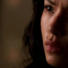
to
to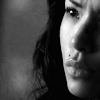
Program(s)+version: Paint Shop Pro X2
Involves: Channel Mixer, Fill Layers, Colour Balance, the Hue/Saturation tool
Translatable: To any program that has a channel mixer.
Steps: 6 for both the B&W and Colour versions
Difficulty: Easy. There's a lot of explanation.
This tutorial covers the colouring that I used for this icon, but also has a short (er, well, for me) section on how the channel mixer works, for people who aren't familiar or comfortable with that tool. These exact numbers probably won't work on every image (or, more likely, any other image but this one), but the basic technique should translate no problem.
I started with a cap from Terminator: The Sarah Connor Chronicles, and played around with crops until I found one that I was satisfied with. Once I had that, I realized that I needed to brighten up the image a bit because it's dark, so I duplicated the base and set it to Screen, 100%.
So, lately I've been playing around with the channel mixer, which I find is either the most useful tool or the most frustrating tool depending on the image I'm working with. It's great for PSP users who are trying to imitate selective colouring, but that's not my goal in this image - mostly I just want to brighten up the reds and the yellows of the image. First, though, I'm going to do something that's a little counter-intuitive. Create a new raster layer and flood fill it with #c0ffff (
), and set that layer to Multiply, 100%.

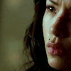
->
The point of doing this is so that when I go into the channel mixer, I'll be able to make more precise adjustments without having to worry about overdoing it, since I need to get rid of all of the cyan now anyway. While I don't normally/always add the opposite colour of what I'm actually trying to achieve when I work with the channel mixer, I found that I had to with this image because it already was a little red, just not quite what I was looking for. If the image were already overwhelmingly blue/cyan or yellow, obviously I don't need to do that. XD
If you're already familiar with the channel mixer, you could probably skip the next few paragraphs. My understanding of the channel mixer is hardly perfect, and I mostly learned through experimentation, but this should hopefully clear up any of your questions about how it works if you've got any, since it's really not as scary as it seems! :) I'm just going to explain it in relation to the Red Output Channel, but it's the same principle for all three.
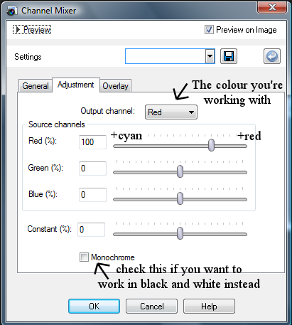
Using the channel mixer involves a basic understanding of how colours show up on a computer screen - as my handy-dandy help file with PSPX2 tells me, "All colours on your computer screen are created by mixing red, green, and blue light in varying proportions and intensities. When these primary colours are mixed in equal proportions, they create yellow, cyan, and magenta. Adding all the colours together creates white." So, basically, what we're working with when we use the channel mixer is the amount of red, green and blue in the image by adjusting how much Red/Green/Blue is (or how intense each of these is) in the red we're using, the green we're using, etc.
As you can see in the screencap, the red in the red channel is at 100% - if you increase that number to 150, you're increasing the amount of red in that channel by 50%, and if you reduce it to 50 you're decreasing it by 50%. Moving down to the green %, the same principle applies - if you increase that to 50%, you're adding 50% more red to the greens that are in the picture, and reducing it by 50% decreases the red in the greens that are in the picture (by adding cyan - so you could also think of it as increasing the cyans by 50%). That sounds incredibly more complicated than it really is. XD Adjusting the Constant % will flood the image with the colour your working with - increasing the number will increase the amount of red in the entire image, and decreasing the constant will increase the amount of cyan in the image.
Essentially, you just have to keep in mind that because you're working in a percentage, the slightest adjustments in the channel mixer can make a huge difference, so you're going to want to make small adjustments and counter what you've added by decreasing the other channels (green and blue if you're working with red) sightly, until you get a product that hopefully looks good. The best way to use this tool, as with any tool, is through a lot of experimentation, until you're comfortable with the results. A great tutorial for the channel mixer is this one, which probably explains it better than I did. XD
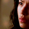
Back to the tutorial! Create a new channel mixer layer (Layer > New Adjustment Layer > Channel Mixer). Under the red channel I (unsurprisingly) up the red a great deal, and then lower the Green% and Blue% slightly to compensate, and then push the Constant% up one tick so the image is a little more red. The green and blues don't need to be pushed down much thanks to the cyan multiply layer that was just added. Then I swap to the blues because the image is really, really red now - it needs some yellow so she doesn't look totally sunburned. The blues get pushed up, and then the Red% and Green% are pushed down, a little more than I normally would so there is yellow in the image. The same happens under the Green channel - up the Green% (which actually adds magenta), and push the red% and blue% down.
Red: 159 | -21 | -12 | 1
Green: -10 | 114 | -8 | 0
Blue: -10 | -3 | 121 | 0

->
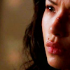
The image is still probably a little too red, but we can fix that later. First, I want to add a little more contrast, so I duplicated the base and dragged it to the top, and set that layer to soft light, 100%. Now the image is too dark for my liking, so I decide to adjust the Hue/Saturation/Lightness. Instead of creating a new adjustment layer, I want to work with only this layer. In PSPX2, I go Adjust > Hue and Saturation > Hue/Saturation/Lightness (or Shift+H) and increase the Lightness to +33. It's a very subtle change, but that's what I'm going for.

->
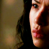
The image is a little too red for me, so I create a new colour balance layer (Layers > New Adjustment Layer > Colour Balance) to remedy that. First I go to the shadows and add a little cyan to get rid of the red, and then some green and yellow to brighten the image up a little more. In the midtones, I increase the cyan, again to get rid of the red, and some blue to tone down the yellow midtones. Lastly, I hop over to the highlights and try to make the skin highlights a little more natural by increasing the red and yellow. I push the green up a little to add some more brightness to the icon. Make sure that "Preserve Luminance" is checked.
Shadows: -10 | 4 | -5
Midtones: -2 | 0 | 14
Highlights: 7 | 10 | -4

->
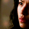
If you want the black and white result, this is where to stop colouring! I'm satisfied with where Jesse's face is at, but the background is still too yellow for my tastes, so I create one last colour balance layer to remedy that. I ignored what went on with her face entirely, and increased the blues, only in the midtones and the highlights. I left the shadows alone, and didn't touch the red or green sliders. "Preserve Luminance" should still be checked.
Shadows: 0 | 0 | 0
Midtones: 0 | 0 | 17
Highlights: 0 | 0 | 18
Then, I took a soft, round eraser and ran it over my subject, so the colour balance only affected the background (and probably the edges of her hair since I was messy about it, but since it's black it's not really noticeable). Again, it's a subtle effect, but I wasn't looking for a drastic change in the background, just a little more blue than it had before.

->
Last, but not least, I copy-merged everything (right click, Copy Merged) and pasted it as a new raster layer, and took a soft brush over her face and the bridge of her nose to get rid of the cut and any pixellation that the image had.

In order to get the black and white icon, I backtracked a few steps, to just after my first colour balance layer. In order to grayscale the image, I flood-filled a new raster layer with white (#FFFFFF), but any neutral colour will do, and set it to Colour, 100%.

->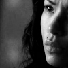
The image is already pretty contrasted, but too dark, so I create a new Brightness/Contrast layer to fix this. I up the brightness, and then increase the contrast very slightly, so that Jesse's hair doesn't end up looking washed out.
Brightness: 10, Contrast: 5
Last, I copy-merged everything, pasted it as a new layer, and ran a soft brush over her skin.

->
This tutorial should probably work for screen caps and photoshoot images, if you play with the numbers a bit depending on your image. If you've got any questions, I'd be more than happy to answer them! :D

to
to
Program(s)+version: Paint Shop Pro X2
Involves: Channel Mixer, Fill Layers, Colour Balance, the Hue/Saturation tool
Translatable: To any program that has a channel mixer.
Steps: 6 for both the B&W and Colour versions
Difficulty: Easy. There's a lot of explanation.
This tutorial covers the colouring that I used for this icon, but also has a short (er, well, for me) section on how the channel mixer works, for people who aren't familiar or comfortable with that tool. These exact numbers probably won't work on every image (or, more likely, any other image but this one), but the basic technique should translate no problem.
I started with a cap from Terminator: The Sarah Connor Chronicles, and played around with crops until I found one that I was satisfied with. Once I had that, I realized that I needed to brighten up the image a bit because it's dark, so I duplicated the base and set it to Screen, 100%.
So, lately I've been playing around with the channel mixer, which I find is either the most useful tool or the most frustrating tool depending on the image I'm working with. It's great for PSP users who are trying to imitate selective colouring, but that's not my goal in this image - mostly I just want to brighten up the reds and the yellows of the image. First, though, I'm going to do something that's a little counter-intuitive. Create a new raster layer and flood fill it with #c0ffff (

), and set that layer to Multiply, 100%.

->

The point of doing this is so that when I go into the channel mixer, I'll be able to make more precise adjustments without having to worry about overdoing it, since I need to get rid of all of the cyan now anyway. While I don't normally/always add the opposite colour of what I'm actually trying to achieve when I work with the channel mixer, I found that I had to with this image because it already was a little red, just not quite what I was looking for. If the image were already overwhelmingly blue/cyan or yellow, obviously I don't need to do that. XD
If you're already familiar with the channel mixer, you could probably skip the next few paragraphs. My understanding of the channel mixer is hardly perfect, and I mostly learned through experimentation, but this should hopefully clear up any of your questions about how it works if you've got any, since it's really not as scary as it seems! :) I'm just going to explain it in relation to the Red Output Channel, but it's the same principle for all three.

Using the channel mixer involves a basic understanding of how colours show up on a computer screen - as my handy-dandy help file with PSPX2 tells me, "All colours on your computer screen are created by mixing red, green, and blue light in varying proportions and intensities. When these primary colours are mixed in equal proportions, they create yellow, cyan, and magenta. Adding all the colours together creates white." So, basically, what we're working with when we use the channel mixer is the amount of red, green and blue in the image by adjusting how much Red/Green/Blue is (or how intense each of these is) in the red we're using, the green we're using, etc.
As you can see in the screencap, the red in the red channel is at 100% - if you increase that number to 150, you're increasing the amount of red in that channel by 50%, and if you reduce it to 50 you're decreasing it by 50%. Moving down to the green %, the same principle applies - if you increase that to 50%, you're adding 50% more red to the greens that are in the picture, and reducing it by 50% decreases the red in the greens that are in the picture (by adding cyan - so you could also think of it as increasing the cyans by 50%). That sounds incredibly more complicated than it really is. XD Adjusting the Constant % will flood the image with the colour your working with - increasing the number will increase the amount of red in the entire image, and decreasing the constant will increase the amount of cyan in the image.
Essentially, you just have to keep in mind that because you're working in a percentage, the slightest adjustments in the channel mixer can make a huge difference, so you're going to want to make small adjustments and counter what you've added by decreasing the other channels (green and blue if you're working with red) sightly, until you get a product that hopefully looks good. The best way to use this tool, as with any tool, is through a lot of experimentation, until you're comfortable with the results. A great tutorial for the channel mixer is this one, which probably explains it better than I did. XD
Back to the tutorial! Create a new channel mixer layer (Layer > New Adjustment Layer > Channel Mixer). Under the red channel I (unsurprisingly) up the red a great deal, and then lower the Green% and Blue% slightly to compensate, and then push the Constant% up one tick so the image is a little more red. The green and blues don't need to be pushed down much thanks to the cyan multiply layer that was just added. Then I swap to the blues because the image is really, really red now - it needs some yellow so she doesn't look totally sunburned. The blues get pushed up, and then the Red% and Green% are pushed down, a little more than I normally would so there is yellow in the image. The same happens under the Green channel - up the Green% (which actually adds magenta), and push the red% and blue% down.
Red: 159 | -21 | -12 | 1
Green: -10 | 114 | -8 | 0
Blue: -10 | -3 | 121 | 0

->

The image is still probably a little too red, but we can fix that later. First, I want to add a little more contrast, so I duplicated the base and dragged it to the top, and set that layer to soft light, 100%. Now the image is too dark for my liking, so I decide to adjust the Hue/Saturation/Lightness. Instead of creating a new adjustment layer, I want to work with only this layer. In PSPX2, I go Adjust > Hue and Saturation > Hue/Saturation/Lightness (or Shift+H) and increase the Lightness to +33. It's a very subtle change, but that's what I'm going for.

->

The image is a little too red for me, so I create a new colour balance layer (Layers > New Adjustment Layer > Colour Balance) to remedy that. First I go to the shadows and add a little cyan to get rid of the red, and then some green and yellow to brighten the image up a little more. In the midtones, I increase the cyan, again to get rid of the red, and some blue to tone down the yellow midtones. Lastly, I hop over to the highlights and try to make the skin highlights a little more natural by increasing the red and yellow. I push the green up a little to add some more brightness to the icon. Make sure that "Preserve Luminance" is checked.
Shadows: -10 | 4 | -5
Midtones: -2 | 0 | 14
Highlights: 7 | 10 | -4

->

If you want the black and white result, this is where to stop colouring! I'm satisfied with where Jesse's face is at, but the background is still too yellow for my tastes, so I create one last colour balance layer to remedy that. I ignored what went on with her face entirely, and increased the blues, only in the midtones and the highlights. I left the shadows alone, and didn't touch the red or green sliders. "Preserve Luminance" should still be checked.
Shadows: 0 | 0 | 0
Midtones: 0 | 0 | 17
Highlights: 0 | 0 | 18
Then, I took a soft, round eraser and ran it over my subject, so the colour balance only affected the background (and probably the edges of her hair since I was messy about it, but since it's black it's not really noticeable). Again, it's a subtle effect, but I wasn't looking for a drastic change in the background, just a little more blue than it had before.

->

Last, but not least, I copy-merged everything (right click, Copy Merged) and pasted it as a new raster layer, and took a soft brush over her face and the bridge of her nose to get rid of the cut and any pixellation that the image had.
In order to get the black and white icon, I backtracked a few steps, to just after my first colour balance layer. In order to grayscale the image, I flood-filled a new raster layer with white (#FFFFFF), but any neutral colour will do, and set it to Colour, 100%.

->

The image is already pretty contrasted, but too dark, so I create a new Brightness/Contrast layer to fix this. I up the brightness, and then increase the contrast very slightly, so that Jesse's hair doesn't end up looking washed out.
Brightness: 10, Contrast: 5
Last, I copy-merged everything, pasted it as a new layer, and ran a soft brush over her skin.

->
This tutorial should probably work for screen caps and photoshoot images, if you play with the numbers a bit depending on your image. If you've got any questions, I'd be more than happy to answer them! :D