MAKE TEXT YOUR FRIEND: PART I - FONTS
Program(s): Most graphic programs (Tutorial series is for Paint Shop Pro)
Involves: Basic tips/suggestions
Translatable: Most graphic programs
Steps: 0 - It's a list of tips/suggestions
Difficulty: Beginner
MAKE TEXT YOUR FRIEND
PART I: A BEGINNERS GUIDE TO FONTS
Like I've said, text is only your friend if you know how to use it. While bad cropping can be made better by good contrast, coloring and text; bad text is just bad text, and bad text ruins an icon. Now, I can't teach you how to make text look good on any and every icon. I can however teach you some techniques to at least make the text readable on just about any icon. Only practice and time will help you realize what text looks good on which icon and how. Part one of the text tutorials will be addressing fonts. (Part Two will teaching four techinques to make text readable.)
As an icon maker one of the biggest things in your arsenal (besides brushes and textures) should be fonts. Don't rely strictly on the default fonts that your computer or paint shop pro has. Download new and unique fonts to really make your icons and graphics stand out. You won't need to download dozens, but a few key fonts will give your graphics a little flair.
WHERE DO I GET NEW FONTS?
Thankfully there are a number of decent sites where you can download a wide variety of free fonts. If you're looking for a font that's for a certain fandom Google "[fandom here] fonts" or "[fandom here] free fonts". Here are some major free font sites for general fonts:
1001 Free Fonts
Acid Fonts
Action Fonts
dafont.com (this is where I get all mine)
Font Garden
FontStock.net
Fonts 'N Things
Urban Fonts
HOW DO I DOWNLOAD NEW FONTS?
Never DLed a new font? Here are step-by-step instructions on how to do that (for Windows users):
1.) If you're going to be DLing a number of new fonts I suggest you make a folder for them, so they're easier to find.
2.) Click download, choose 'open' and click 'ok'.
3.) Unzip the file and move it to your new fonts folder.
4.) Go to the Start Menu and select 'Control Panel'.
5.) Choose 'Appearance and Themes'. When I do this 'Fonts' is usually an option on the left under 'See Also'. If it's not there for you do a search for 'Fonts' and you should find it.
6.) Once in your fonts folder click 'File' then 'Install New Font'. Find your folder for your downloaded fonts and select it. When you do that all the fonts in that folder will show up in that small window. You can select all of them to download or just the one you have yet to download and click. (To select multiple fonts hold down the CTRL button while you select them. To select them all hold down the Shift key and click on the first and last fonts.)
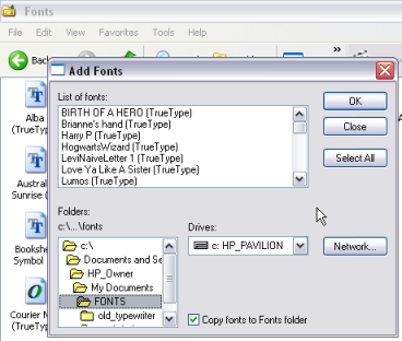
Congrats, you have a new font to use in every application that uses fonts!
SO MANY FONTS! WHAT KIND OF FONTS SHOULD I DOWNLOAD?
Like I said, you don't need to go DLing dozens of fonts. You do however, want to have a wide variety. Different types of fonts will look better on certain icons. I'm going to try and help you cover all your bases, or at least most of them. Here is a list of different types of fonts you'll want to get and why.
NOTE ON SUGGESTIONS: Each suggestions is just that, a suggestion. It's just to help you get an idea of what I'm talking about, they are a very small number of fonts you could use. Each suggestion has a link to that font at dafont.com.
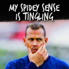
BOLD FONTS
Big and bold fonts are the sure fire way to make sure your text is readable. I suggest using bolder fonts if you're only putting one or two words on an icon. Though they're also useful in combination with other types of fonts if you want a certain word to stand out (last example).
EXAMPLES

SUGGESTIONS
Sketch Rockwell
You Are Loved
Army
Badaboom
Yikes
Adam Warren
Boris Black Bloxx
Reznor Broken
Gilgongo
Olijo
Suede
Teaspoon
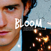
SLIM FONTS
Big and bold is not always better. The bolder and wider the font the less text you can fit on your icon. If you want more text in a smaller space you'll need a few slimmer, smaller fonts.
EXAMPLES
SUGGESTIONS
Stamp
Steelfish
SF Movie Poster
Ever After
Gotham Nights
Tall Dark And Handsome
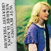
You Are Loved
Eat More Chocolate
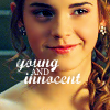
HANDWRITING FONTS
Fonts that look like they're handwritten can give an icon a little more personal flair. They can be big and bold or slim. Either way you'll want a few in your collection.
EXAMPLES
SUGGESTIONS
Webcomic whore
Trash Hand
Complete in Him
Kaileen
King CooL KC
Brianne's hand
Ellianarelle's Path
Burst My Bubble
CURSIVE FONTS
I mention this type for style reasons more than function/techincal reasons. Cursive can be harder to read but can add something if used correctly. I suggest using it in combination with other fonts or for only a few words.
EXAMPLES

SUGGESTIONS
Jane Austen
Windsong
Ballpark Weiner
Dear Joe Four
Anke Calligraphic
Jey
Lauren Script
Heather
Marcelle
GRUNGY FONTS
I mention this type for both style and funtional reasons. You don't always need brushes to get an interesting effect! A grungy font can give an icon character with little effort.
EXAMPLES

SUGGESTIONS
Sketch Rockwell
Soul Mission
Tiza
You Are Loved
Times New Yorker
The Maple Origins
Birth of a Hero
Hotel Coral Essex
FT Kolari
Dirty Headline
Sidewalk
FANDOM FONTS
Icons are very much fandom related, so it wouldn't hurt to have a few fonts that directly relate to your personal fandom(s). Use them sparingly though, as they can be easily overused by the fandom.
EXAMPLES
SUGGESTIONS
Harry Potter
LOTR
'Ringbearer'
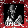
Pirates
Smallville
Twilight
Battlestar
Star Wars
Star Trek
Stargate
Misc. SciFi
Ideas or links for other fandoms?
TUTORIAL SERIES:
INTRODUCTION
A GOOD BASE
>>>>BEGINNERS GUIDE TO FONTS<<<<
TEXT TECHNIQUES
BLEND MODES; BRUSHES & TEXTURES: THE DO'S AND DON'TS
Involves: Basic tips/suggestions
Translatable: Most graphic programs
Steps: 0 - It's a list of tips/suggestions
Difficulty: Beginner
MAKE TEXT YOUR FRIEND
PART I: A BEGINNERS GUIDE TO FONTS
Like I've said, text is only your friend if you know how to use it. While bad cropping can be made better by good contrast, coloring and text; bad text is just bad text, and bad text ruins an icon. Now, I can't teach you how to make text look good on any and every icon. I can however teach you some techniques to at least make the text readable on just about any icon. Only practice and time will help you realize what text looks good on which icon and how. Part one of the text tutorials will be addressing fonts. (Part Two will teaching four techinques to make text readable.)
As an icon maker one of the biggest things in your arsenal (besides brushes and textures) should be fonts. Don't rely strictly on the default fonts that your computer or paint shop pro has. Download new and unique fonts to really make your icons and graphics stand out. You won't need to download dozens, but a few key fonts will give your graphics a little flair.
WHERE DO I GET NEW FONTS?
Thankfully there are a number of decent sites where you can download a wide variety of free fonts. If you're looking for a font that's for a certain fandom Google "[fandom here] fonts" or "[fandom here] free fonts". Here are some major free font sites for general fonts:
1001 Free Fonts
Acid Fonts
Action Fonts
dafont.com (this is where I get all mine)
Font Garden
FontStock.net
Fonts 'N Things
Urban Fonts
HOW DO I DOWNLOAD NEW FONTS?
Never DLed a new font? Here are step-by-step instructions on how to do that (for Windows users):
1.) If you're going to be DLing a number of new fonts I suggest you make a folder for them, so they're easier to find.
2.) Click download, choose 'open' and click 'ok'.
3.) Unzip the file and move it to your new fonts folder.
4.) Go to the Start Menu and select 'Control Panel'.
5.) Choose 'Appearance and Themes'. When I do this 'Fonts' is usually an option on the left under 'See Also'. If it's not there for you do a search for 'Fonts' and you should find it.
6.) Once in your fonts folder click 'File' then 'Install New Font'. Find your folder for your downloaded fonts and select it. When you do that all the fonts in that folder will show up in that small window. You can select all of them to download or just the one you have yet to download and click. (To select multiple fonts hold down the CTRL button while you select them. To select them all hold down the Shift key and click on the first and last fonts.)
Congrats, you have a new font to use in every application that uses fonts!
SO MANY FONTS! WHAT KIND OF FONTS SHOULD I DOWNLOAD?
Like I said, you don't need to go DLing dozens of fonts. You do however, want to have a wide variety. Different types of fonts will look better on certain icons. I'm going to try and help you cover all your bases, or at least most of them. Here is a list of different types of fonts you'll want to get and why.
NOTE ON SUGGESTIONS: Each suggestions is just that, a suggestion. It's just to help you get an idea of what I'm talking about, they are a very small number of fonts you could use. Each suggestion has a link to that font at dafont.com.
BOLD FONTS
Big and bold fonts are the sure fire way to make sure your text is readable. I suggest using bolder fonts if you're only putting one or two words on an icon. Though they're also useful in combination with other types of fonts if you want a certain word to stand out (last example).
EXAMPLES
SUGGESTIONS
Sketch Rockwell
You Are Loved
Army
Badaboom
Yikes
Adam Warren
Boris Black Bloxx
Reznor Broken
Gilgongo
Olijo
Suede
Teaspoon
SLIM FONTS
Big and bold is not always better. The bolder and wider the font the less text you can fit on your icon. If you want more text in a smaller space you'll need a few slimmer, smaller fonts.
EXAMPLES
SUGGESTIONS
Stamp
Steelfish
SF Movie Poster
Ever After
Gotham Nights
Tall Dark And Handsome
You Are Loved
Eat More Chocolate
HANDWRITING FONTS
Fonts that look like they're handwritten can give an icon a little more personal flair. They can be big and bold or slim. Either way you'll want a few in your collection.
EXAMPLES
SUGGESTIONS
Webcomic whore
Trash Hand
Complete in Him
Kaileen
King CooL KC
Brianne's hand
Ellianarelle's Path
Burst My Bubble
CURSIVE FONTS
I mention this type for style reasons more than function/techincal reasons. Cursive can be harder to read but can add something if used correctly. I suggest using it in combination with other fonts or for only a few words.
EXAMPLES
SUGGESTIONS
Jane Austen
Windsong
Ballpark Weiner
Dear Joe Four
Anke Calligraphic
Jey
Lauren Script
Heather
Marcelle
GRUNGY FONTS
I mention this type for both style and funtional reasons. You don't always need brushes to get an interesting effect! A grungy font can give an icon character with little effort.
EXAMPLES
SUGGESTIONS
Sketch Rockwell
Soul Mission
Tiza
You Are Loved
Times New Yorker
The Maple Origins
Birth of a Hero
Hotel Coral Essex
FT Kolari
Dirty Headline
Sidewalk
FANDOM FONTS
Icons are very much fandom related, so it wouldn't hurt to have a few fonts that directly relate to your personal fandom(s). Use them sparingly though, as they can be easily overused by the fandom.
EXAMPLES
SUGGESTIONS
Harry Potter
LOTR
'Ringbearer'
Pirates
Smallville
Twilight
Battlestar
Star Wars
Star Trek
Stargate
Misc. SciFi
Ideas or links for other fandoms?
TUTORIAL SERIES:
INTRODUCTION
A GOOD BASE
>>>>BEGINNERS GUIDE TO FONTS<<<<
TEXT TECHNIQUES
BLEND MODES; BRUSHES & TEXTURES: THE DO'S AND DON'TS