GRAPHIC TUTORIALS: INTRODUCTION
Program(s): Paint Shop Pro 9
Involves: Basic tips
Translatable: To all graphic programs.
Steps: 0 - It's just a list of tips.
Difficulty: Beginner
I first started posting a series of graphic tutorials at my graphic journal last March. When I decided to go beyond just icons and banners and started making userinfo tables I decided to make some graphic tutorials as well. I've done tutorials before, but that was quite a while ago for another community. I'd like to think I've learned since then and could make better tutorials. And that's exactly what I intend to do: I will be writing a series of graphic tutorials, I hope someone gets a little something out of them!
These tutorials are for people with Paint Shop Pro. It seems so many tutorials out there are for Photoshop, which is why it took me so long to learn. I couldn't find good instruction on how to use the program I had. How can I translate a PS tutorial into a PSP tutorial if I don't know anything about my own program first?
Before we go on to the actual tutorials I wanted to start with a basic introduction to my view on icon and graphic making for those who are just starting out. Here goes. I've always been a big fan of photography and images. As they say an image is worth a thousand words. Which is what drives me to make icons the way I do, the image is the most important part of the icon. I'm not really big into very complex icons with a lot of bells, whistles and meaningless brushes. The brushes must always compliment the image, (for the most part) I feel the brush shouldn't be the central focus. (Though naturally there are artistic exceptions, and it depends on ones own personal tastes.) As you experiment with icon making just keep this in mind:
This is a form of art, and like all forms of art what makes it 'good' depends on personal tastes. Don't let elitist assholes dishearten you. I'm going to be giving you tips and suggestions, none of what I tell you should be taken as 'the one and only way' or 'the right way' to make icons. The tutorials are just step by step instructions of how I would make the icon. I'm hoping that these tutorials will help you learn new techniques, and that in learning all these new techniques you will find your own personal style.
Now, when it comes to making graphics I have certain subconscious rules for myself:
1.) Cropping is a small first step.
How you crop the image can make your icon look unique and creative... or just ridiculously amateur. Granted a bad crop can be made better by quality coloring, text and brush work. Which is why I consider it a 'small first step', but unless you're experienced I suggest focusing on cropping the image well first. Though cropping can be very subjective. A good crop to one person may be a bad crop to another. Don't let someone tell you that it's bad to center your subject, sometimes that may look bad but there are times when it may also look good. When it comes to cropping just use your best judgment and then focus on making it a quality base. Thus giving you an example of a good crop and a bad crop was difficult...
DECENT CROP

AWKWARD

2.) Good icon base first, text and brushes later.
Text and brushes cannot save your icon if the base image is of poor quality. Your first priority when making a graphic should always be making the base look like a stand alone icon. Once this is accomplished then you can feel free to start adding text and brushes. Though in some (or many) cases you may find that once a quality base is achieved the icon may be complete!
BAD BASE

GOOD BASE

3.) Less is more.
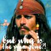
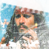
Text and brushes are only your friends if you know how to use them. As I said in rule two the image comes first, so don't add something when you're not sure how to do it well. It's best to have a text-less icon that looks decent, rather than an icon full of text that just doesn't look right. The same goes for brushes, you can ruin a perfectly good base with a poorly applied brush.
LESS IS MORE

BAD TEXT
BAD BRUSH
4.) Layers are your friend, use them!
If you put all your text and effects onto the background (aka original image) it makes it much harder to change things later on. Having each effect on a different layer can help you edit your icon and try different techniques. It also makes it easier to get rid of something you may not like, instead of hitting the 'undo' button twenty times and losing things you'd rather keep in the process of getting rid of something you don't want. It can also help you change the contrast, color balance and saturation by just changing the opacity of the layer and not redoing the entire icon. Make sense? It will once you'd experimented a bit more.
5.) If it ain't broke, don't fix it.
If you find a text, brush or coloring technique that you perfect and can make decent icons with... why not stick with it? Sure, the same old thing can get boring but if you're making the icon for an icontest or LIMS competition stick with what you know! Don't go trying a new technique you have yet to get just right when you're about to be judged against other icon makers. Along the same lines: perfect a technique before moving on and trying your hand at a new one. One thing at a time. You'd be amazed what you can learn by taking it one technique and effect at a time.
TUTORIAL SERIES:
>>>INTRODUCTION<<<
A GOOD BASE
BEGINNERS GUIDE TO FONTS
TEXT TECHNIQUES
BLEND MODES; BRUSHES & TEXTURES: THE DO'S AND DON'TS
Involves: Basic tips
Translatable: To all graphic programs.
Steps: 0 - It's just a list of tips.
Difficulty: Beginner
I first started posting a series of graphic tutorials at my graphic journal last March. When I decided to go beyond just icons and banners and started making userinfo tables I decided to make some graphic tutorials as well. I've done tutorials before, but that was quite a while ago for another community. I'd like to think I've learned since then and could make better tutorials. And that's exactly what I intend to do: I will be writing a series of graphic tutorials, I hope someone gets a little something out of them!
These tutorials are for people with Paint Shop Pro. It seems so many tutorials out there are for Photoshop, which is why it took me so long to learn. I couldn't find good instruction on how to use the program I had. How can I translate a PS tutorial into a PSP tutorial if I don't know anything about my own program first?
Before we go on to the actual tutorials I wanted to start with a basic introduction to my view on icon and graphic making for those who are just starting out. Here goes. I've always been a big fan of photography and images. As they say an image is worth a thousand words. Which is what drives me to make icons the way I do, the image is the most important part of the icon. I'm not really big into very complex icons with a lot of bells, whistles and meaningless brushes. The brushes must always compliment the image, (for the most part) I feel the brush shouldn't be the central focus. (Though naturally there are artistic exceptions, and it depends on ones own personal tastes.) As you experiment with icon making just keep this in mind:
This is a form of art, and like all forms of art what makes it 'good' depends on personal tastes. Don't let elitist assholes dishearten you. I'm going to be giving you tips and suggestions, none of what I tell you should be taken as 'the one and only way' or 'the right way' to make icons. The tutorials are just step by step instructions of how I would make the icon. I'm hoping that these tutorials will help you learn new techniques, and that in learning all these new techniques you will find your own personal style.
Now, when it comes to making graphics I have certain subconscious rules for myself:
1.) Cropping is a small first step.
How you crop the image can make your icon look unique and creative... or just ridiculously amateur. Granted a bad crop can be made better by quality coloring, text and brush work. Which is why I consider it a 'small first step', but unless you're experienced I suggest focusing on cropping the image well first. Though cropping can be very subjective. A good crop to one person may be a bad crop to another. Don't let someone tell you that it's bad to center your subject, sometimes that may look bad but there are times when it may also look good. When it comes to cropping just use your best judgment and then focus on making it a quality base. Thus giving you an example of a good crop and a bad crop was difficult...
DECENT CROP

AWKWARD

2.) Good icon base first, text and brushes later.
Text and brushes cannot save your icon if the base image is of poor quality. Your first priority when making a graphic should always be making the base look like a stand alone icon. Once this is accomplished then you can feel free to start adding text and brushes. Though in some (or many) cases you may find that once a quality base is achieved the icon may be complete!
BAD BASE

GOOD BASE

3.) Less is more.
Text and brushes are only your friends if you know how to use them. As I said in rule two the image comes first, so don't add something when you're not sure how to do it well. It's best to have a text-less icon that looks decent, rather than an icon full of text that just doesn't look right. The same goes for brushes, you can ruin a perfectly good base with a poorly applied brush.
LESS IS MORE

BAD TEXT

BAD BRUSH

4.) Layers are your friend, use them!
If you put all your text and effects onto the background (aka original image) it makes it much harder to change things later on. Having each effect on a different layer can help you edit your icon and try different techniques. It also makes it easier to get rid of something you may not like, instead of hitting the 'undo' button twenty times and losing things you'd rather keep in the process of getting rid of something you don't want. It can also help you change the contrast, color balance and saturation by just changing the opacity of the layer and not redoing the entire icon. Make sense? It will once you'd experimented a bit more.
5.) If it ain't broke, don't fix it.
If you find a text, brush or coloring technique that you perfect and can make decent icons with... why not stick with it? Sure, the same old thing can get boring but if you're making the icon for an icontest or LIMS competition stick with what you know! Don't go trying a new technique you have yet to get just right when you're about to be judged against other icon makers. Along the same lines: perfect a technique before moving on and trying your hand at a new one. One thing at a time. You'd be amazed what you can learn by taking it one technique and effect at a time.
TUTORIAL SERIES:
>>>INTRODUCTION<<<
A GOOD BASE
BEGINNERS GUIDE TO FONTS
TEXT TECHNIQUES
BLEND MODES; BRUSHES & TEXTURES: THE DO'S AND DON'TS