inquisitory ✭ 29; want to give directions
These requests are going extra slow, I'm sorry :') I've already made all the image files for the next three, just need to write them up... but it's easier said than done with me xD
Request by experienced ♥
Go from
to
in Photoshop. Very simple but uses one Selective Color layer, so not translatable. (You could technically make do without it, though~)
This is our base image, so I cropped like this:

Let's start off with #003775 on Exclusion, 100%. No surprises there :')

Now use this grunge texture by threeeyespei (whose username makes me kind of dizzy, lawl all those e's) on Multiply, 100% to really wash the base out %D!
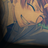
Okay, now that it's sufficiently ugly'd up, let's fix it :DDD Duplicate the base on Soft Light, 100% and you can breathe a sigh of relief!

Hooray, much better :] Now take a glowy dot for great justice! You can either make one yourself (take a brush with a colour, make a circle, and then Gassian Blur it) or use one from a set like this by sanami276. Either way, it should go on Lighten, 100%~

One more step, that was easy! *presses Staples button* 8) haha yeah, take the Selective Color... adjustment layer settings in step 3 of this tutorial by my dear almateria and set it to Soft Light, 100%, and that's it!

If you don't have Selective Coloring, like I said, maybe you could try a Soft Light duplicate of your base with the saturation turned up and see how it goes xD
Other examples:


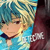
<< omg Mirai Nikki chapter 25, I died inside *AAA*
I encourage you to go play around and show me your finished icons! DOOO IIIIIIT, I wanna see what you guys come up with~
If you like what you see, why not friend ewidentnie for future updates?
Request by experienced ♥
Go from

to

in Photoshop. Very simple but uses one Selective Color layer, so not translatable. (You could technically make do without it, though~)
This is our base image, so I cropped like this:

Let's start off with #003775 on Exclusion, 100%. No surprises there :')

Now use this grunge texture by threeeyespei (whose username makes me kind of dizzy, lawl all those e's) on Multiply, 100% to really wash the base out %D!

Okay, now that it's sufficiently ugly'd up, let's fix it :DDD Duplicate the base on Soft Light, 100% and you can breathe a sigh of relief!

Hooray, much better :] Now take a glowy dot for great justice! You can either make one yourself (take a brush with a colour, make a circle, and then Gassian Blur it) or use one from a set like this by sanami276. Either way, it should go on Lighten, 100%~

One more step, that was easy! *presses Staples button* 8) haha yeah, take the Selective Color... adjustment layer settings in step 3 of this tutorial by my dear almateria and set it to Soft Light, 100%, and that's it!

If you don't have Selective Coloring, like I said, maybe you could try a Soft Light duplicate of your base with the saturation turned up and see how it goes xD
Other examples:


<< omg Mirai Nikki chapter 25, I died inside *AAA*
I encourage you to go play around and show me your finished icons! DOOO IIIIIIT, I wanna see what you guys come up with~
If you like what you see, why not friend ewidentnie for future updates?