almateria ♔ 128
Request by inquisitory ♥
Using PS CS, we'll be making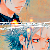
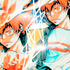
. This tutorial is translatable only to other PS programs.
The icons this tutorial covers are:

is A,
is B.
01 Start with your base: A B
02 Follow this tutorial entirely before moving on.
03 Paste this texture (by hellodarliing), and set it to screen 100%. I erased the area around Tsuna's face.
A did not use this step.
04 Make a new Color Balance adjustment layer, and input these settings:
Midtones: -30 0 20
Shadows: 10 0 0
05 Make a new Selective Color adjustment layer, and input these values:
FOR A:
Reds: 100 0 -30 0
Yellows: 0 0 -50 0
Neutrals: 50 0 0 -25
Blacks: 100 0 0 0
FOR B:
Reds: 100 0 -30 0
Yellows: 0 0 -50 0
Neutrals: 100 0 0 0
Blacks: 100 0 0 0
06 Make a new Selective Color adjustment layer, and input these values:
Reds: -45 -35 45 -15
Yellows: 100 0 -50 100
Neutrals: 35 0 0 -10
07 Make a new Selective Color adjustment layer, and input these values:
Neutrals: 20 0 -15 -15
08 Make a new Hue/Saturation/Lightness adjustment layer, and set master saturation to 20.
09 Make a new Brightness/Contrast adjustment layer, and set brightness to -25 and contrast to 15.
10 I went to PSP XI for the following steps, only because it's easier for me. You can achieve a similar effect in PS.
The following is for A only.
11 I used the Pen Tool and made some lines to enhance the middle of the icon.
12 Paste this texture (by loveicon), and set it to screen 100%. Duplicate the layer, negate it (so it's black text on a white background), move it under the black screen layer, and set it to multiply 100%. What I did to change the color was move the layer to the top and set it on normal. Using the Brush Tool, I picked a color and changed the Blend Mode to multiply. Then I just colored the text and viola, you have a colored shadow! Move the layer a tiny bit and move it back under the black screen layer.
13 Paste this texture (by boutique), and set it to screen 100%. I rotated it and erased some parts to get the glow in the middle of the icon.
The following is for B only.
11 Make a new Brightness/Contrast adjustment layer, and set brightness to 10 and contrast to 5.
12 I used the Pen Tool to make the squiggly lines in the middle of the icon.
I'd love to see what you guys come up with, so please post your results! Hope this tutorial helped :)
OTHER EXAMPLES FOR THIS TUTORIAL

Like what you see? Why don't you friend us!
Using PS CS, we'll be making


. This tutorial is translatable only to other PS programs.
The icons this tutorial covers are:

is A,

is B.
01 Start with your base: A B
02 Follow this tutorial entirely before moving on.
03 Paste this texture (by hellodarliing), and set it to screen 100%. I erased the area around Tsuna's face.
A did not use this step.
04 Make a new Color Balance adjustment layer, and input these settings:
Midtones: -30 0 20
Shadows: 10 0 0
05 Make a new Selective Color adjustment layer, and input these values:
FOR A:
Reds: 100 0 -30 0
Yellows: 0 0 -50 0
Neutrals: 50 0 0 -25
Blacks: 100 0 0 0
FOR B:
Reds: 100 0 -30 0
Yellows: 0 0 -50 0
Neutrals: 100 0 0 0
Blacks: 100 0 0 0
06 Make a new Selective Color adjustment layer, and input these values:
Reds: -45 -35 45 -15
Yellows: 100 0 -50 100
Neutrals: 35 0 0 -10
07 Make a new Selective Color adjustment layer, and input these values:
Neutrals: 20 0 -15 -15
08 Make a new Hue/Saturation/Lightness adjustment layer, and set master saturation to 20.
09 Make a new Brightness/Contrast adjustment layer, and set brightness to -25 and contrast to 15.
10 I went to PSP XI for the following steps, only because it's easier for me. You can achieve a similar effect in PS.
The following is for A only.
11 I used the Pen Tool and made some lines to enhance the middle of the icon.
12 Paste this texture (by loveicon), and set it to screen 100%. Duplicate the layer, negate it (so it's black text on a white background), move it under the black screen layer, and set it to multiply 100%. What I did to change the color was move the layer to the top and set it on normal. Using the Brush Tool, I picked a color and changed the Blend Mode to multiply. Then I just colored the text and viola, you have a colored shadow! Move the layer a tiny bit and move it back under the black screen layer.
13 Paste this texture (by boutique), and set it to screen 100%. I rotated it and erased some parts to get the glow in the middle of the icon.
The following is for B only.
11 Make a new Brightness/Contrast adjustment layer, and set brightness to 10 and contrast to 5.
12 I used the Pen Tool to make the squiggly lines in the middle of the icon.
I'd love to see what you guys come up with, so please post your results! Hope this tutorial helped :)
OTHER EXAMPLES FOR THIS TUTORIAL


Like what you see? Why don't you friend us!