Mary
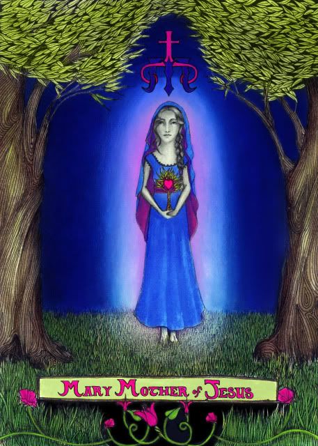
I started this over the summer and just now finished. I discovered if you layer colored pencil over colored ink washes you get super saturation because the ink has already soaked into the paper and made it less "toothy"

When you get into the mythology of saints, especially in the Catholic church, people feel really strongly about the way things "should" look. This series is MY interpretation of how I perceive the saints and what they mean to me, personally. I have been working on this series as a way of exploring my faith and discovering some of the nuances of the Catholic church that escaped me in 12 years of Catholic education and a lifetime of church. So when I showed this to my mom and she said it didn't "look like Mary" it reminds me that it was not my intention to regurgitate the way that past artists perceived religious iconography... Unless photos or portraits painted while they were alive (or if they remain incorrupt) we have no way of knowing what these people looked like. So this is MY interpretation of Mary.
I gave her a sapling to hold because I think it is a good representation of the potential that was born of her. Likewise, the mature trees next to her symbolize the fruition that was recognized from the sapling.
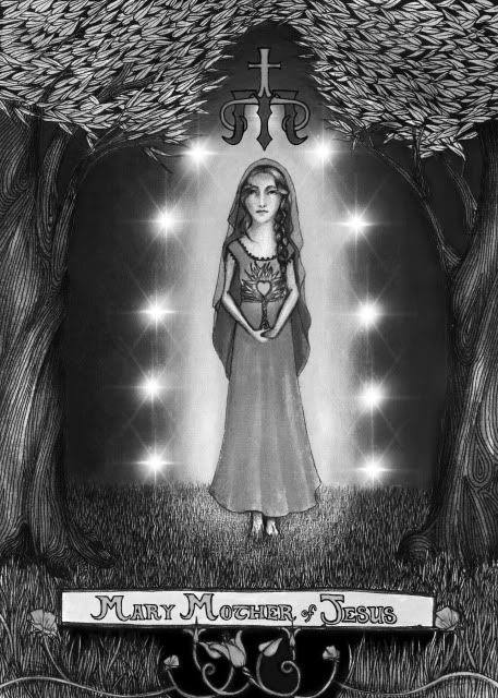
I'm still considering putting in a circle of stars around her (just outside the glow) Here's how it looks photoshopped in with the picture in black and white... I'd probly make them look less like photoshop brushes if I were going to actually do this properly... or use white gouache... Any thoughts?
