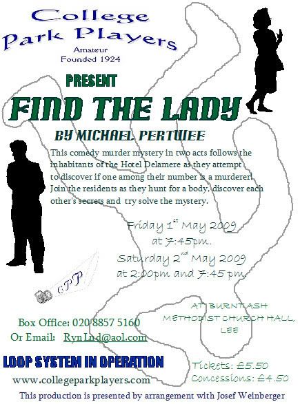
Not quite the finished article, since I've shifted a couple of things!
However, I just wanted to share my final poster. Artistic critique welcome - mainly... *grin*. Um, it actually looks much better in person - the chalk outline is less obvious and you can read the writing a lot easier. Obviously that was always going to be a problem with a background image, but I think the green looks fairly good all things considered. Let me know if it's too big - I'll cut it or make it smaller so that it's not taking up your screens! I quite like it, but the description still seems stiff to me, and I'm sure it'd look better with a border but unfortunately my stupid printer/corel draw combination won't allow me to make it have a border without making it look like it's been printed on the wrong sized paper. Stupid margins. Anyway. One poster for a little known (apparently) play called Find The Lady.

I am still sniffing. It is not good. I'm still going to karaoke tomorrow though - despite my misgivings - because I'm not about to let some guy stop me from going out with my friends to a regular event. Even if it does cause weirdness and awkwardness. See, I am a brave little toaster!

I am still sniffing. It is not good. I'm still going to karaoke tomorrow though - despite my misgivings - because I'm not about to let some guy stop me from going out with my friends to a regular event. Even if it does cause weirdness and awkwardness. See, I am a brave little toaster!