awmp
in
awmpdotnet
some kind of style guide: pop art (part2 - brushwork)
originally posted at awmp on 5/19/05
I feel crappy today for no apparent reason...
oh, well, *shrugs* so I can also post the next part of the kind of pop art style guide that I'm procrastinating since uhm, a long time now...
so today I ramble about brushwork and shapes, and I'm also sharing some of my own favorite popartish brushes


and more...
so this version is a little different, I'm only explaing the steps that cover brushes and shapes...
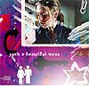
1) I've started with this (some pics thrown together, a little coloring, some patterns, text and light effects...)

2) I've added this shape with the PS Custom Shape Tool:

there are tons of useful shapes in PS' default shapes. everything that screams comicbookstyle is definitely great for pop art, like the thought or talk bubbles, or in this case a star burst
I used the Filter - Sketch - Torn Edges on the Layer Mask for this Shape.
Imagine the black being transparent of course, the color used is white, no transparency, normal Layer Mode

3) after a bit more coloring, and some more pics I've added, it looks somehow like this

4) time for another shape, I've used one of the thought ones, with a Layer Style (stroke, black, 1 pt)
again imagine the black being tranparent...

5) to make it look more "natural" and not so clean I've added some drops and splatters on a new layer. Layer Mode was Screen, set to 80% transparency. the color used is #E0D9C9.
of course the black indicates transparency again...

6) another Layer on Screen mode, the color is pure white, the opacity 100%
the black here, yeah, I know, you know this already...

so we have this so far (with a white layer set to Soft Light with a 50% transparency to make the whole thing lighter

7) I've added more of PS' default Custom Shapes in black and white...
therefore the gray here indicates the transparent parts (ha, and you thought I'll never ever surprise you!)
and one word: pictograms! they are the high art of design and so damn pop, it's a shame not use them... jsut saying...

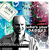
8) looks nice already doesn't it? I've just added a border and some white highlights... oh, and some text...

9) some of my fave elements are arrows. you can pretty much add them to every pop art piece you're making ;)

10) and we're finished

here are the brushsets (for PS 7.0) I've used for this piece, and some more useful stuff for pop art. please comment&credit in case of DLing as these are my own, and I feel kinda insecure to share them...

Download the abr-pack (Photoshop 7.0) here, contains 12 brushes, each in two different sizes (for 200x200 or 100x100 canvases).
edit: Download the imagepack here.

Download the abr-pack (Photoshop 7.0) here, contains 12 brushes, each in two different sizes (for 200x200 or 100x100 canvases).
edit: Download the imagepack here.

Download the abr-pack (Photoshop 7.0) here, contains 21 brushes, each in two different sizes (for 200x200 or 100x100 canvases). lots of strokepeople here *g*
edit: Download the imagepack here.

Download the abr-pack (Photoshop 7.0) here, contains 12 brushes, each in two different sizes (for 200x200 or 100x100 canvases).
edit: Download the imagepack here.

Download the abr-pack (Photoshop 7.0) here, contains 20 brushes, each in two different sizes (for 200x200 or 100x100 canvases).
edit: Download the imagepack here.
please comment&credit if you're downloading the brushsets.
used for these icons for example
previous parts (basic elements) can be found here and here.
coming up next: patterns, how to make and how to use them...
ETA: upon multiple requests I've added imagepacks for the brushsets :)
I feel crappy today for no apparent reason...
oh, well, *shrugs* so I can also post the next part of the kind of pop art style guide that I'm procrastinating since uhm, a long time now...
so today I ramble about brushwork and shapes, and I'm also sharing some of my own favorite popartish brushes
and more...
so this version is a little different, I'm only explaing the steps that cover brushes and shapes...
1) I've started with this (some pics thrown together, a little coloring, some patterns, text and light effects...)
2) I've added this shape with the PS Custom Shape Tool:
there are tons of useful shapes in PS' default shapes. everything that screams comicbookstyle is definitely great for pop art, like the thought or talk bubbles, or in this case a star burst
I used the Filter - Sketch - Torn Edges on the Layer Mask for this Shape.
Imagine the black being transparent of course, the color used is white, no transparency, normal Layer Mode
3) after a bit more coloring, and some more pics I've added, it looks somehow like this
4) time for another shape, I've used one of the thought ones, with a Layer Style (stroke, black, 1 pt)
again imagine the black being tranparent...
5) to make it look more "natural" and not so clean I've added some drops and splatters on a new layer. Layer Mode was Screen, set to 80% transparency. the color used is #E0D9C9.
of course the black indicates transparency again...
6) another Layer on Screen mode, the color is pure white, the opacity 100%
the black here, yeah, I know, you know this already...
so we have this so far (with a white layer set to Soft Light with a 50% transparency to make the whole thing lighter
7) I've added more of PS' default Custom Shapes in black and white...
therefore the gray here indicates the transparent parts (ha, and you thought I'll never ever surprise you!)
and one word: pictograms! they are the high art of design and so damn pop, it's a shame not use them... jsut saying...
8) looks nice already doesn't it? I've just added a border and some white highlights... oh, and some text...
9) some of my fave elements are arrows. you can pretty much add them to every pop art piece you're making ;)
10) and we're finished
here are the brushsets (for PS 7.0) I've used for this piece, and some more useful stuff for pop art. please comment&credit in case of DLing as these are my own, and I feel kinda insecure to share them...
Download the abr-pack (Photoshop 7.0) here, contains 12 brushes, each in two different sizes (for 200x200 or 100x100 canvases).
edit: Download the imagepack here.
Download the abr-pack (Photoshop 7.0) here, contains 12 brushes, each in two different sizes (for 200x200 or 100x100 canvases).
edit: Download the imagepack here.
Download the abr-pack (Photoshop 7.0) here, contains 21 brushes, each in two different sizes (for 200x200 or 100x100 canvases). lots of strokepeople here *g*
edit: Download the imagepack here.
Download the abr-pack (Photoshop 7.0) here, contains 12 brushes, each in two different sizes (for 200x200 or 100x100 canvases).
edit: Download the imagepack here.
Download the abr-pack (Photoshop 7.0) here, contains 20 brushes, each in two different sizes (for 200x200 or 100x100 canvases).
edit: Download the imagepack here.
please comment&credit if you're downloading the brushsets.
used for these icons for example
previous parts (basic elements) can be found here and here.
coming up next: patterns, how to make and how to use them...
ETA: upon multiple requests I've added imagepacks for the brushsets :)