awmp
in
awmpdotnet
some kind of style guide: pop art (part3 - patterns)
originally posted at awmp on 5/26/05
I've just replied to a million of comments so I don't feel so guilty when I'm already posting again *g*
patterns: making and using them...


and more...
please ignore the fact, that I did most of this on a XP computer, I hate XP, but it was not mine *g*
1) The Basics
- make a new document of a reasonable size and a transparent background. if you're working on a 200x200 canvas a pattern of 20x20 will be repeated 10 times. if you want something more compact try 15x15 or even 10x10...

- zoom in! I work at a zoom around 500%

- make a shape (here I used the PS default star shape), or draw something in BLACK

- if you used a Custom Shape you have to copy it to a new layer, so that it isn't masked anymore (make a new layer and stamp it on the new layer with ctrl+shift+alt+e)

- that's what it looks like right now
- define it as a pattern. Edit - Define Pattern... give it a name.

- go to your actual canvas and fill it with your pattern. Edit - Fill... - Use: Pattern - Custom Pattern: choose your pattern
or just use shift+backspace and choose your pattern

- awww, lookie

2) The advantages of Black on Transparent patterns
- I always make black on transparent patters because they are the most versatile. (and they are easily visible when choosing them from the fill tool. and you can use them on any background color
- with one single ctrl+i (for invert) you have a white pattern

- try different blending options. in this case it's Softlight (my fave for patterns). the black and the white one...


- you can make the background color any color you want and then you can colorize your pattern with Image - Adjust - Hue/Saturation (or ctrl+u)
check the colorization button and make it lighter then you can change the saturation and hue.

3) It's all about the Geometry
- so if you want to make a shifted pattern, you have to make your canvas a bit larger (double the size to be exact)
- make two rows of the shape of your choice.
- split the second row shape and move it to the left and the right side.

- it's very helpful to use guides for this, as you have to work verrrry exact to make the final pattern working

- and the result

4) Mask them away
- a little more interesting it gets when you're masking your pattern layer.
- make a layer mask, and use the Filter- Render - Clouds filter on it. then the Filter - Render - Difference Clouds to make it more intense. You can recall the filter until you're satisfied with Ctrl+f.

- so it looks like this now

5) A very useful trick
- so, if you are artistically challenged (just like myself), this a a very nifty way to do complicated looking patterns ;)
- make a new canvas with transparent BG , zoom in, then draw some random points and lines with your one point pencil tool (not the brush! use the pencil!)

- then do the following: duplicate the layer, flip it horizontically, merge it down.


- duplicate it again, flip it vertically now. define it as Pattern

- use the pattern on your icon canvas

- these patterns were made with this technique


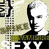
- and in use


6) Block it out
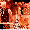
- I use different patterns on color blocks to get the retro look...


7) More organic patterns
- for more organic patterns use the brush tool

- make random little dots, try to stay away from the edges (just go right to them but not overlapping)

now play along *g*
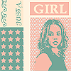
used for example to create these icons
coming up next: text (font recs and effects and general tips)
part 1 (basic elements) can be found here (I) and here (II).
part 2 (brushwork) can be found here and includes some downloadable brushsets.
there are only two parts left of this guide (the text one which will coming up next and the last one will be a complete walkthrough, I haven't decided for which icon I will do the walkthrough, so if you want to see a specific popart icon of mine walked through, tell me about it *g*)
I've just replied to a million of comments so I don't feel so guilty when I'm already posting again *g*
patterns: making and using them...
and more...
please ignore the fact, that I did most of this on a XP computer, I hate XP, but it was not mine *g*
1) The Basics
- make a new document of a reasonable size and a transparent background. if you're working on a 200x200 canvas a pattern of 20x20 will be repeated 10 times. if you want something more compact try 15x15 or even 10x10...
- zoom in! I work at a zoom around 500%
- make a shape (here I used the PS default star shape), or draw something in BLACK
- if you used a Custom Shape you have to copy it to a new layer, so that it isn't masked anymore (make a new layer and stamp it on the new layer with ctrl+shift+alt+e)
- that's what it looks like right now
- define it as a pattern. Edit - Define Pattern... give it a name.
- go to your actual canvas and fill it with your pattern. Edit - Fill... - Use: Pattern - Custom Pattern: choose your pattern
or just use shift+backspace and choose your pattern
- awww, lookie
2) The advantages of Black on Transparent patterns
- I always make black on transparent patters because they are the most versatile. (and they are easily visible when choosing them from the fill tool. and you can use them on any background color
- with one single ctrl+i (for invert) you have a white pattern
- try different blending options. in this case it's Softlight (my fave for patterns). the black and the white one...
- you can make the background color any color you want and then you can colorize your pattern with Image - Adjust - Hue/Saturation (or ctrl+u)
check the colorization button and make it lighter then you can change the saturation and hue.
3) It's all about the Geometry
- so if you want to make a shifted pattern, you have to make your canvas a bit larger (double the size to be exact)
- make two rows of the shape of your choice.
- split the second row shape and move it to the left and the right side.
- it's very helpful to use guides for this, as you have to work verrrry exact to make the final pattern working
- and the result
4) Mask them away
- a little more interesting it gets when you're masking your pattern layer.
- make a layer mask, and use the Filter- Render - Clouds filter on it. then the Filter - Render - Difference Clouds to make it more intense. You can recall the filter until you're satisfied with Ctrl+f.
- so it looks like this now
5) A very useful trick
- so, if you are artistically challenged (just like myself), this a a very nifty way to do complicated looking patterns ;)
- make a new canvas with transparent BG , zoom in, then draw some random points and lines with your one point pencil tool (not the brush! use the pencil!)
- then do the following: duplicate the layer, flip it horizontically, merge it down.
- duplicate it again, flip it vertically now. define it as Pattern
- use the pattern on your icon canvas
- these patterns were made with this technique
- and in use
6) Block it out
- I use different patterns on color blocks to get the retro look...
7) More organic patterns
- for more organic patterns use the brush tool
- make random little dots, try to stay away from the edges (just go right to them but not overlapping)
now play along *g*
used for example to create these icons
coming up next: text (font recs and effects and general tips)
part 1 (basic elements) can be found here (I) and here (II).
part 2 (brushwork) can be found here and includes some downloadable brushsets.
there are only two parts left of this guide (the text one which will coming up next and the last one will be a complete walkthrough, I haven't decided for which icon I will do the walkthrough, so if you want to see a specific popart icon of mine walked through, tell me about it *g*)