awmp
in
awmpdotnet
some kind of style guide: pop art (part1 - basic elements II)
originally posted at awmp on 2005/05/08
first thing for today:
Happy Mother's Day to all the Moms (or soon to be Mommy's) on my flist :D
then here's the second part of the so called pop art style guide...
more basic techniques, this time
duotones, shapes, outlines, color halftone, geometric elements


and more...
6) duotone images
- duotone images are a nice variation of the overcontrsted b/w pics
- normally I'm using an adjustment layer for this effect so that I can play around with it more easily and change it later to my needs again (add the adjustment layer, choose Gradient Map, use the gradient of your pleasure)

- try bright colors, we're talking of pop art here after all *g*
- adjust the gradient, so that you get more contrast. this is actually very important especially when your colors are of a very similar brightness as then they tend to look washed out.
- double-click on your gradient and drag one of the sliders more to the other side
- if your pic looks inverted just check the reverse option


before:
after:
7) stars

- one of the most important elements of the comicbook style
- used behind silhouettes or people
- you can add a drop shadow to it. no transparency. no softness.
- use Photoshop's Custom Shape tool if you're lazy
- or draw it with the Polygon Lasso Tool (no need for even parts *g*)


8) outlines

- use Blending Options
- Stroke, around 3 px normally works best for icon size

- if it looks a little to shreddered try Outer Glow instead and use a high Spread, (+ normal blending mode)
- a very nice underused feature is 'Create Layer', right-click on the little f that indicates the Layer Effects and choose Create Layer fromt he pull down menu

- ctrl-click on the original silhouette layer to load the selection, and delete this part from your new Outer Stroke Layer


9) color halftone
- this is one of my fave popartish effects, and it's actually quite easy to achieve :)
- you can use it as background or for emphasizing (more on that later)
- first thing is open a random picture

- select all, copy it, switch to your channels pallette, add a new alpha channel and paste your pic
- this is important as the color halftone only works nicely for 8 bit channels and your normal pic mode is 24 bit (RGB, each channel 8 bit)
- plus you have the big advantage that you can load a selection from it. yay!

- blur the pic slightly, the result will look better (i used a Gaussian Blur of 5 in this case)
- use Filter - Pixelate - Color Halftone
- the first option Max. Radius is the size of the biggest circles on your final pattern, keep your picture size in mind for this (the bigger the picture the higher you can choose your radius)

- now we have something like this and we will ctrl-click on our Alpha Channel to load the selection

- we switch back to our Layer Pallette and fill the selection with a color
- we add another floodfilled color layer underneath and have a very nice background pattern :)

- another version, we go back to our well known silhouette technique *g*
- we are using a black and white version
- IMPORTANT: change the Image - Mode - to Grayscale!!

- we are blurring it quite a lot (here I used a Gaussian Blur of 12)

- we are using the Filter - Pixelate - Color Halftone again

- we are copying the result to our original picture (that is in RGB mode and with colors of course)

- and we add some color to our pattern (here I used a blue layer on difference mode)

- I made the top layer visible again and tada, here's the result

10) Geometric elements
- geometric elements such as rectangulars and circles are strong elements to create backgrounds
- for this version I used the same technique I used for the retro dots...
- then I made rectangulars with the selection tool and filled it with colors
- I tend to use colors of the same range plus black and white for these things


- for small circles I use the hard round bruch tip
- for outlines I use Layer Effects


- time to add another great element and that's special characters in common fonts
- for this one I used Arial Black and the curly brackets {
- and also time to use some transparency for the additional elements


- Photoshop's Custom Shape Tool is your friend, in this case I used the arrows
- the swirly shapes are some 'SSS' in a font called Jokerman


- some more basic shapes and finally the cropping of your choice and the background is ready to be used


the previous part can be found here.
coming up next: my ramblings on brushwork. which might include downloadable popartish brush sets, in case I'm brave enough to share mine...
thanks so much for the nice feedback on the first part, it's really appreciated as these tutorials take an awful long time to write up and prepare. so it's nice to know that they are appreciated :)
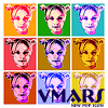
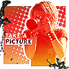
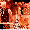
and may I say that I love the icons that were inspired by this guide so far, because I do :D
first thing for today:
Happy Mother's Day to all the Moms (or soon to be Mommy's) on my flist :D
then here's the second part of the so called pop art style guide...
more basic techniques, this time
duotones, shapes, outlines, color halftone, geometric elements
and more...
6) duotone images
- duotone images are a nice variation of the overcontrsted b/w pics
- normally I'm using an adjustment layer for this effect so that I can play around with it more easily and change it later to my needs again (add the adjustment layer, choose Gradient Map, use the gradient of your pleasure)
- try bright colors, we're talking of pop art here after all *g*
- adjust the gradient, so that you get more contrast. this is actually very important especially when your colors are of a very similar brightness as then they tend to look washed out.
- double-click on your gradient and drag one of the sliders more to the other side
- if your pic looks inverted just check the reverse option
before:
after:
7) stars
- one of the most important elements of the comicbook style
- used behind silhouettes or people
- you can add a drop shadow to it. no transparency. no softness.
- use Photoshop's Custom Shape tool if you're lazy
- or draw it with the Polygon Lasso Tool (no need for even parts *g*)
8) outlines
- use Blending Options
- Stroke, around 3 px normally works best for icon size
- if it looks a little to shreddered try Outer Glow instead and use a high Spread, (+ normal blending mode)
- a very nice underused feature is 'Create Layer', right-click on the little f that indicates the Layer Effects and choose Create Layer fromt he pull down menu
- ctrl-click on the original silhouette layer to load the selection, and delete this part from your new Outer Stroke Layer
9) color halftone
- this is one of my fave popartish effects, and it's actually quite easy to achieve :)
- you can use it as background or for emphasizing (more on that later)
- first thing is open a random picture
- select all, copy it, switch to your channels pallette, add a new alpha channel and paste your pic
- this is important as the color halftone only works nicely for 8 bit channels and your normal pic mode is 24 bit (RGB, each channel 8 bit)
- plus you have the big advantage that you can load a selection from it. yay!
- blur the pic slightly, the result will look better (i used a Gaussian Blur of 5 in this case)
- use Filter - Pixelate - Color Halftone
- the first option Max. Radius is the size of the biggest circles on your final pattern, keep your picture size in mind for this (the bigger the picture the higher you can choose your radius)
- now we have something like this and we will ctrl-click on our Alpha Channel to load the selection
- we switch back to our Layer Pallette and fill the selection with a color
- we add another floodfilled color layer underneath and have a very nice background pattern :)
- another version, we go back to our well known silhouette technique *g*
- we are using a black and white version
- IMPORTANT: change the Image - Mode - to Grayscale!!
- we are blurring it quite a lot (here I used a Gaussian Blur of 12)
- we are using the Filter - Pixelate - Color Halftone again
- we are copying the result to our original picture (that is in RGB mode and with colors of course)
- and we add some color to our pattern (here I used a blue layer on difference mode)
- I made the top layer visible again and tada, here's the result
10) Geometric elements
- geometric elements such as rectangulars and circles are strong elements to create backgrounds
- for this version I used the same technique I used for the retro dots...
- then I made rectangulars with the selection tool and filled it with colors
- I tend to use colors of the same range plus black and white for these things
- for small circles I use the hard round bruch tip
- for outlines I use Layer Effects
- time to add another great element and that's special characters in common fonts
- for this one I used Arial Black and the curly brackets {
- and also time to use some transparency for the additional elements
- Photoshop's Custom Shape Tool is your friend, in this case I used the arrows
- the swirly shapes are some 'SSS' in a font called Jokerman
- some more basic shapes and finally the cropping of your choice and the background is ready to be used
the previous part can be found here.
coming up next: my ramblings on brushwork. which might include downloadable popartish brush sets, in case I'm brave enough to share mine...
thanks so much for the nice feedback on the first part, it's really appreciated as these tutorials take an awful long time to write up and prepare. so it's nice to know that they are appreciated :)
and may I say that I love the icons that were inspired by this guide so far, because I do :D