Tutorial #8
Using PSP7, not selective colouring. Just fill layers, color balance and curves.
As requested by famous_divaxo
NOTE: This technique doesn't work on all images. I'm guessing the base has to be a tanny brown colour.
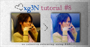
So we're going from

to

STEPONE: Get a base. Mines of Rachel Bilson. Sharpen if you want but I don't really sharpen my edges; ruins the haze.
Next make a new raster layer and floodfill it with #8ADCE8 and set the layer to Softlight 100%.
It should look something like this:
>

>

STEPTWO: Make a curves layer (Layers > New Adjustment Layer > Curves) and make the following points.
RED I:139 O:147
BLUE three points:
I:30 O:91
I:89 O:123
I:122 O:195
The press OK
It should look something like this:
>

STEPTHREE: Make a Brightness/Contrast layer (Layers > New Adjustment Layer > Brightness/Contrast) and up the contrast to +10.
It should look somewhat like this:
>

STEPFOUR: Duplicate the blue soflight layer (#8ADCE8) and drag it to the top. Once again, set it to Softlight 100%.
It should look like this:
>
>

STEPFIVE: Make a Color Balance layer (Layers > New Adjustment Layer > Color Balance) and set the following settings:
Midtones-10 -50 0
It should look something like this:
>

STEPSIX: Make a new Hue/Saturation/Lightness layer and up the saturation up to 20*
Look like this:
>
AND YOU'RE DONE!
* - PSP7's saturation is twice as intensive as other programs. If you would like to get the same result as mine, then set the saturation to around 35-40.
Other icons made by this colouring:


Didn't really work that well on the last one.
Friend me if you want ;) Comments and results are love - PEACE OUT.