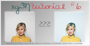
Tutorial #6

IN PSP. Translatable
melisah suggested I do a tutorial from my latest icon post. =D So we're going from

to

.
STEPONE: Grab a base. I got mine from Kristen-B.net. And then prepare it, crop resize, sharpen, yada yada.
Then duplicate the base and set that layer to Screen 17%.
It should look something like this:

>

Not much of a difference, but it makes a difference later on.
STEPTWO: Make a Levels adjustment layer. (Layers > New Adjustment Layer > Levels)
Settings:
RGB: input: 0, 0.69, 255
Then press OK.
Duplcate your new Levels layer.
Y icon should look now something like this:

>

A bit dark, but don't wory.
STEPTHREE: Make a new curves layer. (Layers > New Adjustment Layer > Curves)
Settings:
RGB: first point: Input: 57 output: 55
second point: Input: 92 Output: 136
Then click OK.
You should have something that looks sorta like this:

>

This layer was just to lighten up the stuff thats supposed to be light and darken up the dark parts =D
STEPFOUR: Create a new raster layer and fill with #80FFFF (a vibrant aqua colour ) and set it to Softlight 100%.

+

=

STEPFIVE: Create another raster layer and fill it with #F8BEDB ( a light pink )and set it to softlight 100%.

+

=

STEPSIX: Go to Layers > New Adjustment Layer > Hue/Saturation/Lighness and up the Saturation of the RGB to 20.
You should have something like this:

>


NOTE: I use PSP7, and the saturation on this program is very strong. So if you use photoshop, or something other than PSP7, I suggest you either double the amount of saturation or add an amount on to 20. =D
Other Icons made by this technique:


I'd love to see what you come up with =) In the meantime, FRIEND ME.