Adios Viejo Layout, Hola Nuevo Layout!
woodycakes + woodycakes + woodycakes
tutorial by cartonage
modifications done by me // inspired by Buzz Feed
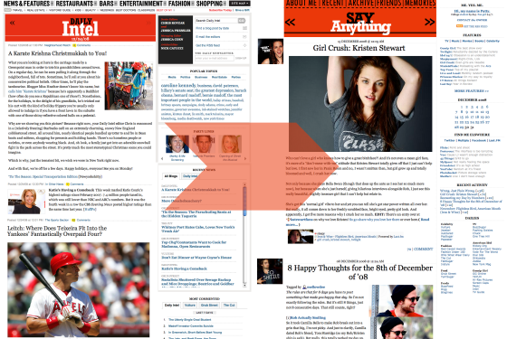
I don't usually change my layout much, but that's because I really loved the one I had. My last layout was based on one of my favorite websites, New York Magazine's Daily Intel. I loved reading their site so much, I patterned my former layout on it.
Finally though, I've decided to change. And this time around, I'm basing it on Buzz Feed's layout. I adore how their site looks and I just wanted to adapt it to my LJ, just how I did with Intel. But really, I'm so proud of this one because unlike my former layout, I built this one from freaking scratch.
I didn't base it on any other pre-made layout. Instead, I went straight to the base CSS stylesheet for Flexible Squares and made it what it is now. Much props to the team over at Buzz Feed for the design, but I built this one completely from nothing.

R.I.P. Intel-inspired layout
CSS style sheet by fruitystyle
modifications done by me // inspired by the Daily Intel
I didn't think I'd switch from my old layout. I loved it so much, I'd just change the header's color cause the layout was so simple and just love. But then I eventually got tired of it, not to mention the kinks it had when viewed in Internet Explorer (ew) and the alignment issues.
So I finally made the switch and I'm hoping this one works out fine. I'm sure I'll have a ton of kinks to sort out, but I'm pretty proud of myself. Sure, I didn't come up with the design, but it never hurt to get inspired right? Oh Buzzfeed my muse, I only aspire to be like you.
recommend your friends!
Oh and do this for me, if you're feeling up to it!
tutorial by cartonage
modifications done by me // inspired by Buzz Feed
I don't usually change my layout much, but that's because I really loved the one I had. My last layout was based on one of my favorite websites, New York Magazine's Daily Intel. I loved reading their site so much, I patterned my former layout on it.
Finally though, I've decided to change. And this time around, I'm basing it on Buzz Feed's layout. I adore how their site looks and I just wanted to adapt it to my LJ, just how I did with Intel. But really, I'm so proud of this one because unlike my former layout, I built this one from freaking scratch.
I didn't base it on any other pre-made layout. Instead, I went straight to the base CSS stylesheet for Flexible Squares and made it what it is now. Much props to the team over at Buzz Feed for the design, but I built this one completely from nothing.

R.I.P. Intel-inspired layout
CSS style sheet by fruitystyle
modifications done by me // inspired by the Daily Intel
I didn't think I'd switch from my old layout. I loved it so much, I'd just change the header's color cause the layout was so simple and just love. But then I eventually got tired of it, not to mention the kinks it had when viewed in Internet Explorer (ew) and the alignment issues.
So I finally made the switch and I'm hoping this one works out fine. I'm sure I'll have a ton of kinks to sort out, but I'm pretty proud of myself. Sure, I didn't come up with the design, but it never hurt to get inspired right? Oh Buzzfeed my muse, I only aspire to be like you.
recommend your friends!
Oh and do this for me, if you're feeling up to it!