Results LIMS Challenge 5
Great turnout for Lims Challenge 5! Unfortunately 2 people will be leaving us tonight.
ELIMINATIONS
VOTED OFF
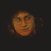
by that_was_cheesy (-10)
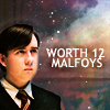
by weasley_hobbit (-3)
CONGRATULATIONS!
FAVORITE ICON + BANNER

by curtana (+2) » Click to Save your Banner ! You also got a ♥ on the Icon Talent List!
NO NEGATIVE VOTE (eligible for a SKIP)
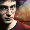
by hezzda (1) You already won a skip, you can't win another one but congrats for no negative vote :)
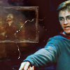
by stefycarter (1) You already won a skip, you can't win another one but congrats for no negative vote :)
MOVING ON TO NEXT ROUND
♥ ♥ curtana
driveshaft108
endgegner07
fabi7
♥ fahrenheit1993
♥ farfadine
fightclubs
hermionesparkle
♥ ♥ hezzda
karlakaine
♥ pasta_and_pepsi
♥ ♥ stefycarter
utkari02
VOTING TALLIES!
Here's the tally. Remember we're picking 3 least favorites and 1 favorite. Therefore, a negative (-) denotes how many people voted against your icon and a plus (+) denotes how many people voted your icon their favorit, zero (0) means you got neither or that they anuled each other out. So if you have a + point, pat yourself on the back!
Lims Challenge 5: Provided Textures
01
02
03
04

05
06
07
08


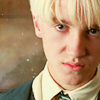
09
10
11
12
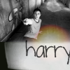


01: -1 + 2 = 1
02: -1 + 1 = 0
03: -2 + 1 = -1
04: -1 + 3 = 2
05: -2 + 1 = -1
06: -1 + 1 = 0
07: -0 + 1 = 1
08: -1 + 1 = 0
09: -1 + 0 = -1
10: -0 + 1 = 1
11: -3 + 0 = -3
12: -10 + 0 = -10
+ POSITIVE VOTING COMMENTS +
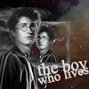
#01 -- Great texture use! Everything is well blended. The texture adds a nice splash of color on the B&W icon, without being overdone. The text placement on the far right well balances the icon.
#01 -- Wonderful usage of textures. The duplication of Harry idea is good.
#02 -- Wonderful use of textures!
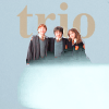
#03 -- The crop and the color is great and the textures fits very well.
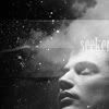
#04 -- I don't know what the picture is, but the cropping and use of texture are excellent!
#04 -- Good use of the textures given. The composition and colors are really good and match the emotion of the picture of young Severus Snape.
#04 -- The blending of the textures or the look of the blended textures with the dark and light effects gives him a cetain amount of space, drawing your eye to the character and allowing you to see more depth to his isolation.
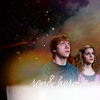
#05 -- Lovely composition and use of text.
#06 -- The whole theme of the rounded edges is used through the icon making it look really cohesive.
#07 -- Colouring, crop and use of texture all fantastic.
#08 -- Love the colouring and good crop :)
#10 -- The placement of textures, use of images, and coloring are all fabulous.
- NEGATIVE VOTING COMMENTS -
» Don't take these comments as mean pointless critics, they could help you make a better icon for the next challenge!
#01 -- The photo isn't blended into the texture well. I can still see bits of the original background off the photograph. The words 'boy' and 'lives' are so close that it's kind of hard to read.
#02 -- The figures look a bit too 'cut out' it would be better if they blended more smoothly into the background.
#03 -- The trio are very hard to see and a bit over-sharpened. Good idea in principle, though.
#03 -- The use of the brush adds nothing to the icon and seems to be used just because it was required of the challenge. Is a distraction rather than an enhancement.
#04 -- The character is a bit blurry, maybe sharpen it will be better.
#05 -- Font too small and gets lost in the background. Also it is unclear to me as to who the subject is. (Note from the Mod: It's Viktor Krum, when he's about to put his name in the Cup)
#05 -- The crop is a little confusing, I can not tell who the picture is. Possibly Dan Radcliffe from an Equus promo?
#06 -- The shading on top of the image gives the image an unflattery sharpness and blurryness at the same time.
#08 -- The coloring is bland; draco doesn't stand out at all from the image.
#09 -- Not enought contrast, it make Harry's face not neat enought. The yellow don't mix too well with the background.
#11 -- Neville's face is too red! It's also a bit too blurry, and the texture isn't well blended around Neville's face. Also, the text used is nice, but the font is a bit too plain and sticks out too much.
#11 -- The font doesn't work with the icon. it's too generic.
#11 -- I think the image and the textures don't compliment very well and also the font used doesn't fit with the style of the icon.
#12 -- It's far too dark (it looks like Harry's head is just floating there) and too blurry.
#12 -- The colour is odd, and the image is monotonous.
#12 -- Too dark and the placement doesn't work.
#12 -- The crop is unflattering and the use of texture and coloring is not complementary to the icon.
#12 -- The image of Harry is very dark and low-contrast.
#12 -- Too dark overall and Harry's face needs contrast.
#12 -- The icon is too dark and Harry's face has a weird color.
#12 -- The image is very dark and the texture drowns it.
#12 -- The yellow color on Harry face isn't really great and doesn't make it stand out from the black around.
#12 -- The lighting is good, but the backround is the same shade as his hair and the highlights we see are so narrow, it looks cramped and unfished.
It's farfadine's turn to do the Nomination for the winning icon. (with the Noms for Week 189 in a couple of days)
ELIMINATIONS
VOTED OFF
by that_was_cheesy (-10)
by weasley_hobbit (-3)
CONGRATULATIONS!
FAVORITE ICON + BANNER
by curtana (+2) » Click to Save your Banner ! You also got a ♥ on the Icon Talent List!
NO NEGATIVE VOTE (eligible for a SKIP)
by hezzda (1) You already won a skip, you can't win another one but congrats for no negative vote :)
by stefycarter (1) You already won a skip, you can't win another one but congrats for no negative vote :)
MOVING ON TO NEXT ROUND
♥ ♥ curtana
driveshaft108
endgegner07
fabi7
♥ fahrenheit1993
♥ farfadine
fightclubs
hermionesparkle
♥ ♥ hezzda
karlakaine
♥ pasta_and_pepsi
♥ ♥ stefycarter
utkari02
VOTING TALLIES!
Here's the tally. Remember we're picking 3 least favorites and 1 favorite. Therefore, a negative (-) denotes how many people voted against your icon and a plus (+) denotes how many people voted your icon their favorit, zero (0) means you got neither or that they anuled each other out. So if you have a + point, pat yourself on the back!
Lims Challenge 5: Provided Textures
01
02
03
04
05
06
07
08
09
10
11
12
01: -1 + 2 = 1
02: -1 + 1 = 0
03: -2 + 1 = -1
04: -1 + 3 = 2
05: -2 + 1 = -1
06: -1 + 1 = 0
07: -0 + 1 = 1
08: -1 + 1 = 0
09: -1 + 0 = -1
10: -0 + 1 = 1
11: -3 + 0 = -3
12: -10 + 0 = -10
+ POSITIVE VOTING COMMENTS +
#01 -- Great texture use! Everything is well blended. The texture adds a nice splash of color on the B&W icon, without being overdone. The text placement on the far right well balances the icon.
#01 -- Wonderful usage of textures. The duplication of Harry idea is good.
#02 -- Wonderful use of textures!
#03 -- The crop and the color is great and the textures fits very well.
#04 -- I don't know what the picture is, but the cropping and use of texture are excellent!
#04 -- Good use of the textures given. The composition and colors are really good and match the emotion of the picture of young Severus Snape.
#04 -- The blending of the textures or the look of the blended textures with the dark and light effects gives him a cetain amount of space, drawing your eye to the character and allowing you to see more depth to his isolation.
#05 -- Lovely composition and use of text.
#06 -- The whole theme of the rounded edges is used through the icon making it look really cohesive.
#07 -- Colouring, crop and use of texture all fantastic.
#08 -- Love the colouring and good crop :)
#10 -- The placement of textures, use of images, and coloring are all fabulous.
- NEGATIVE VOTING COMMENTS -
» Don't take these comments as mean pointless critics, they could help you make a better icon for the next challenge!
#01 -- The photo isn't blended into the texture well. I can still see bits of the original background off the photograph. The words 'boy' and 'lives' are so close that it's kind of hard to read.
#02 -- The figures look a bit too 'cut out' it would be better if they blended more smoothly into the background.
#03 -- The trio are very hard to see and a bit over-sharpened. Good idea in principle, though.
#03 -- The use of the brush adds nothing to the icon and seems to be used just because it was required of the challenge. Is a distraction rather than an enhancement.
#04 -- The character is a bit blurry, maybe sharpen it will be better.
#05 -- Font too small and gets lost in the background. Also it is unclear to me as to who the subject is. (Note from the Mod: It's Viktor Krum, when he's about to put his name in the Cup)
#05 -- The crop is a little confusing, I can not tell who the picture is. Possibly Dan Radcliffe from an Equus promo?
#06 -- The shading on top of the image gives the image an unflattery sharpness and blurryness at the same time.
#08 -- The coloring is bland; draco doesn't stand out at all from the image.
#09 -- Not enought contrast, it make Harry's face not neat enought. The yellow don't mix too well with the background.
#11 -- Neville's face is too red! It's also a bit too blurry, and the texture isn't well blended around Neville's face. Also, the text used is nice, but the font is a bit too plain and sticks out too much.
#11 -- The font doesn't work with the icon. it's too generic.
#11 -- I think the image and the textures don't compliment very well and also the font used doesn't fit with the style of the icon.
#12 -- It's far too dark (it looks like Harry's head is just floating there) and too blurry.
#12 -- The colour is odd, and the image is monotonous.
#12 -- Too dark and the placement doesn't work.
#12 -- The crop is unflattering and the use of texture and coloring is not complementary to the icon.
#12 -- The image of Harry is very dark and low-contrast.
#12 -- Too dark overall and Harry's face needs contrast.
#12 -- The icon is too dark and Harry's face has a weird color.
#12 -- The image is very dark and the texture drowns it.
#12 -- The yellow color on Harry face isn't really great and doesn't make it stand out from the black around.
#12 -- The lighting is good, but the backround is the same shade as his hair and the highlights we see are so narrow, it looks cramped and unfished.
It's farfadine's turn to do the Nomination for the winning icon. (with the Noms for Week 189 in a couple of days)