Ask The Maker III (part one)

I. CROPPING
You always have crazy creative crops; I'd love to hear a little something about your process there! -rocketgirl2
So apparently I like to cut off the sides of people’s faces. :) I like doing that but mostly only if there’s something else happening on the ‘empty’ side of the icon.
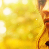
This icon for example is the only one in which the non-face side is as good as empty. I tried out a few crops at first of the right side of her face but it just didn’t work out well so I tried it like this. I like that it accentuates that lock of hair though and I do like the colors from the background, which makes it interesting anyway.
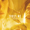
This icon came from a bigger graphic I made for Tumblr, so it looks a little more complex than it actually is. My goal was basically to capture an entire scene in one 500x500 graphic so I knew I was gonna have to use multiple caps. And what better way to make room for other caps? Put them on the side! So that’s basically messing with a couple of Lighten and Screen modes and erasing a bit of where it isn’t needed and before you know it’s done.
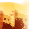
I don’t think I actually remember my thought process for this all that well. I had one of these two caps, but for some reason they didn’t work out alone so I added in the other (without trying to blend, just put them on top of the other) and added that text to make it seem more full.
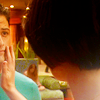
I personally think a crop on Victor himself and using just the hand as a focus would have worked fine, but I think for cap quality issues I went with this crop instead.
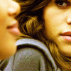
I find this cap personally really interesting because you can crop it in interesting ways (and I have iconned it many times before) but I think this crop is my favorite. Jaden being blurred in the front, smiling slightly, and Alex on the side looking menacing at her. It works in the context of the show and it works as a crop.
Let’s take a look at the original cap for a second.

You see? These are things I try to notice when looking at caps and how I decide to crop them. There’s this space inbetween their two faces that’s interesting enough and that’s just the right size to get in a square.
Obviously we could just focus our crop on Alex and get something out of that (because Alex is the focus of the cap) but I’d personally say the look she gaves Jaden is the focus, and I really wanted to capture that.
So crops like these aren’t really bad:


But when there is something more in the cap and you don’t decide to use it, I find it a bit of a waste.

II. GENERAL
How did you make these? Any stories to tell about how you came up with the compositions? The texture use? -fouroux

I have to say that this icon was already made in my mind before I even started it. I already knew what text I wanted to use, what scene I wanted to use, what color scheme I wanted.
I knew this scene wasn’t too interesting cropping wise, so I knew I was going to do a standard center crop that almost had his whole face on it. This meant I was going to have to pick a frame with at least an interesting facial expression to not make it too lame.

The little headtilt, the half-smile, the cuts on the side. It’s those things that made me go with this cap.
I went with that pretty standard crop, made sure the scene didn’t end up too dark (I really wanted to make those soft yellows and greens stand out and it works more effectively if the other colors are very light).
Eventually then, the text. I decided to have them big and all over his face. I tried it tiny and on the side but it just didn’t work because his face was already such a big part of the icon. For the colors I just used white (which was clear enough) and yellow from the cap itself to accentuate the word ‘criminal’. Originally I was also going to use a handwritten font for the ‘yo’ but it didn’t really work either.

A few weeks ago I basically just wanted a new Tumblr icon and wanted it to be of Jesse to celebrate Breaking Bad returning that day, so there was not a lot of thought process going into this. A quickly chosen cap, a few yellow color layers set on Hard Light and Soft Light and then a few messy paint textures on Screen.

This one was cropped of a bigger graphic I made but that was basically a lot of yellow thrown over it and a light texture at the end for good measure. I found the cap itself already really interesting so I didn’t really do much else to it.
III. LIGHTING
Your lighting is always so flawless and on spot, it would be great if you could write a guide on how you go about it usually, specifically when you blend. -twistedbones
I don’t think I really actively look at my lighting. I just make sure the icon is light enough and at the same time contrasted enough but that you’re still able to see what’s going on in the icon. I also use a lot of gradients to focus on the more interesting parts of the icon.
This is basically almost always my standard icon palette.

This was made purely as an example (the colors and textures were randomly chosen), and I ended up with this

Which is a mess of an icon but at least the lighting’s good?
For me lighting is an aspect of an icon that has a way of working itself out because of my icon making habits, I think. I mean, some caps are a bit of a challenge (and then I play with gradients or gradient-like textures much more), but most of the time I don’t have to do anything special for it.
IV. COLORING
A general guide on how you achieve such lovely solid colorings on your icons would be awesome. -wickedgrdn
I guess the trick for this is to use whatever color is already in the icon.
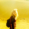
For this icon I already had a lot of yellow tints in the original cap.

It’s mostly brownish yellow but yellow isn’t a very hard color to achieve if it’s at least slightly yellow. In that case I play with a lot of yellow color layers (one set to Hard Light at a low percentage, and then a few set to Soft Light at a higher percentage), and then just play with Vibrance and Saturation to make it more vibrant.
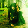
The same basically goes for this one.

There’s more green than yellow in this cap (and I think I would have been able to make something purple-ish work as well, due to her dress) so for this I went with the same tactic as the one above, but just with green instead of yellow.
You know what? Just as an example, I’m going to try.


In this case purple comes out a bit too cold which is a weird combination to me considering she’s in the woods. Yellow actually works surprisingly good too so I could have gone with that as well. I associate the woods easily with green though so at the time I thought it was the more obvious choice.
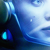
Blues are actually one of the easiest colors to make work to me. As long as the cap is already really blue, because otherwise it’s difficult for me to really make it work without it looking wonky.

There is so much blue that it seems obvious to just use blue already. Same thing again, a light blue color layer set to Hard Light (around 20%, depends) and the same blue color layer duplicated, but set to Soft Light (around 80-100%) and play with those. Afterwards just add a Vibrance or Saturation layer to color it up. And then just do everything to the icon that you normally do.
V. OTHER
What are your favourite icon textures at the moment? -cypherrs
It changes all the time but currently it’s these.


unknown | tinebrella | mm3butterfly | vetica x2
What are your fav fonts? -alexsuami
My favorite fonts are definitely Amplitude, Helvetica, and Bodoni MT. I’ve been especially abusing the first one for a long time.
Amplitude:


Helvetica:


Bodoni MT:


Any tips on how you do text?? -alexsuami
I don’t think I’m particularly gifted at text so most of the time when I do decide to do it I don’t always know what I’m doing. Finding what text you want to put on it is the hardest part actually. Usually the text you end up with is more than a few words too so then you have to find out how you’re going to organize it. All centered and even with eachother? More as a sentence? Like a poem? More spread out? And then when you decide on that, what color do you want your text to be? How are you going to make sure it’s readable? Is there a particular word I should focus on? What font should I decide on? Something Serif or non-serif? Playful or serious?
A lot of these things also depend on the cap so some of these are really hard to answer.
DECIDING WHAT TEXT: Usually a quote from the show or the scene itself, whatever comes up. Sometimes I’d listen to a song while making that particular icon and suddenly hear something that fits so I’d use that sometimes too.
PLACEMENT: I like using the characters in my icon to decide my placement. There’s a cheek free? Text on that! Someone’s back is empty! Text on that! Things I personally don’t like doing is putting text on negative space spots, far away from the character the icon is focused on.
COLOR: First I always try using colors that are already in the icon, and when there are certain words I want highlighted, I use other colors from the icon to change their colors. When the icon is so busy in colors though and it’s not very readable, I usually just end up with white.
FONT: I think deciding between serif and non-serif or something handwritten is the most important part. Afterwards you can decide on a particular font of the type you’ve chosen. I don’t really have any rules for this though. It just works or it just doesn’t.
And one thing I've always loved about your icons is that there's this comforting warmth to them (e.g. the Elena userpic I'm using for this comment)-is that a side-effect of your usual coloring or do you do something special to achieve that tone? -summerstorm
I'm particularly infatuated with this style of yours, from posts like these: x x x Anything related to how you worked with color and shadows on those would be amazing, and if possible, I'd love to know your process for the Buffy icons as I find those caps really difficult to work with. -accordion

I think that was sort of a side effect from my usual coloring. A few months ago (from when that icon in particular was made) I chose a lot of warm and easy to color caps so eventually all the icons turned out warm.

TVD also tends to have really brownish caps (at least early S2) so I tried to stick with the original colors as close as possible. Not too much colored textures, just adding to the brownish tints. For more details, I made a tutorial concerning this coloring a while ago here.
As for Buffy, they really aren’t the easiest caps to work with so I went with caps that weren’t really hard to light up without losing their quality. It’s basically the same process as the tutorial linked above and just generally not changing too much to the original colors of the cap.
Part 2 is going to just consist of tutorials but I felt like this post was already long enough so I split it up :) I hope this was at least clear enough and if not, don't hesitate to ask me to elaborate on something.