HP Colour Halftone B/W/R tutorial
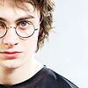
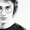
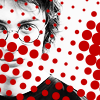
How to go from 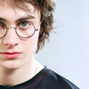
to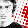
Technique same as here
Tutorial for Photoshop CS2. Any issues with translation to other programs, comment and maybe somebody else can help you
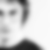
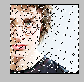
I took this picture and cropped it like this:
I did my typical things that I do to all my icons, Auto levels/contrast/colour (Image>Adjustments), sharpening (though for this paticular picture it was too sharp so I fade sharpened it by going Edit>Fade Sharpen.
NOTE:The colouring was inspired and played around with from this colouring technique by dashdashdot.
Next I duplicated the layer and set it to screen 100%
Really bright and harsh now huh? I fixed that by duplicating the layer again and setting it to Multiply %38.
Next I created a new adjustment layer and applied a black and white gradient map layer (they're better than just desaturating, it gives more contrast).
I merged the picture layers (not the gradient map layer), duplicated it, and applied a 4.4 Gaussian blur (Filters>Blur>Gaussian Blur)
Next I set that layer to soft light 100%
Now, you could stop right there and be happy with it, but I tend to like things to fill up large amounts of empty space.
YET MORE NOTES: Dot technique learned from awmp
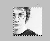
Now, go back to the original and Select all (Ctrl+A) around the image
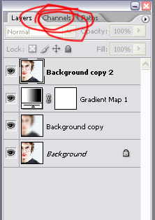
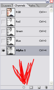
Next go to your channels panel
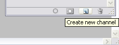
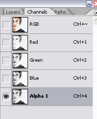
and make a new channel
and paste the image into it
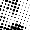
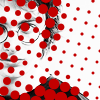
Then you go to Filters>Pixelate>Color Halftone and apply the filter at the default settings.
Next, click load channel as selection and go back to your layers pallette
So now it's going to look something like this:
*
Now, you have to right click on the selection (when you have the selection tool as your active tool) and go Select Inverse
*
*=Don't mind that those are in colour, I got it mixed up a bit on the layers.
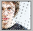
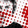
Now create a new layer and fill it with whatever colour you want your dots to be. I chose red (#c30000), because red and black/white is always a good combo.
Obviously we need to rotate it, so I rotated it 90 degrees CCW (counter-clockwise)
Next I set the layer to Linear Burn 100% (though for the Josh H. icons I set it to colour burn, but there was more of darker background so it looked better)
(Upon looking at it while writing this, it's unnesscessary to change the blend mode, as it doesn't change the colour for this since it has a solid background, but it will if you have say, clouds or a wall or something)
Since we don't want it covering his face, I made a layer mask (more on those here) and erased all the bits that I didn't want.
I'd add more to it... but I suck at text and I don't want to.
DO NOT COPY EXACTLY Experiment, use things differently, don't make a frigging carbon copy if this icon.
If you do anything with this, or like it or find it useful or whatever comment I am a comment whore sex me up
Previous Tutorials
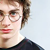
to
Technique same as here
Tutorial for Photoshop CS2. Any issues with translation to other programs, comment and maybe somebody else can help you
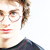
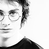
I took this picture and cropped it like this:
I did my typical things that I do to all my icons, Auto levels/contrast/colour (Image>Adjustments), sharpening (though for this paticular picture it was too sharp so I fade sharpened it by going Edit>Fade Sharpen.
NOTE:The colouring was inspired and played around with from this colouring technique by dashdashdot.
Next I duplicated the layer and set it to screen 100%
Really bright and harsh now huh? I fixed that by duplicating the layer again and setting it to Multiply %38.
Next I created a new adjustment layer and applied a black and white gradient map layer (they're better than just desaturating, it gives more contrast).
I merged the picture layers (not the gradient map layer), duplicated it, and applied a 4.4 Gaussian blur (Filters>Blur>Gaussian Blur)
Next I set that layer to soft light 100%
Now, you could stop right there and be happy with it, but I tend to like things to fill up large amounts of empty space.
YET MORE NOTES: Dot technique learned from awmp
Now, go back to the original and Select all (Ctrl+A) around the image
Next go to your channels panel
and make a new channel
and paste the image into it
Then you go to Filters>Pixelate>Color Halftone and apply the filter at the default settings.
Next, click load channel as selection and go back to your layers pallette
So now it's going to look something like this:
*
Now, you have to right click on the selection (when you have the selection tool as your active tool) and go Select Inverse
*
*=Don't mind that those are in colour, I got it mixed up a bit on the layers.
Now create a new layer and fill it with whatever colour you want your dots to be. I chose red (#c30000), because red and black/white is always a good combo.
Obviously we need to rotate it, so I rotated it 90 degrees CCW (counter-clockwise)
Next I set the layer to Linear Burn 100% (though for the Josh H. icons I set it to colour burn, but there was more of darker background so it looked better)
(Upon looking at it while writing this, it's unnesscessary to change the blend mode, as it doesn't change the colour for this since it has a solid background, but it will if you have say, clouds or a wall or something)
Since we don't want it covering his face, I made a layer mask (more on those here) and erased all the bits that I didn't want.
I'd add more to it... but I suck at text and I don't want to.
DO NOT COPY EXACTLY Experiment, use things differently, don't make a frigging carbon copy if this icon.
If you do anything with this, or like it or find it useful or whatever comment I am a comment whore sex me up
Previous Tutorials