Round Three: Week Seven - Results
Thanks so much you guys for the last minute voting! Now we can get things back on track :)
So here are the results!
Eliminated: tartankilts - im so sorry to see you go!your icons are always differnt,and very creative in its way.but i hope i wil see you next round :)
Favorite: _blurplinkle_ - Congrats! You have won Favorite this week again!

-I like the selective coloring, but the typography is a bit bothersome. While the black and while looks nice, the text itself is a bit jagged. Choosing a different font or anti-alias setting might have helped.
-The font is choppy and the cropping doesn't look appealing.
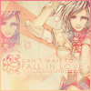
-It looks washed-out and the text is barely readable >_<
Ashe doesn't look so clear. Also, those red spots on Ashe really distract her. The duplicated box looks unsuitable.
+++The coloring is beautiful, and I love the image used. I also like the small inset repeated pic, it's done well, which isn't easy. The text is also very pretty.
+++I like the colors and setup.

-the icon seems over powered by the textures
+++Although it looks scratcy, it looks really nice :)
megan23352 will you like to put up the new theme? if not i can do it for you.
So here are the results!
Eliminated: tartankilts - im so sorry to see you go!your icons are always differnt,and very creative in its way.but i hope i wil see you next round :)
Favorite: _blurplinkle_ - Congrats! You have won Favorite this week again!
-I like the selective coloring, but the typography is a bit bothersome. While the black and while looks nice, the text itself is a bit jagged. Choosing a different font or anti-alias setting might have helped.
-The font is choppy and the cropping doesn't look appealing.
-It looks washed-out and the text is barely readable >_<
Ashe doesn't look so clear. Also, those red spots on Ashe really distract her. The duplicated box looks unsuitable.
+++The coloring is beautiful, and I love the image used. I also like the small inset repeated pic, it's done well, which isn't easy. The text is also very pretty.
+++I like the colors and setup.
-the icon seems over powered by the textures
+++Although it looks scratcy, it looks really nice :)
megan23352 will you like to put up the new theme? if not i can do it for you.