Round Three: Week One - Results
Here are the results for the first week of round three ^^
Eliminated: wingweaver22 - Thank you for participating, and I really hope to see you enter the next round!
Favorite: _blurplinkle_ - Congrats! You have won immunity, meaning it's up to you whether or not you submit an icon this week, and you can't get voted off no matter what.
NOTE: The rule has changed in a way, meaning that if _blurplinkle_ DOES submit an icon, and it gets the most votes, the icon with the second most votes is voted off. That way, each week sees an elimination.
- The coloring is very dull and dark and the text is very plain looking. Maybe a fancier serif font would look nicer. The icon as a whole just looks like so much more could have been done to it.
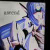
- The icon is a bit dark and somewhat dull. Also I don't see the connection between the image used (and how it's been cropped, colored, etc.) and the text "ascend".
- i like how creative the icon is,but the icon seems way to dark on the girl.and the text seems kinda "flat" maybe something more eye catching text would help :)
- The color is a bit too dull, and the icon is without much of a focus. I love the cropping, though.
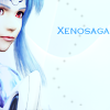
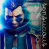
- I don't know what's going on in the icon. Is it supposed to say "Xenosaga!" or "Sexy!" or both?
- Very plain, not very exciting. The colours clash together and the cropping is terrible.
- though I don't personally disliek this icon with the way the cropping was done her head looks slightly stretched and the colour scheme doesn't work too well (Meaning the red, blue, white, and black).
- Nice colours but those bubbles don't look nice. The text & the colour look terrible and it hurts my eyes.
- The image doesn't seem to have too much colouring effect on it, and although I do like the text and the bubbles behind it I don't think they go very well the colour scheme of this icon.
- i like the different colors in the icon,they match very good together.but the texture and dots dont seems to blend well with the image.the image looks very "soothing and relaxing" and the background looks more like "funky and fresh".
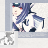
- I'm not too fond of the cropping. There seems to be too much space to the right, so moving the subject a little more would be better. I like the little decorative touches and the blue, but the character seems to be washed out with blue too. A little colour to bring out her features would be nice.
- love the colors in this icon, but I think that Kos-Mos is a little too far to the left. Nudging her to the right a bit might have helped a whole lot.
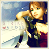
- The font doesn't seem to fit the icon and it is hard to read. The left side of the icon is also a lot brighter than the right side. The coloring is too dull and muted.
+++ I like the typography, with two fonts, one serif and one script, and the drop shadow on both to make the text pop out even more. The colors are nice and vibrant except that the lady is a little gray and pale looking, so much so that her skin kind of blends in with the background. Maybe add a little warmth to her skin with a low opacity multiply or soft light layer? (Granted, I don't know the character so that could just be how she looks.)
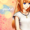
+++ i really like the overall simple and elegant look to this icon.
+++ This is a beautiful icon, the border color matching the text and heart color is a wonderful touch. The contrast is perfect, and the use of both themes works wonderfully.
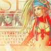
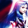
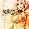
-It's got a gorgeous composition and cropping but the selective coloring kills it. The red is too saturated, it looks more like one big blob around Rikku's neck versus a scarf. (And yes, I've calibrated the moniter on my Mac.) Maybe ease up a little on the selective coloring? I know it's the hot new trendy thing to do but the same numbers don't always work well with every image.
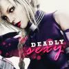
+++ Love the compositiong and such lovely coloring! Truly sexy!
+++ Because the style is just so pretty! It's obvious that whoever made it really worked on it. The colors are great, and the text in the background speaks a lot about Rikku (and why she's sexy).
+++ This is definitely the best icon in the batch but one critique, the text beside Rikku should be readable and the colours are too bright. Maybe make the image a bit darker?
Either Orlandogirl or myself will be posting the next challenge soon. BUT, since she is in the current round, I still choose the game and word challenge, which is only fair to everyone else, right? :)
Eliminated: wingweaver22 - Thank you for participating, and I really hope to see you enter the next round!
Favorite: _blurplinkle_ - Congrats! You have won immunity, meaning it's up to you whether or not you submit an icon this week, and you can't get voted off no matter what.
NOTE: The rule has changed in a way, meaning that if _blurplinkle_ DOES submit an icon, and it gets the most votes, the icon with the second most votes is voted off. That way, each week sees an elimination.
- The coloring is very dull and dark and the text is very plain looking. Maybe a fancier serif font would look nicer. The icon as a whole just looks like so much more could have been done to it.
- The icon is a bit dark and somewhat dull. Also I don't see the connection between the image used (and how it's been cropped, colored, etc.) and the text "ascend".
- i like how creative the icon is,but the icon seems way to dark on the girl.and the text seems kinda "flat" maybe something more eye catching text would help :)
- The color is a bit too dull, and the icon is without much of a focus. I love the cropping, though.
- I don't know what's going on in the icon. Is it supposed to say "Xenosaga!" or "Sexy!" or both?
- Very plain, not very exciting. The colours clash together and the cropping is terrible.
- though I don't personally disliek this icon with the way the cropping was done her head looks slightly stretched and the colour scheme doesn't work too well (Meaning the red, blue, white, and black).
- Nice colours but those bubbles don't look nice. The text & the colour look terrible and it hurts my eyes.
- The image doesn't seem to have too much colouring effect on it, and although I do like the text and the bubbles behind it I don't think they go very well the colour scheme of this icon.
- i like the different colors in the icon,they match very good together.but the texture and dots dont seems to blend well with the image.the image looks very "soothing and relaxing" and the background looks more like "funky and fresh".
- I'm not too fond of the cropping. There seems to be too much space to the right, so moving the subject a little more would be better. I like the little decorative touches and the blue, but the character seems to be washed out with blue too. A little colour to bring out her features would be nice.
- love the colors in this icon, but I think that Kos-Mos is a little too far to the left. Nudging her to the right a bit might have helped a whole lot.
- The font doesn't seem to fit the icon and it is hard to read. The left side of the icon is also a lot brighter than the right side. The coloring is too dull and muted.
+++ I like the typography, with two fonts, one serif and one script, and the drop shadow on both to make the text pop out even more. The colors are nice and vibrant except that the lady is a little gray and pale looking, so much so that her skin kind of blends in with the background. Maybe add a little warmth to her skin with a low opacity multiply or soft light layer? (Granted, I don't know the character so that could just be how she looks.)
+++ i really like the overall simple and elegant look to this icon.
+++ This is a beautiful icon, the border color matching the text and heart color is a wonderful touch. The contrast is perfect, and the use of both themes works wonderfully.
-It's got a gorgeous composition and cropping but the selective coloring kills it. The red is too saturated, it looks more like one big blob around Rikku's neck versus a scarf. (And yes, I've calibrated the moniter on my Mac.) Maybe ease up a little on the selective coloring? I know it's the hot new trendy thing to do but the same numbers don't always work well with every image.
+++ Love the compositiong and such lovely coloring! Truly sexy!
+++ Because the style is just so pretty! It's obvious that whoever made it really worked on it. The colors are great, and the text in the background speaks a lot about Rikku (and why she's sexy).
+++ This is definitely the best icon in the batch but one critique, the text beside Rikku should be readable and the colours are too bright. Maybe make the image a bit darker?
Either Orlandogirl or myself will be posting the next challenge soon. BUT, since she is in the current round, I still choose the game and word challenge, which is only fair to everyone else, right? :)