Making Good Cartoon Icons- Tutorial 3// Ai Love You
First post!
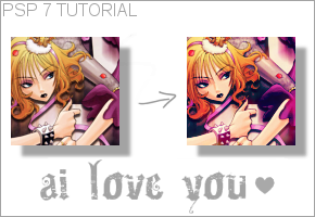
Difficulty: So-so. Knowledge of curves and colour balance needed.
Transferability: As usual, easily translated.
Step 1
Base image
New raster layer, fill with #06004b, set to Soft Light at 28% opacity.
Step 2
New raster layer, fill with #000235, set to Exclusion at 100% opacity.
Step 3
New raster layer, fill with #a9ecff, set to Burn at 100% opacity.
Step 4
New raster layer, fill with #E298F4, set to Soft Light at 100% opacity.
Step 5
New raster layer, fill with #E4F597, set to Soft Light at 100% opacity.
Step 6
Duplicate layer, bring to top, set to Soft Light at 100%. Flatten layers.
Step 7
Colours > Adjust > Curves
My settings
Step 8
Colours > Adjust > Colour Balance
My settings
Step 9
This gradient (by me) set to Soft Light at 47% opacity.
OPTIONAL
Step 10
This light texture (by me) set to Screen at 100% opacity.
Remember, experimenting is key! Not all images are alike.

Difficulty: So-so. Knowledge of curves and colour balance needed.
Transferability: As usual, easily translated.
Step 1

Base image
New raster layer, fill with #06004b, set to Soft Light at 28% opacity.
Step 2

New raster layer, fill with #000235, set to Exclusion at 100% opacity.
Step 3

New raster layer, fill with #a9ecff, set to Burn at 100% opacity.
Step 4

New raster layer, fill with #E298F4, set to Soft Light at 100% opacity.
Step 5

New raster layer, fill with #E4F597, set to Soft Light at 100% opacity.
Step 6

Duplicate layer, bring to top, set to Soft Light at 100%. Flatten layers.
Step 7

Colours > Adjust > Curves
My settings
Step 8

Colours > Adjust > Colour Balance
My settings
Step 9

This gradient (by me) set to Soft Light at 47% opacity.
OPTIONAL
Step 10

This light texture (by me) set to Screen at 100% opacity.
Remember, experimenting is key! Not all images are alike.