Round 3 - Challenge 03 - Results
ROUND 3 - CHALLENGE 03 - RESULTS
Where were my voters this challenge? You all left me! Was it my bad pun? I bet it was. We have a couple of ties as a result. :P
1ST PLACE [5 points]:

erzsebet with +4 votes (and more first place votes).
2ND PLACE [4 points]:

giulsss with +4 votes.
3RD PLACE [3 points]:

and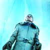
wildalyss + lwena11 with +3 votes (and greater overall votes).
BEST CINEMATOGRAPHY [2 points]:

+
wildalyss + erzsebet with +3 votes.
MODS CHOICE [1 point]:
[absolutelybatty]
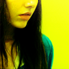
julie_izumi
[This icon just missed out on placing, and it is too bad because what a wonderful example of flood light! It was an interesting and ambitious color choice that I think is executed really well. It doesn't look over saturated or monochromatic. Instead it is very striking use of yellow and pitch perfect contrast!]
[raiindust]

midnightisclose
[The crop on this icon is stunning, and draws immediate attention to the expression of the characters. The colours are also beautiful. I love how there are variations of yellows and oranges across the icon, so neither overwhelms the icon completely.]
TABLE KEY:
+++ = 1st Place Vote
++ = 2nd Place Vote
+ = 3rd Place Vote | Beginning of a new comment.
Note: Votes are not weighted in this round. Meaning a 1st, 2nd or 3rd vote will only give you 1 point when tallying the votes. Except in the case of a tie - then the icon with the most 1st place votes will be given first.
ICON VOTES

collsPOSITIVE VOTES
None.
BEST INTERPRETATION OF THEME
None.
CONSTRUCTIVE VOTES
+ The composition is a little lopsided, the negative space yellow background is the majority focus of the icon, maybe shifting her a little bit or even zooming in a bit would help balance the icon out.
ADDITIONAL VOTES
+ though the use of yellow and red is very nice, I think the character needs to stand out a bit more, maybe by making her look a bit darker.

arctic_flowerPOSITIVE VOTES
++ Gorgeous crop and choice of colour for this icon!
++ The colors seem to fit with her facial expression, and it looks beautiful.
BEST INTERPRETATION OF THEME
None.
CONSTRUCTIVE VOTES
None.
ADDITIONAL VOTES
+ good crop, I like how the shadow falls across her face.

alice_tripPOSITIVE VOTES
++ The crop and use of texture here really make the icon dramatic. Good use of blue - its not too saturated or overpowering and lets you see the details of the two subjects nicely.
BEST INTERPRETATION OF THEME
None.
CONSTRUCTIVE VOTES
+ The negative space is a creative touch to give the sense of the characters looking upwards. The texture is a bit pixelated on the edge. A soft blur would add a smooth transition into the white.
+ I like the negative space and composition of this icon, but the characters are made somewhat dull by the overlaid texture.
ADDITIONAL VOTES
+ very nice use of texture and colouring, it works out very well. You could make the characters stand out a bit more by brightening them, but it also looks nice like that.

erzsebetPOSITIVE VOTES
+++ Red is always a tricky color to use. The very subtle red gradient is great effect because it plays with the downward perspective on the subject. The faded box is a good use of the negative space and focuses the viewer's eyes on the subject.
+++ The crop and background are very eye catching. I love the lighter red square/rectangle thing that fades into the back. It helps put emphasis on Margot.
+++ I love the way you use the borders to shape your icon. It really adds a lot of depth to it.
++ The texture used in the sides draws the attention well to the subject. The center crop & use of negative space work very favorably.
BEST INTERPRETATION OF THEME
+ No reason given.
+ No reason given.
+ the color flooding isn't just hinted at, it's bold and intentional and doesn't sacrifice the quality of the image.
CONSTRUCTIVE VOTES
None.
ADDITIONAL VOTES
+ The colors in this icon are really beautiful. I love the texture(s?) used. Also, good background removal -- sometimes it can come off as too sharp/obvious looking, but it's nice here.

enrianaPOSITIVE VOTES
+ The lighting and shadows on the wall(?) are perfect because it allows the viewer to focus on the dynamic nature of the subject.
+ The use of negative space is really well done, and good job getting the right amount of contrast.
BEST INTERPRETATION OF THEME
None.
CONSTRUCTIVE VOTES
None.
ADDITIONAL VOTES
+ I love the composition of your icon - the negative space, the geometrical look, etc. I think the lighting and contrast could still use some work, though. For instance, your subject's face is pretty light, and surrounded by all that dark, it looks a bit neon. It's hard to tell what's going on because of that. Her body stands out well against the dark surrounding it, but then when we get up to her arm that's extended above her head (at least, I think that's what's going on there), it almost looks like a part of the background because it's mostly the same colour. I think making all of the background pretty dark would help give the icon a more uniform look, and help your subject to be more identifiable. I think it's River, but I honestly cannot tell. I love where you're going with this, and I think with a bit of work, it could be an awesome icon.

wildalyssPOSITIVE VOTES
+++ Wow this is just amazing! I love how the pink and blue compliment each other and the little blue bars on the top and bottom.
++ Beautiful colouring here. Though I'm usually one of those people who shies away from doing purple skin and such in my icons, you've managed to make it look fantastic, especially because it sets your subject's face apart from the background, while staying the same hue. Good job.
+ nice use of texture in the background, which fits the movie very well. Also nice colouring, all in shades of blue without being "too much".
BEST INTERPRETATION OF THEME
+ Just the right amount of color, contrast, and the texture used on the top & bottom edges draws the attention well to the subject.
+ This icon really feels like it is lit in blues and purples, and is well coloured and well composed.
+ No reason given.
CONSTRUCTIVE VOTES
None.
ADDITIONAL VOTES
None.

giulsssPOSITIVE VOTES
+++ The crop here is just exquisite. It shows just the right amount of each part of the image, draws the eye well, and is very creative. In addition, the yellow coloring is very vibrant and warm.
++ the icon has really great clarity and good lighting.
++ This is an interesting take on the theme, because the colour wasn't the background but more like the prominent colour. It's a very pretty icon and the colouring is lovely.
+ Good choice of yellow and cropping. Really enhances that dramatic feel. Also nice use of contrast/light with the yellow floodlight.
BEST INTERPRETATION OF THEME
+ No reason given.
CONSTRUCTIVE VOTES
None.
ADDITIONAL VOTES
+ I love this icon's cropping and colors. I feel like it doesn't *totally* go with the floodlight theme, though.

dudette_in_townPOSITIVE VOTES
+++ The blues in this icon are so gorgeous; it looks amazing. I also love the cropping.
BEST INTERPRETATION OF THEME
+ No reason given.
CONSTRUCTIVE VOTES
None.
ADDITIONAL VOTES
None.

julie_izumiPOSITIVE VOTES
+++ the colouring is great and works out very well, especially with the contrasting which brings out the girl's features and her dress.
+ a good crop and a good choice of images as her black hair contrasts well with the yellow.
+ I love how perfectly the colors are on this icon. The yellow looks really great.
BEST INTERPRETATION OF THEME
None.
CONSTRUCTIVE VOTES
+ Your icon looks a bit flat at the moment. I know it's hard to get a lot of contrast and depth with a theme like this (especially if it's not something you normally do), but building contrast is super important. Basically, it's a good idea to do a lot of work with your colours to get the reds to really be separate from the blues, and to make a lot of light/dark contrast. It's almost one of those things where you can go overboard on the base before you add the layer that makes your icon bright yellow. I love your crop on this one, though!
ADDITIONAL VOTES
None.

midnightisclosePOSITIVE VOTES
++ I love the close crop and the colouring, especially the use of red, it makes this icon unique.
BEST INTERPRETATION OF THEME
None.
CONSTRUCTIVE VOTES
+ I love this crop. Usually icons that crop off at the bottom of the mouth look off but it looks great here. My only complaint is that the colouring doesn't flatter the icon, the yellow is too dark and murky. I'd suggest brightening it up.
ADDITIONAL VOTES
None.
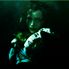
fireinmybonessPOSITIVE VOTES
None.
BEST INTERPRETATION OF THEME
None.
CONSTRUCTIVE VOTES
+ The icon is too dark and the characters difficult to distinguish - at first glance I only saw one. You might want to make these characters brighter, maybe by adding more contrast.
+ I like your use of light and shadows and the black negative space in the background, but Hermione's face seems to be a little overly sharp/pixely and it was a little difficult to make out Bellatrix's face at first.
+ I think this icon would've been better with just Bellatrix in it. I like the mist on the top of the icon and the green colouring on Bellatrix is perfect, but the other person is way too bright and looks out of place.
+ a pretty dark icon, it's difficult to make out the image.
+ The icon is just a little too dark. It also seems oversharpened (most noticeable in the bright areas). A bit lighter & a bit softer would help it a lot. I do like the overall colors, though.
+ While the picture chosen is quite good, Bellatrix is very underexposed and Hermione is very overexposed. In addition, the icon is a bit dark - and Hermione is oversharpened.
ADDITIONAL VOTES
+ Love the fact that you've chosen green for this icon - great way to set the mood. However, the high contrast on...Hermione's (?) face makes it hard to tell what's going on. For one, it's hard for me to recognize her, and also, having her so light and Bellatrix pretty dark kind of makes Bellatrix seem like she's a part of the background. I'm guessing that wasn't your intention, since the knowledge that Bellatrix is torturing Hermione is pretty instrumental to the scene. A bit of work with the lighting would help both of them to be the same brightness, and then they'd both share the icon. Also, the edges of Hermione's face look a bit oversharpened on my monitor, so a little work with a blur tool there would really help.

fulminant8POSITIVE VOTES
+ This colouring is gorgeous! I like the blues in the shadows. My only complaint is that it's a bit too light on her back.
BEST INTERPRETATION OF THEME
+ The cap chosen fits the theme perfectly, as there is one main colour in it, and the colouring makes it even better. I especially like the brightness of the dress, which stil has a shade of blue.
CONSTRUCTIVE VOTES
None.
ADDITIONAL VOTES
+ nice, soft coloring.
+ The colors are pretty but seem a bit 'off' for the picture -- like perhaps a warmer color would've fit better. Also, the front of her shirt is too brightened.
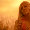
gribouillePOSITIVE VOTES
None.
BEST INTERPRETATION OF THEME
None.
CONSTRUCTIVE VOTES
+ I feel like nothing was done to the icon. If anything, it needs contrast and just a tad of sharpness. Also, it seems like she's squished -- the cap might not have the correct aspect ratio.
+ The use of negative space is lovely, however, it feels like the subject is very hard to see and is slightly oversharpened. In addition, the coloring makes the icon feel a bit flat.
+ I like the crop on your icon, but the colouring really lets it down, in my opinion. First, it's kind of flat - under the warm yellow colour, you can't really see much contrast in the reds of her lips or the dark of her eyes or the pink of her clothing. Bringing that out a bit more would help the icon to feel less flat. Also, the fact that your subject is darker than the rest of the icon means that she's not really the focal point of the icon. My eye is drawn the the bright spot that's at the top in the approximate center rather than to her face. Using gradient layers on soft light is a great way to fix the lighting and shape your viewers' focus.
+ While I really like the orange, sunny tones in this icon, the subject is really dark and a little difficult to make out. Maybe using a screen layer and erasing the background or using a brightness/contrast layer and masking out the parts that are too bright might help.
ADDITIONAL VOTES
+ I really like the coloring on this, but perhaps a bit more lighting on her face would help draw the eye there?
+ I love the crop and coloring, but it could be a tiny bit lighter just to show of the details a bit more.

lwena11POSITIVE VOTES
+++ dramatic crop and nice job on the contrast and coloring.
++ The soft use of the texture accents the icon nicely and the white bits around the subject lets the subject stand out from the background.
+ Your icon doesn't have much variation of hue, but that doesn't matter because of your fantastic use of lighting and contrast. I love the way the lighting complements the camera angle. Great job.
BEST INTERPRETATION OF THEME
None.
CONSTRUCTIVE VOTES
None.
ADDITIONAL VOTES
+ The colouring is good in this but the character is oversharpened and it doesn't fit well with the soft background.
+ very nice choice of cap, I like the angle, and I love the use of the texture in the background, the only problem is that the face of the character is difficult to distinguish, you might want to sharpen it a little. Otherwise, it's a pretty creative icon.

rocketgirl2POSITIVE VOTES
+++ I like your use of duplicated images to really focus my gaze on the Hatter's face, and the red is really well done. The amount of contrast is really great as well.
+ The use of multiple levels is creative without being distracting, and the vibrant coloring is very attractive.
BEST INTERPRETATION OF THEME
None.
CONSTRUCTIVE VOTES
+ The intercutting of the caps, with the focus on the eyes, is brilliant because you could see the emotion on his face. The coloring is a bit intense that it is difficult to make out the small details on the Hatter, perhaps a slight sharpen would help.
+ The idea for the composition is nice but I don't think it works too well with these images, which appear too blurry.
+ I do like the triple image composition, but it seems almost out of order - like it should go from really zoomed in at the bottom, to the top part then the middle part. It would help the composition flow more. But the coloring is lovely - not too saturated which is good because red is one of those colors you don't want to have too bold.
ADDITIONAL VOTES
+ The top image is a bit blurry compared to the middle and bottom ones, but the colouring is nice.
Please feel free to share alternates in the comment below as well as any additional icons made after tweaking based on concrit.
Updated Scoring Spreadsheet
Where were my voters this challenge? You all left me! Was it my bad pun? I bet it was. We have a couple of ties as a result. :P
1ST PLACE [5 points]:

erzsebet with +4 votes (and more first place votes).
2ND PLACE [4 points]:

giulsss with +4 votes.
3RD PLACE [3 points]:

and

wildalyss + lwena11 with +3 votes (and greater overall votes).
BEST CINEMATOGRAPHY [2 points]:

+

wildalyss + erzsebet with +3 votes.
MODS CHOICE [1 point]:
[absolutelybatty]

julie_izumi
[This icon just missed out on placing, and it is too bad because what a wonderful example of flood light! It was an interesting and ambitious color choice that I think is executed really well. It doesn't look over saturated or monochromatic. Instead it is very striking use of yellow and pitch perfect contrast!]
[raiindust]

midnightisclose
[The crop on this icon is stunning, and draws immediate attention to the expression of the characters. The colours are also beautiful. I love how there are variations of yellows and oranges across the icon, so neither overwhelms the icon completely.]
TABLE KEY:
+++ = 1st Place Vote
++ = 2nd Place Vote
+ = 3rd Place Vote | Beginning of a new comment.
Note: Votes are not weighted in this round. Meaning a 1st, 2nd or 3rd vote will only give you 1 point when tallying the votes. Except in the case of a tie - then the icon with the most 1st place votes will be given first.
ICON VOTES

collsPOSITIVE VOTES
None.
BEST INTERPRETATION OF THEME
None.
CONSTRUCTIVE VOTES
+ The composition is a little lopsided, the negative space yellow background is the majority focus of the icon, maybe shifting her a little bit or even zooming in a bit would help balance the icon out.
ADDITIONAL VOTES
+ though the use of yellow and red is very nice, I think the character needs to stand out a bit more, maybe by making her look a bit darker.

arctic_flowerPOSITIVE VOTES
++ Gorgeous crop and choice of colour for this icon!
++ The colors seem to fit with her facial expression, and it looks beautiful.
BEST INTERPRETATION OF THEME
None.
CONSTRUCTIVE VOTES
None.
ADDITIONAL VOTES
+ good crop, I like how the shadow falls across her face.

alice_tripPOSITIVE VOTES
++ The crop and use of texture here really make the icon dramatic. Good use of blue - its not too saturated or overpowering and lets you see the details of the two subjects nicely.
BEST INTERPRETATION OF THEME
None.
CONSTRUCTIVE VOTES
+ The negative space is a creative touch to give the sense of the characters looking upwards. The texture is a bit pixelated on the edge. A soft blur would add a smooth transition into the white.
+ I like the negative space and composition of this icon, but the characters are made somewhat dull by the overlaid texture.
ADDITIONAL VOTES
+ very nice use of texture and colouring, it works out very well. You could make the characters stand out a bit more by brightening them, but it also looks nice like that.

erzsebetPOSITIVE VOTES
+++ Red is always a tricky color to use. The very subtle red gradient is great effect because it plays with the downward perspective on the subject. The faded box is a good use of the negative space and focuses the viewer's eyes on the subject.
+++ The crop and background are very eye catching. I love the lighter red square/rectangle thing that fades into the back. It helps put emphasis on Margot.
+++ I love the way you use the borders to shape your icon. It really adds a lot of depth to it.
++ The texture used in the sides draws the attention well to the subject. The center crop & use of negative space work very favorably.
BEST INTERPRETATION OF THEME
+ No reason given.
+ No reason given.
+ the color flooding isn't just hinted at, it's bold and intentional and doesn't sacrifice the quality of the image.
CONSTRUCTIVE VOTES
None.
ADDITIONAL VOTES
+ The colors in this icon are really beautiful. I love the texture(s?) used. Also, good background removal -- sometimes it can come off as too sharp/obvious looking, but it's nice here.

enrianaPOSITIVE VOTES
+ The lighting and shadows on the wall(?) are perfect because it allows the viewer to focus on the dynamic nature of the subject.
+ The use of negative space is really well done, and good job getting the right amount of contrast.
BEST INTERPRETATION OF THEME
None.
CONSTRUCTIVE VOTES
None.
ADDITIONAL VOTES
+ I love the composition of your icon - the negative space, the geometrical look, etc. I think the lighting and contrast could still use some work, though. For instance, your subject's face is pretty light, and surrounded by all that dark, it looks a bit neon. It's hard to tell what's going on because of that. Her body stands out well against the dark surrounding it, but then when we get up to her arm that's extended above her head (at least, I think that's what's going on there), it almost looks like a part of the background because it's mostly the same colour. I think making all of the background pretty dark would help give the icon a more uniform look, and help your subject to be more identifiable. I think it's River, but I honestly cannot tell. I love where you're going with this, and I think with a bit of work, it could be an awesome icon.

wildalyssPOSITIVE VOTES
+++ Wow this is just amazing! I love how the pink and blue compliment each other and the little blue bars on the top and bottom.
++ Beautiful colouring here. Though I'm usually one of those people who shies away from doing purple skin and such in my icons, you've managed to make it look fantastic, especially because it sets your subject's face apart from the background, while staying the same hue. Good job.
+ nice use of texture in the background, which fits the movie very well. Also nice colouring, all in shades of blue without being "too much".
BEST INTERPRETATION OF THEME
+ Just the right amount of color, contrast, and the texture used on the top & bottom edges draws the attention well to the subject.
+ This icon really feels like it is lit in blues and purples, and is well coloured and well composed.
+ No reason given.
CONSTRUCTIVE VOTES
None.
ADDITIONAL VOTES
None.

giulsssPOSITIVE VOTES
+++ The crop here is just exquisite. It shows just the right amount of each part of the image, draws the eye well, and is very creative. In addition, the yellow coloring is very vibrant and warm.
++ the icon has really great clarity and good lighting.
++ This is an interesting take on the theme, because the colour wasn't the background but more like the prominent colour. It's a very pretty icon and the colouring is lovely.
+ Good choice of yellow and cropping. Really enhances that dramatic feel. Also nice use of contrast/light with the yellow floodlight.
BEST INTERPRETATION OF THEME
+ No reason given.
CONSTRUCTIVE VOTES
None.
ADDITIONAL VOTES
+ I love this icon's cropping and colors. I feel like it doesn't *totally* go with the floodlight theme, though.

dudette_in_townPOSITIVE VOTES
+++ The blues in this icon are so gorgeous; it looks amazing. I also love the cropping.
BEST INTERPRETATION OF THEME
+ No reason given.
CONSTRUCTIVE VOTES
None.
ADDITIONAL VOTES
None.

julie_izumiPOSITIVE VOTES
+++ the colouring is great and works out very well, especially with the contrasting which brings out the girl's features and her dress.
+ a good crop and a good choice of images as her black hair contrasts well with the yellow.
+ I love how perfectly the colors are on this icon. The yellow looks really great.
BEST INTERPRETATION OF THEME
None.
CONSTRUCTIVE VOTES
+ Your icon looks a bit flat at the moment. I know it's hard to get a lot of contrast and depth with a theme like this (especially if it's not something you normally do), but building contrast is super important. Basically, it's a good idea to do a lot of work with your colours to get the reds to really be separate from the blues, and to make a lot of light/dark contrast. It's almost one of those things where you can go overboard on the base before you add the layer that makes your icon bright yellow. I love your crop on this one, though!
ADDITIONAL VOTES
None.

midnightisclosePOSITIVE VOTES
++ I love the close crop and the colouring, especially the use of red, it makes this icon unique.
BEST INTERPRETATION OF THEME
None.
CONSTRUCTIVE VOTES
+ I love this crop. Usually icons that crop off at the bottom of the mouth look off but it looks great here. My only complaint is that the colouring doesn't flatter the icon, the yellow is too dark and murky. I'd suggest brightening it up.
ADDITIONAL VOTES
None.

fireinmybonessPOSITIVE VOTES
None.
BEST INTERPRETATION OF THEME
None.
CONSTRUCTIVE VOTES
+ The icon is too dark and the characters difficult to distinguish - at first glance I only saw one. You might want to make these characters brighter, maybe by adding more contrast.
+ I like your use of light and shadows and the black negative space in the background, but Hermione's face seems to be a little overly sharp/pixely and it was a little difficult to make out Bellatrix's face at first.
+ I think this icon would've been better with just Bellatrix in it. I like the mist on the top of the icon and the green colouring on Bellatrix is perfect, but the other person is way too bright and looks out of place.
+ a pretty dark icon, it's difficult to make out the image.
+ The icon is just a little too dark. It also seems oversharpened (most noticeable in the bright areas). A bit lighter & a bit softer would help it a lot. I do like the overall colors, though.
+ While the picture chosen is quite good, Bellatrix is very underexposed and Hermione is very overexposed. In addition, the icon is a bit dark - and Hermione is oversharpened.
ADDITIONAL VOTES
+ Love the fact that you've chosen green for this icon - great way to set the mood. However, the high contrast on...Hermione's (?) face makes it hard to tell what's going on. For one, it's hard for me to recognize her, and also, having her so light and Bellatrix pretty dark kind of makes Bellatrix seem like she's a part of the background. I'm guessing that wasn't your intention, since the knowledge that Bellatrix is torturing Hermione is pretty instrumental to the scene. A bit of work with the lighting would help both of them to be the same brightness, and then they'd both share the icon. Also, the edges of Hermione's face look a bit oversharpened on my monitor, so a little work with a blur tool there would really help.

fulminant8POSITIVE VOTES
+ This colouring is gorgeous! I like the blues in the shadows. My only complaint is that it's a bit too light on her back.
BEST INTERPRETATION OF THEME
+ The cap chosen fits the theme perfectly, as there is one main colour in it, and the colouring makes it even better. I especially like the brightness of the dress, which stil has a shade of blue.
CONSTRUCTIVE VOTES
None.
ADDITIONAL VOTES
+ nice, soft coloring.
+ The colors are pretty but seem a bit 'off' for the picture -- like perhaps a warmer color would've fit better. Also, the front of her shirt is too brightened.
gribouillePOSITIVE VOTES
None.
BEST INTERPRETATION OF THEME
None.
CONSTRUCTIVE VOTES
+ I feel like nothing was done to the icon. If anything, it needs contrast and just a tad of sharpness. Also, it seems like she's squished -- the cap might not have the correct aspect ratio.
+ The use of negative space is lovely, however, it feels like the subject is very hard to see and is slightly oversharpened. In addition, the coloring makes the icon feel a bit flat.
+ I like the crop on your icon, but the colouring really lets it down, in my opinion. First, it's kind of flat - under the warm yellow colour, you can't really see much contrast in the reds of her lips or the dark of her eyes or the pink of her clothing. Bringing that out a bit more would help the icon to feel less flat. Also, the fact that your subject is darker than the rest of the icon means that she's not really the focal point of the icon. My eye is drawn the the bright spot that's at the top in the approximate center rather than to her face. Using gradient layers on soft light is a great way to fix the lighting and shape your viewers' focus.
+ While I really like the orange, sunny tones in this icon, the subject is really dark and a little difficult to make out. Maybe using a screen layer and erasing the background or using a brightness/contrast layer and masking out the parts that are too bright might help.
ADDITIONAL VOTES
+ I really like the coloring on this, but perhaps a bit more lighting on her face would help draw the eye there?
+ I love the crop and coloring, but it could be a tiny bit lighter just to show of the details a bit more.

lwena11POSITIVE VOTES
+++ dramatic crop and nice job on the contrast and coloring.
++ The soft use of the texture accents the icon nicely and the white bits around the subject lets the subject stand out from the background.
+ Your icon doesn't have much variation of hue, but that doesn't matter because of your fantastic use of lighting and contrast. I love the way the lighting complements the camera angle. Great job.
BEST INTERPRETATION OF THEME
None.
CONSTRUCTIVE VOTES
None.
ADDITIONAL VOTES
+ The colouring is good in this but the character is oversharpened and it doesn't fit well with the soft background.
+ very nice choice of cap, I like the angle, and I love the use of the texture in the background, the only problem is that the face of the character is difficult to distinguish, you might want to sharpen it a little. Otherwise, it's a pretty creative icon.

rocketgirl2POSITIVE VOTES
+++ I like your use of duplicated images to really focus my gaze on the Hatter's face, and the red is really well done. The amount of contrast is really great as well.
+ The use of multiple levels is creative without being distracting, and the vibrant coloring is very attractive.
BEST INTERPRETATION OF THEME
None.
CONSTRUCTIVE VOTES
+ The intercutting of the caps, with the focus on the eyes, is brilliant because you could see the emotion on his face. The coloring is a bit intense that it is difficult to make out the small details on the Hatter, perhaps a slight sharpen would help.
+ The idea for the composition is nice but I don't think it works too well with these images, which appear too blurry.
+ I do like the triple image composition, but it seems almost out of order - like it should go from really zoomed in at the bottom, to the top part then the middle part. It would help the composition flow more. But the coloring is lovely - not too saturated which is good because red is one of those colors you don't want to have too bold.
ADDITIONAL VOTES
+ The top image is a bit blurry compared to the middle and bottom ones, but the colouring is nice.
Please feel free to share alternates in the comment below as well as any additional icons made after tweaking based on concrit.
Updated Scoring Spreadsheet