Tutorial 4: Magic Knight Rayearth
I haven't posted a tutorial in a while, so here's a simple way to color requested by laury_kos.

-->
and
-->
I use PSP 7 but this is easily translatable.
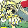
1. I haven't tried this out with a variety of images, but I used this technique for an entire batch of Magic Knight Rayearth icons here. Different colors respond very differently, so keep an eye on your settings and just pick and crop a base you like.
Here's mine:
and
2. Next, we add two light textures by silverqe and set them both to Screen 100 on top of the base. I always put the purplish-blue one on the bottom and the greeny-yellow one on top of that, but you don't always have to. (Note: I rotated the greeny-yellow one 90 degrees to the left from what it was originally and have put it here in its rotated state)

+
-->
and
3. They look faded and generally pretty bad right now, don't they? Take the opportunity to erase some of the lights away from places you don't want them. (You might want to do this step later as a finishing touch instead of now if you aren't sure what parts you want to erase just yet.)
Never erase with a hard setting; you might want to set the opacity to something like 40% and the hardness to about 60% to make it gently fade away. Otherwise, the layer in step 6 will make your coloring look bizarre. A little goes a long way, here. ^^

and
4. Create a new layer on top and fill it with #000F3D. Set to Exclusion 100.

and
5. Duplicate the base and bring it to the top, setting it to Soft Light 100.

and
6. Create a Hue/Saturation adjustment layer and set Saturation to 30. This really brings out the colors, so you can adjust it as need be. I always use 30, myself.

and
7. Create a new Exclusion layer and fill it with the hideous shade of #0040FF. Set that to 30 to tone it waaay down.

and
8. Duplicate the base and bring it to the top again. Set it to Screen and set it to somewhere around 50. This will lighten up really dark images and enhance the dark parts of lighter images. I usually set mine at about 53.

and
9. Duplicate the base and bring it to the top yet again. Desaturate it completely and set it to Overlay. The opacity really depends on the image you use, so experiment to see what looks best. For my examples, Hikaru (the pink girl) was set to 75 and Fuu (the green and yellow girl) was set to 100.

and
10. You can stop now and enjoy your results but if you think your icon is a little too bright, you might want to darken it up a bit. I did it by duplicating the base and setting it to Multiply right above it. How much you want it darkened is entirely up to you, so feel free to fiddle around with it however much you like. In my examples, Hikaru didn't need this step and Fuu was set to 100.
and
If you have any questions or comments, feel free to ask away. And if you make anything, I'd love to see it. :D
-->
and
-->
I use PSP 7 but this is easily translatable.
1. I haven't tried this out with a variety of images, but I used this technique for an entire batch of Magic Knight Rayearth icons here. Different colors respond very differently, so keep an eye on your settings and just pick and crop a base you like.
Here's mine:
and
2. Next, we add two light textures by silverqe and set them both to Screen 100 on top of the base. I always put the purplish-blue one on the bottom and the greeny-yellow one on top of that, but you don't always have to. (Note: I rotated the greeny-yellow one 90 degrees to the left from what it was originally and have put it here in its rotated state)
+
-->
and
3. They look faded and generally pretty bad right now, don't they? Take the opportunity to erase some of the lights away from places you don't want them. (You might want to do this step later as a finishing touch instead of now if you aren't sure what parts you want to erase just yet.)
Never erase with a hard setting; you might want to set the opacity to something like 40% and the hardness to about 60% to make it gently fade away. Otherwise, the layer in step 6 will make your coloring look bizarre. A little goes a long way, here. ^^
and
4. Create a new layer on top and fill it with #000F3D. Set to Exclusion 100.
and
5. Duplicate the base and bring it to the top, setting it to Soft Light 100.
and
6. Create a Hue/Saturation adjustment layer and set Saturation to 30. This really brings out the colors, so you can adjust it as need be. I always use 30, myself.
and
7. Create a new Exclusion layer and fill it with the hideous shade of #0040FF. Set that to 30 to tone it waaay down.
and
8. Duplicate the base and bring it to the top again. Set it to Screen and set it to somewhere around 50. This will lighten up really dark images and enhance the dark parts of lighter images. I usually set mine at about 53.
and
9. Duplicate the base and bring it to the top yet again. Desaturate it completely and set it to Overlay. The opacity really depends on the image you use, so experiment to see what looks best. For my examples, Hikaru (the pink girl) was set to 75 and Fuu (the green and yellow girl) was set to 100.
and
10. You can stop now and enjoy your results but if you think your icon is a little too bright, you might want to darken it up a bit. I did it by duplicating the base and setting it to Multiply right above it. How much you want it darkened is entirely up to you, so feel free to fiddle around with it however much you like. In my examples, Hikaru didn't need this step and Fuu was set to 100.
and
If you have any questions or comments, feel free to ask away. And if you make anything, I'd love to see it. :D