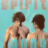
2017 icon remakes
bestof_icons challenged everyone to remake some icons again, and this time I got so many (I was the first commenter on the remakes post, oops :)) I couldn't do them all. My thread is here.
Also, some people chose icons I really love and didn't want to remake, so I compromised and did two out of every three that people chose for me. Plus, as usual, I chose three icons for myself. The first in the row is always the old one, the next one the fave remake, the other ones are alts.
Teasers:
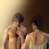
xafirah picked:

->

->
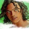
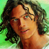
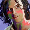
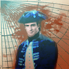
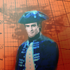
1) I really like the original Finn icon, and it's my favorite color, too. So I decided to go for the exact opposite and came up with a flat version in complementary colors. I chose a different cap since the other one was so LQ I couldn't get his face to look sharper with a closer crop. 2) The second one, Kiss!Silver, was an experiment in skin painting (a la longerthanwedo). I still love the idea but the execution in this icon left a lot to be desired. I decided to try a more subtle painted approach in the remake, and I really like how it came out.
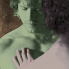
naginis picked:

->

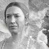
->
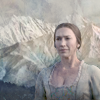
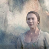
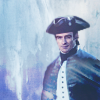
->
1) The Timeless cap was so blurry that I hated everything I tried in the remake. Apparently a monochrome bright is all that works with it. ;) In the end, I went for a different style and a different cap. I couldn't figure out what text to add, so it looks a little unfinished. *shrug* 2) The original Miranda icon was ugly, but I love her beige dress, so I stuck with muted coloring for the remake. I'm experimenting with fake scenery a lot these days, and that's the version of the remake I like best. The painted-background version is nice, too ;), but the scenery just always adds great depth. 3) The James icon was another good pick, I didn't like how the paint textures clashed in the original version. So I decided to remake this in another painted style - and failed (no example of this here, it sucked so bad). In the end, I added some nautical textures in a contrasting color, which works much better than the original. I think I overdid it on the lighting, though, he looks too washed out now. I think I could have done better.
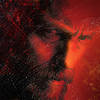
afastmachine picked:

->

->
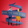

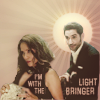
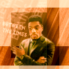
Two Lucifer icons! 1) The first one was from a provided cap for a challenge, and I find it looks splotchy and LQ. A very good pick for a remake! I decided to use the whole cap this time, and I really love how it came out. 2) The one on the beach is one I really like (and got a lot of positive feedback for), so it was a lot harder to remake. It is one of my fave scenes, though, so there can never be too many icons of it. ;) I decided to show the meddling by Lucifer's father as a theme, which is why I chose a bold ribbon texture. The text on the blue one says (mixed up) "made for each other - in nomine patris". I really like how that came out, even though it doesn't have the beach scene anymore, which I'd really wanted to keep. But it was too complex and looked ugly with it. The alt is better but doesn't have the meaning. Hmpf. I want to eat my cake and have it, too. :)
novindalf picked:

->
->
1) I like the grungy paint look of the original Marcus, but I thought I could bring his features out better in the remake. I don't think I succeeded. The remake looks a little too full to have a good impact. Oh, well, I tried. 2) The outlander icon is from my (and everyone's) favorite scene, and I think it brought across the tentative emotions of it really well. I tried to get that same effect with false colors, and am pretty happy with the result. The mood is completely different, but I like it. The second one is from a different cap in that same scene that sidetracked me until I made it into another icon. Oops. :)
tturners picked:
->

->
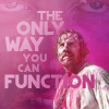
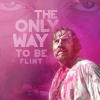
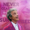
1) The first one is "spooky" Flint from a Halloween challenge. I really like him, so I decided not to redo the cap but try to produce the same style with a different cap. I really like how that came out. Don't they look spooky together? :) 2) The Doctor Who icon was made for a battle, and was imho the best icon I made for that battle, so I was reluctant to redo it in a different style. Instead, just like the first pick, I decided to redo the same style with a different character. I like the text on the alt better, but it just doesn't flow as well in the composition as the first one. Also, Flint in pink is hilarious for some reason. :D
luminousdaze picked:

->


->
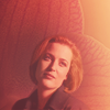
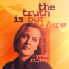
1) Another one that only looked good in bright monochrome. :) I couldn't really make it look better in the remake, even though I completely recolored everything. I like how the blocked alt of it came out. But I really love the attempt I made with a different cap from the same scene. This is exactly how I feel about Sleepy Hollow. *sigh* 2) The Scully icon was made for a rumble and involved in incredible amount of work. I decided I liked the cap and crop and just went for a remake that brings out her beauty. It's much simpler than the original, but I like it.
I picked these:
->


->
->

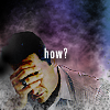
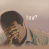
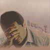
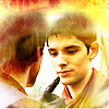
I decided to pick active user icons that I like to use but are no longer "up to my standards" ;) 1) The first one is my default icon, and has been for a decade. I have been dithering about remaking it for a while now. The text is completely unreadable - on purpose, but still, it sucks - and the textures obscure way too much of the subject. So I tried different things, and all those crops are lovely, but I really didn't want such a big change after all, so in the end I just took the old psd and threw out all the textures and redid the coloring and text. I really like the result, and it's been my new default icon for a few weeks already now. 2) I still love that season of Grimm, my most fannish involvement in the show was when Renard was plagued by the love spell. I still use it a lot, because a headdesk icon is always useful. :) It's just that it's way oversharpened and the texture is too busy. So I remade it in a calmer-looking way. The muted colors might be a bit too unemotional for me, in hindsight, but I can always remake it again if I find it doesn't work for me. 3) Last but not least, I wanted to remake one of my bright yellow Merlin icons. This is the one I use most often, and it's a mess. I am not sure the remakes turned out exactly the way I wanted, but at least they're cleaner. I chose a slightly different cap because I like the eye contact in this one. And now it's at least possible to tell that Merlin is smiling at Arthur poking him in the face. :)
As usual, I loved this activity. Most of the remakes turned out well. There are a few I am not happy with, but others that I really like. All comments welcome, and concrit, too. Check out my resource post if you are looking for the makers whose textures and brushes I use.
On to new challenges! :D
Previous icon posts:


x-posted from dw (comments:
)
Also, some people chose icons I really love and didn't want to remake, so I compromised and did two out of every three that people chose for me. Plus, as usual, I chose three icons for myself. The first in the row is always the old one, the next one the fave remake, the other ones are alts.
Teasers:
xafirah picked:
->
->
1) I really like the original Finn icon, and it's my favorite color, too. So I decided to go for the exact opposite and came up with a flat version in complementary colors. I chose a different cap since the other one was so LQ I couldn't get his face to look sharper with a closer crop. 2) The second one, Kiss!Silver, was an experiment in skin painting (a la longerthanwedo). I still love the idea but the execution in this icon left a lot to be desired. I decided to try a more subtle painted approach in the remake, and I really like how it came out.
naginis picked:
->
->
->
1) The Timeless cap was so blurry that I hated everything I tried in the remake. Apparently a monochrome bright is all that works with it. ;) In the end, I went for a different style and a different cap. I couldn't figure out what text to add, so it looks a little unfinished. *shrug* 2) The original Miranda icon was ugly, but I love her beige dress, so I stuck with muted coloring for the remake. I'm experimenting with fake scenery a lot these days, and that's the version of the remake I like best. The painted-background version is nice, too ;), but the scenery just always adds great depth. 3) The James icon was another good pick, I didn't like how the paint textures clashed in the original version. So I decided to remake this in another painted style - and failed (no example of this here, it sucked so bad). In the end, I added some nautical textures in a contrasting color, which works much better than the original. I think I overdid it on the lighting, though, he looks too washed out now. I think I could have done better.
afastmachine picked:
->
->
Two Lucifer icons! 1) The first one was from a provided cap for a challenge, and I find it looks splotchy and LQ. A very good pick for a remake! I decided to use the whole cap this time, and I really love how it came out. 2) The one on the beach is one I really like (and got a lot of positive feedback for), so it was a lot harder to remake. It is one of my fave scenes, though, so there can never be too many icons of it. ;) I decided to show the meddling by Lucifer's father as a theme, which is why I chose a bold ribbon texture. The text on the blue one says (mixed up) "made for each other - in nomine patris". I really like how that came out, even though it doesn't have the beach scene anymore, which I'd really wanted to keep. But it was too complex and looked ugly with it. The alt is better but doesn't have the meaning. Hmpf. I want to eat my cake and have it, too. :)
novindalf picked:
->
->
1) I like the grungy paint look of the original Marcus, but I thought I could bring his features out better in the remake. I don't think I succeeded. The remake looks a little too full to have a good impact. Oh, well, I tried. 2) The outlander icon is from my (and everyone's) favorite scene, and I think it brought across the tentative emotions of it really well. I tried to get that same effect with false colors, and am pretty happy with the result. The mood is completely different, but I like it. The second one is from a different cap in that same scene that sidetracked me until I made it into another icon. Oops. :)
tturners picked:
->
->
1) The first one is "spooky" Flint from a Halloween challenge. I really like him, so I decided not to redo the cap but try to produce the same style with a different cap. I really like how that came out. Don't they look spooky together? :) 2) The Doctor Who icon was made for a battle, and was imho the best icon I made for that battle, so I was reluctant to redo it in a different style. Instead, just like the first pick, I decided to redo the same style with a different character. I like the text on the alt better, but it just doesn't flow as well in the composition as the first one. Also, Flint in pink is hilarious for some reason. :D
luminousdaze picked:
->
->
1) Another one that only looked good in bright monochrome. :) I couldn't really make it look better in the remake, even though I completely recolored everything. I like how the blocked alt of it came out. But I really love the attempt I made with a different cap from the same scene. This is exactly how I feel about Sleepy Hollow. *sigh* 2) The Scully icon was made for a rumble and involved in incredible amount of work. I decided I liked the cap and crop and just went for a remake that brings out her beauty. It's much simpler than the original, but I like it.
I picked these:
->
->
->
I decided to pick active user icons that I like to use but are no longer "up to my standards" ;) 1) The first one is my default icon, and has been for a decade. I have been dithering about remaking it for a while now. The text is completely unreadable - on purpose, but still, it sucks - and the textures obscure way too much of the subject. So I tried different things, and all those crops are lovely, but I really didn't want such a big change after all, so in the end I just took the old psd and threw out all the textures and redid the coloring and text. I really like the result, and it's been my new default icon for a few weeks already now. 2) I still love that season of Grimm, my most fannish involvement in the show was when Renard was plagued by the love spell. I still use it a lot, because a headdesk icon is always useful. :) It's just that it's way oversharpened and the texture is too busy. So I remade it in a calmer-looking way. The muted colors might be a bit too unemotional for me, in hindsight, but I can always remake it again if I find it doesn't work for me. 3) Last but not least, I wanted to remake one of my bright yellow Merlin icons. This is the one I use most often, and it's a mess. I am not sure the remakes turned out exactly the way I wanted, but at least they're cleaner. I chose a slightly different cap because I like the eye contact in this one. And now it's at least possible to tell that Merlin is smiling at Arthur poking him in the face. :)
As usual, I loved this activity. Most of the remakes turned out well. There are a few I am not happy with, but others that I really like. All comments welcome, and concrit, too. Check out my resource post if you are looking for the makers whose textures and brushes I use.
On to new challenges! :D
Previous icon posts:
x-posted from dw (comments:
)