Ask the Maker - Coloring Guide

I decided to try my hand at participating in the Ask the Maker event this year, and this is my attempt at a coloring/vibrance guide. Guide requested by

adriftingsea. I have never written a guide before, so please bear with me.
If you have any further questions about specific coloring in icons or such, leave a comment and I can include.

Made in Photshop CS6. Some techniques may be exclusive to this version of PS.
[Coloring guide...]
The first two questions I usually ask going into an icon are What blending am I going to do? and What color do I want it to be?
I am a big fan of fake background icons with cut-out subjects and textured/gradiant colored backdrops. I also like to add text to these set-ups to spice it up. Like in this icon:

Usually when deciding colors for the background I always choose a color present in the subject. In Gwaine's case it was either Silver, Red, or Yellow. Silver felt too bland, Red would be too much; so I picked yellow. I added a yellow fill layer and applied a black and white gradiant over the top so it would not be flat. This picking of the background color sets the stage for the coloring you will do later. You can use your background color as a guide to recoloring textures. This background color you choose is also the color that generally is prominent in the entire icon.
So you have finished the blending in your icon. What about the color/vibrance?

The first thing I almost always do to my icons once I have finished blending and adding the desired textues to the background, is add a Vibrance layer. (Layer ---> New Adjustment Layer ---> Vibrance. Looks like this.). Vibrance is an adjustment exclusive to PS, as far as I know, and is one of my favorite additions. It simply makes the existing colors richer, much like Saturation, but without the intensity that Satuarion often brings. I generaly set my Vibrance up close to +80. But it highly depends on the icon. I like rich colored icons.
Adding Vibrance makes it look like this:

My coloring also goes hand-and-hand with lighting and textures. My favorite texture to use for coloring and lighting is this one by talipuu. It is present in almost all of my icons. One of my favorite things to do is change its color to add hue and lighting appropriate to my icon. For this icon, I change the texture, using the Hue/Saturation tool, to look like this. The light yellow will help add yellow glow around the outside and add to the overall yellow color of the icon. The texture will also either significantly darken the icon if set to Soft Light, while still giving color, or significantly brighten it if set to Screen.
I usually change the color of that texture to one that fits the icon then set it to Soft Light; duplicate it and set to Screen 100%; then duplicate it a third time, flip the texture to make sure both sides of the icon get glow equally, and set it to Screen 100% again. This adds contrast, light, and color.

I use the above formula for that texture very often. You can change the amount of times you duplicate it, change the hue you want it to be, etc while getting colorful and lightastic results.
(Note: If you have a problem with that texture brightening only one side of the icon too much, try using your transform tool to pull the some of the light out of your canvas. You can equalize how that texture brightens by transforming until it looks something like this.)
This icon brings me to a third technique I use less often for coloring, but is also very useful.
What if my icon is rich in color, but doesn't have enough of the color I want?
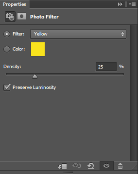
This can be a problem when you have a subject whose skin turns too pink, to brown, to yellow (etc.) and doesn't completely flow with or match your desired overall coloring. One way I add color and help with this, is by using a Photo Filter. (Layer ---> New Adjustment Layer ---> Photo Filter. Looks like this.) I keep preserve luminosity checked, and then pick whether I want a warming/cooling filter, or a specific color filter using the drop down box. Select your color and it will appear in that small square. For this icon I chose yellow. This will add a yellow feel to your entire icon.

Photo filters work the same with any color you use. They add color and can help direct the hue of your icon to what you want it to be.
What are other coloring techniques can you use?
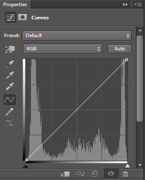
A color technique I use frequently is Curves. (Layer ---> New Adjustment Layer ---> Curves. Looks like this.) The RGB tab will change the lighting, depending on how you curve the line. The Red tab will either add or take away red color depending on if you bend the line up (more red) or down (less red.) The Green with add or take away green, and the blue the same.
This Ironman icon was too bright and too yellow.

The prompt was orange, and I was at a loss for how to make it more orange and darken it. I added a Curves layer. I bent the Red up, the Green down, and the Blue down. This added more red, more magenta, and more yellow. I then set the layer to Soft Light around 50%. And viola!

So, adding Curves can brighten/darken your image (bending the RGB line), or influence your amounts of Red, Green, and Blue, depending on the colors you want for your icon, in each respective tab. You can then set Curves layers to screen or soft light, to make brightness with colors or make contrast with colors.
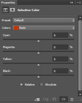
One more technique you can use is the Selective Color. This allows you to very selectively choose colors to increase, decrease, and intensify.
The prompt for this icon was pink.

After using Curves to brighten, generously using the texture I previously mentioned to drastically increase light and color, it looked nice. It was pink. But because I was trying to make the icon match a specifc pink shade, I needed more pink. So I added a Selective Color layer. (Layer ---> New Adjustment Layer ---> Selective Color. Looks like this.) Keeping Relative checked, I selected the Red tab from the drop down box. Then I used the slider to increase the Magenta (+59) and decrease the Yellow (-83). This yielded this result:

Much more pink.
Selective Color can be used on any icon in that manner. If you want to get really detailed in extracting certain shades of various colors and increasing others, Selective Color is for you. You could do the same in the Cyans tab, or the Yellows tab. It just depends on what color you want to extract, intensify, or change.
Last but not least, any textures you use for coloring?
Except

by talipuu, no. But here are some textures I do use on occasion and can be used for coloring and lighting:
Unknown| innocent_lexys x 2 | Unknown


Unknown x 2

