Tutorial #01 - Color Enhancing
First tutorial, and first post with mild value. Woot.
From: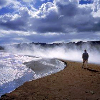
to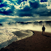
Level: Beginner, just need to know basics about layers.
<< Image heavy >>
First, I took this image from Getty Images. Cropped it, did an unsharp mask. Now, onto the coloring!
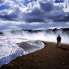
1. Duplicate the base, and desaturate it. Set to Soft Light 100%.
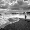
>>
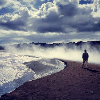
2. Looking a tad colorless... Create a new layer above the base layer [Under the soft light layer], and flood fill with #0b0e49, or a dark, navy blue color. Set to Exclusion 100%.

>>
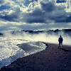
3. Yeah, it's definitely looking faded. Just to sharpen it up a bit, make a new layer and flood fill with #e9f9f9, or a light blue layer. Set to Burn 100%

>>
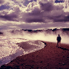
4. It's kinda blue. Blue is cool, but not enough. Flood fill a new layer with #ff382f, or a pale red. Set to soft light, 61% or so.

>>
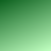
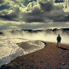
5. Now for a couple gradients, to enhance the color. 'Cause we can't just leave it red now, can we? New layer, fill with Duotone Green [Comes with PSP]. Set to Soft Light, 100%. I rotated the gradient to a 337 degrees angle.
>>
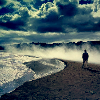
6. Ehh, it's looking washed out. Add a new layer, fill with Duotone Light Blue [Also comes w/ PSP], set on Burn 100%.

>>
7. Allllmost done. New layer, flood filled with Duotone Brown [YET ANOTHER PSP Grad.], set on overlay 100%.
>>
AND YOU'RE DONE! At least, with the coloring. Now, you can add text, borders, brushes, whatever you fancy. 'Tis your icon!
Now remember, no need to follow these instructions exactly. Experiment a little, as it's different with every picture. You never know how it might turn out. If you experiment around, I'd love to see what you come up with :] And don't heisitate to ask questions, of course.
From:
to
Level: Beginner, just need to know basics about layers.
<< Image heavy >>
First, I took this image from Getty Images. Cropped it, did an unsharp mask. Now, onto the coloring!
1. Duplicate the base, and desaturate it. Set to Soft Light 100%.
>>
2. Looking a tad colorless... Create a new layer above the base layer [Under the soft light layer], and flood fill with #0b0e49, or a dark, navy blue color. Set to Exclusion 100%.
>>
3. Yeah, it's definitely looking faded. Just to sharpen it up a bit, make a new layer and flood fill with #e9f9f9, or a light blue layer. Set to Burn 100%
>>
4. It's kinda blue. Blue is cool, but not enough. Flood fill a new layer with #ff382f, or a pale red. Set to soft light, 61% or so.
>>
5. Now for a couple gradients, to enhance the color. 'Cause we can't just leave it red now, can we? New layer, fill with Duotone Green [Comes with PSP]. Set to Soft Light, 100%. I rotated the gradient to a 337 degrees angle.
>>
6. Ehh, it's looking washed out. Add a new layer, fill with Duotone Light Blue [Also comes w/ PSP], set on Burn 100%.
>>
7. Allllmost done. New layer, flood filled with Duotone Brown [YET ANOTHER PSP Grad.], set on overlay 100%.
>>
AND YOU'RE DONE! At least, with the coloring. Now, you can add text, borders, brushes, whatever you fancy. 'Tis your icon!
Now remember, no need to follow these instructions exactly. Experiment a little, as it's different with every picture. You never know how it might turn out. If you experiment around, I'd love to see what you come up with :] And don't heisitate to ask questions, of course.