Icon Tutorial PS: Textures and Cropping
reposted from my journal
We will be going from this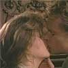
to this
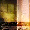
First we start off with this utra cool texture by
incripacu:
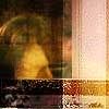
I add a crop proportion of the base, set it to Hard Light and end up with this:
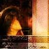
However you can't really see Nick and Nat, so I duplicate the crop pic two times. The first I set to HARD LIGHT and the second to SOFT LIGHT. Now I have this:
Then I add a close up of the two cropped and pasted to the right with HARD LIGHT setting:
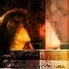
But again can't see them well enough so I duplicate the picture and set it to OVERLAY and get this (sorry if I'm getting boring, but I want to be as clear as possible):
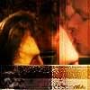
Now at the bottom I add another close up, pasted it, setting to HARD LIGHT and DUPLICATED (still with HARD LIGHT) it. Even though you can't really see the picture, it gives the icon a cool effect:
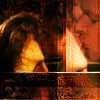
I'm feeling that the color is too much so I get the texture once more and paste it to the very top and set it to SATURATION:
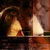
Now I add a text brush by
miggy in the color of #B88A5A and we have our end product:

Please leave any questions, comments, suggestions! They mean a lot to me. :)
We will be going from this

to this

First we start off with this utra cool texture by

incripacu:

I add a crop proportion of the base, set it to Hard Light and end up with this:

However you can't really see Nick and Nat, so I duplicate the crop pic two times. The first I set to HARD LIGHT and the second to SOFT LIGHT. Now I have this:

Then I add a close up of the two cropped and pasted to the right with HARD LIGHT setting:

But again can't see them well enough so I duplicate the picture and set it to OVERLAY and get this (sorry if I'm getting boring, but I want to be as clear as possible):

Now at the bottom I add another close up, pasted it, setting to HARD LIGHT and DUPLICATED (still with HARD LIGHT) it. Even though you can't really see the picture, it gives the icon a cool effect:

I'm feeling that the color is too much so I get the texture once more and paste it to the very top and set it to SATURATION:

Now I add a text brush by

miggy in the color of #B88A5A and we have our end product:

Please leave any questions, comments, suggestions! They mean a lot to me. :)