[4] - Great Expectations icons

Aug 02, 2012 16:30

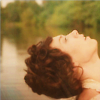
This miniseries was so pretty but very, very dark. I've tried to pick the lightest things and played around with light blob textures a bit. I hope you enjoy!

[20] Great Expectations (2011) icons
[1] Friends Only Banner


Read more... )

miniseries: great expectations 2011, !icons, !fo banners

Leave a comment

Comments 6

litlover12 August 3 2012, 02:51:33 UTC
They're beautiful! I especially like the Herbert ones. :-)

There are new pictures out from the forthcoming "GE" feature film. I think Pip looks rather steampunk in them!

http://blogs.indiewire.com/theplaylist/new-images-of-ralph-fiennes-helena-bonham-carter-in-great-expectations-20120802#

Reply

msantimacassar August 3 2012, 03:13:57 UTC
Thank you so much! Herbert is my favorite!

Hmm, those are very cool! And I agree, definitely steampunk - especially, I think, Estella's hairstyle. I'm very intrigued to see this version now!

Reply


birdienl August 3 2012, 10:13:18 UTC
Lovely icons again! My favourites are 4 and 5. I'm working on the GE caps as well and I agree, most of them are very dark.

Reply

msantimacassar August 3 2012, 22:14:11 UTC
Thank you very much! Especially for naming your favorites :D I'm glad I'm not the only one who struggled with them!

Reply

birdienl August 6 2012, 09:46:10 UTC
I don't know if you're working with Photoshop or another program, but what I always find works very well with dark caps is adjusting the Levels (in Photoshop)

Reply

msantimacassar August 6 2012, 17:46:52 UTC
Sadly, I use Gimp. I have been using Screen layers which help a lot.

Reply


Leave a comment

Up