First Tutorial
Today we are going to make this icon: 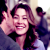
>>
Made in PSP 8. Fairly simple. Definitely translatable.
Take your cap and crop it into a 100 x 100 base. If it needs sharpening, go for it. This was my base:
Duplicate your base, set it to screen, and set the opacity to 50.
Make a new raster layer and fill it with #0B1149. Set to exclusion.
Duplicate that layer, and set it to screen. For this particular icon I have the opacity at 80, but you can adjust it to whatever works for you at the end.
Make a new raster layer and fill it with #EBB567. Set to soft light. 100, but can be adjusted later if the image is too orangey.
Make a new raster layer and fill it with #FFA9A9.
Duplicate your original base, bring it to the top. Set it to overlay. For this particular icon, I left it at 100. You may want to adjust it accordingly.
Make a new raster layer and fill it with #AEDAFC. Set it to (color) burn. Again, you can adjust the opacity.
For this particular icon, I felt it needed a little more..something, so I duplicated my last layer, the #AEDAFC layer.
That leaves you with this:

Now if you want to go a step further, than add this border.

I lost who it's by, so if anybody knows, let me so I can credit.
This works best with slightly green or blue images as opposed to yellow or reddish ones. Also, for some icons (if you have PSP 8 or higher), a One Step Photo Fix Layer works better for step 2, instead of a screen layer.
Other examples:
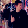
This base was somewhat dark.
I used a One Step Photo Fix layer at 50 instead of a Screen layer. My exclusion, screen, orange and pink softlight layers, and the overlay base layer were all at 80. My blue aedafc layer was at 78. I then added a copy of the One Step Photo Fix layer at at 50 at screen and one more blue layer at 40 at burn.
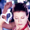
This wasn't the original icon I had made using a similar style of coloring, but the closet I could get.
base:
This icon has the base duplicated, screen, 50, both exclusion and screen layers are also at 50. The orange softlight layer has been skipped in this case, and the pink softlight layer is at 100. The overlay layer of the base is at 70, the blue aedafc layer is at burn at 50. There is one more layer, the base on screen at 100.

I then placed this brush, by me. (talifiney or swordpoker)
Plese do not duplicate the exact icons. If you have any questions, ask.

>>

Made in PSP 8. Fairly simple. Definitely translatable.
Take your cap and crop it into a 100 x 100 base. If it needs sharpening, go for it. This was my base:

Duplicate your base, set it to screen, and set the opacity to 50.
Make a new raster layer and fill it with #0B1149. Set to exclusion.
Duplicate that layer, and set it to screen. For this particular icon I have the opacity at 80, but you can adjust it to whatever works for you at the end.
Make a new raster layer and fill it with #EBB567. Set to soft light. 100, but can be adjusted later if the image is too orangey.
Make a new raster layer and fill it with #FFA9A9.
Duplicate your original base, bring it to the top. Set it to overlay. For this particular icon, I left it at 100. You may want to adjust it accordingly.
Make a new raster layer and fill it with #AEDAFC. Set it to (color) burn. Again, you can adjust the opacity.
For this particular icon, I felt it needed a little more..something, so I duplicated my last layer, the #AEDAFC layer.
That leaves you with this:

Now if you want to go a step further, than add this border.

I lost who it's by, so if anybody knows, let me so I can credit.
This works best with slightly green or blue images as opposed to yellow or reddish ones. Also, for some icons (if you have PSP 8 or higher), a One Step Photo Fix Layer works better for step 2, instead of a screen layer.
Other examples:

This base was somewhat dark.

I used a One Step Photo Fix layer at 50 instead of a Screen layer. My exclusion, screen, orange and pink softlight layers, and the overlay base layer were all at 80. My blue aedafc layer was at 78. I then added a copy of the One Step Photo Fix layer at at 50 at screen and one more blue layer at 40 at burn.

This wasn't the original icon I had made using a similar style of coloring, but the closet I could get.
base:

This icon has the base duplicated, screen, 50, both exclusion and screen layers are also at 50. The orange softlight layer has been skipped in this case, and the pink softlight layer is at 100. The overlay layer of the base is at 70, the blue aedafc layer is at burn at 50. There is one more layer, the base on screen at 100.

I then placed this brush, by me. (talifiney or swordpoker)
Plese do not duplicate the exact icons. If you have any questions, ask.