Round 1 | Results
Увы, нам придется проститься с некоторыми участниками.
Here are our results - it's a pity, but we have to say "goodbye" to some participants.
Eсли вы хотите, чтобы мы перевели вам комментарии по вашему пику, пожалуйста, оставьте комментарий к этому посту с номером вашей работы.
Please, if you need a translation - just leave your icon number and ask to translate your comments.
Исключен | Eliminated
rogue_outkast
Приз Зрительских симпатий | People's Choice
rip_67
Выбор модератора | Mod's Choice
jorge_2
meravigliosaaa: ( Красивый колоринг, хороший текст, ничего лишнего | Nice coloring, good text, everything fits the image )
llean
ira_seregina: ( Отличный кроп, замечательная идея такого дублирования, текст уместен | Great cropping, nice idea of such doubling, text fits the icon )
Голоса распределились следующим образом | People Voting:
01| -1
02| 0
03| 0
04| 0
05| -1+1= 0
06| +1
07| +3
08| 0
09| 0
10| +1
11| -5
12| -3
13| +2
14| +2
Голоса "ЗА" | Favourite icons
5 - subtle coloring; crisp and clear style
6 - The cropping, use of textures, text and different colouring of the text all work brilliantly to make it very aseptically pleasing and desirable to use
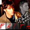
7 - хорошее использование текстур и колорирования - ч/б цвета отлично сочетаются с красным элементом. Ничего лишнего.
7 - приятно и минималистично. Удачное сочетание картинки и используемой текстуры.
7 - Love the cropping, colouring and texture.
10 - приятный мягкий колоринг, смотрится как законченная работа
13 - The colouring is very simple and the texture looks fantastic in the icon
13 - I love the coloring, simple yet effective. And the cropping is very nice.
14 - Beautiful icons. Simple, nice cropping, pretty colouring just perfect.
14 - just loved the layout of the icon and the quality, beautiful icon
Голоса "ПРОТИВ" | Lesser quality icons
1 - the image is slightly stretched on the y-axis (vertically)
5 - I don't really think that any of them were bad, but it just seemed like more work was put into the other icons, but the color and stuff was still good on this one
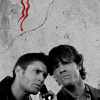
11 - text itself and the very different fonts are a bit overpowering here
11 - нагромождение разных элементов, которые не очень хорошо сочетаются, мелкий текст перешарплен, у цветной и ч/б частей пика разный уровень контрастности, что выглядит не очень эстетично
11 - The text really takes away from the icon. It's a bit pixelated and the placement doesn't look right.
11 - I don't like the text placement + use, doesn't go with the icon.
11 - неподходящий и нечитаемый шрифт, неудачное его расположение и сочетание двух видов шрифтов, картинка "перегружена"
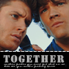
12 - бленд не удался. Верхние головы без шей смотрятся странно. Текст перешарплен, нижняя картинка также сильно зашарплена.
12 - The icon looks oversharpened plus the text looks awful like it was use without the antialias.
12 - The icon is quite pixellated which takes from an otherwise nice design
Here are our results - it's a pity, but we have to say "goodbye" to some participants.
Eсли вы хотите, чтобы мы перевели вам комментарии по вашему пику, пожалуйста, оставьте комментарий к этому посту с номером вашей работы.
Please, if you need a translation - just leave your icon number and ask to translate your comments.
Исключен | Eliminated
rogue_outkast
Приз Зрительских симпатий | People's Choice
rip_67
Выбор модератора | Mod's Choice
jorge_2
meravigliosaaa: ( Красивый колоринг, хороший текст, ничего лишнего | Nice coloring, good text, everything fits the image )
llean
ira_seregina: ( Отличный кроп, замечательная идея такого дублирования, текст уместен | Great cropping, nice idea of such doubling, text fits the icon )
Голоса распределились следующим образом | People Voting:
01| -1
02| 0
03| 0
04| 0
05| -1+1= 0
06| +1
07| +3
08| 0
09| 0
10| +1
11| -5
12| -3
13| +2
14| +2
Голоса "ЗА" | Favourite icons
5 - subtle coloring; crisp and clear style
6 - The cropping, use of textures, text and different colouring of the text all work brilliantly to make it very aseptically pleasing and desirable to use
7 - хорошее использование текстур и колорирования - ч/б цвета отлично сочетаются с красным элементом. Ничего лишнего.
7 - приятно и минималистично. Удачное сочетание картинки и используемой текстуры.
7 - Love the cropping, colouring and texture.
10 - приятный мягкий колоринг, смотрится как законченная работа
13 - The colouring is very simple and the texture looks fantastic in the icon
13 - I love the coloring, simple yet effective. And the cropping is very nice.
14 - Beautiful icons. Simple, nice cropping, pretty colouring just perfect.
14 - just loved the layout of the icon and the quality, beautiful icon
Голоса "ПРОТИВ" | Lesser quality icons
1 - the image is slightly stretched on the y-axis (vertically)
5 - I don't really think that any of them were bad, but it just seemed like more work was put into the other icons, but the color and stuff was still good on this one
11 - text itself and the very different fonts are a bit overpowering here
11 - нагромождение разных элементов, которые не очень хорошо сочетаются, мелкий текст перешарплен, у цветной и ч/б частей пика разный уровень контрастности, что выглядит не очень эстетично
11 - The text really takes away from the icon. It's a bit pixelated and the placement doesn't look right.
11 - I don't like the text placement + use, doesn't go with the icon.
11 - неподходящий и нечитаемый шрифт, неудачное его расположение и сочетание двух видов шрифтов, картинка "перегружена"
12 - бленд не удался. Верхние головы без шей смотрятся странно. Текст перешарплен, нижняя картинка также сильно зашарплена.
12 - The icon looks oversharpened plus the text looks awful like it was use without the antialias.
12 - The icon is quite pixellated which takes from an otherwise nice design