Image Modification Tutorial
So I cave. Because you guys keep asking, here is an absurdly tl;dr tutorial. No coloring secrets though, sorry. ♥

-->
THE IMAGE MODIFICATION TUTORIAL
Okay, so before we get started, I have to throw out a disclaimer or two.
I am assuming that you have more than basic Photoshop knowledge
As in, when I say "gaussian blur" and "soft light" you know what I'm talking about. If not, you might have some difficulty following this tutorial. I use Photoshop CS2, but the specific things that I do in this tutorial can be easily translated into other programs.
This tutorial will not include my coloring adjustment layers.
I figure this might bother some people, but I personally believe that there are two parts to every icon. First is the coloring, and second is the image modification. I consider an icon maker’s coloring to be his or her own style, almost their signature look. By giving you guys a list of all my selective coloring layers, all you’re going to learn how to do is make a carbon copy of my icons. And that’s not fun for anyone. So in the case of coloring, you’re on your own. You’ll have to experiment with that on your own. I can point you in the direction of some coloring tutorials:
- Selective coloring (and creative cropping!)
- Curves (which I don’t use often, but some people prefer them)
You have to be flexible with what I’m telling you here
You have to understand that I don’t use all these techniques every time, sometimes they’re not needed, or sometimes I need to experiment with another function to get the look I desire. And hell, if you have a way to get a similar look to your icons without all of my nonsense, this is probably too tl;dr for you already.
LET'S BEGIN
What do I mean by image modification?
I mean the difference between these three icons:


ICON 1 didn’t even bother to try and adjust the image contrast or make it appealing to the eye. ICON 2 went too far and left us with an overly-sharpened-too-bright-for-human-eyes icon. ICON 3 is what we’re going for in this tutorial.
STEP ONE
The first thing that I obsess about in an icon is the coloring. But we already know that this isn’t a coloring tutorial, and we’ll skip that step. It’s basically just a lot of dragging/dropping/eliminated/opacity changing of my usual coloring layers anyway.
SO TA DA, COLORING IS DONE AND NOW WE HAVE THIS:

Ugh. Okay. Duplicate your base. Leave it on the "Normal". First we go for the smart sharpen filter. (Filter>>sharpen>>smart sharpen) The purpose of this step is to make your icon look hideously over sharpened and then lower the opacity to your liking. It’s a good way to get a crisp look to your icon and darker contour lines.
These are my settings. See what I mean by hideous?

But then we go to this super sharp duplicated layer and lower the opacity to like, 35% or whatever works. Please don’t do 35% just because I said so, sometimes I do 7% or 60% or anything that looks good. Remember. Flexible.
And now we have this.

STEP TWO
Duplicate the original base again. Now we need more contrast and vibrancy to the icon. Take your duplicate (make sure it’s ABOVE the sharpened layer) and use the Gaussian blur filter (Filter>>blur>>gaussian blur)
Now this time, it’s really completely up to you how much you want to blur it. I change my setting frequently; sometimes I’ll do it at 0.8 and sometimes 2.3. You can play with it, but it doesn’t affect your icon all that much.
My settings for this icon:

Now, for the sharp layer before, we left it on "normal". Not for this one though, oh no no. We’re going to set it to "Soft light" and maybe play with opacity. For this icon, I have it set on 58%.

STEP 3
Now is when you want to get that original look to your icon. Create a new, blank layer between your blurred layer and coloring layers. Set the layer to "soft light". Now go to your brush and adjust it to settings similar to these:
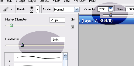
Very very soft edges, and opacity below 30%.
Now go on your blank soft light layer and throw in some value changes where you think it will compliment the icon, using only black and white. I usually like to add some white to faces, to mute the shadows and maybe on the highlights of the hair. Black I will add to the background or tips of hair.
My white highlights in this icon went here:
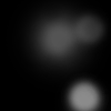
My black shadows in this icon went here:
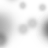
And now we have this!

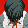
I kind of consider the last step to be the most important in an icon. Once again, not all the time, because we’re flexible with our icons. But it can be the difference between these here ICON 1 and ICON 2:

Now, hopefully I didn’t make that too absurdly confusing, but just in case I did, here’s a quick review:
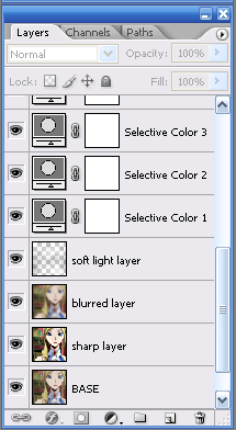
Those are my layers, in the order they usually are.

And this is what it looks like with each adjustment layer added.
1=Base (with selective coloring already added)
2=With sharpened layer
3=With blurred layer
4=With soft light highlights/shadows

-->

THE IMAGE MODIFICATION TUTORIAL
Okay, so before we get started, I have to throw out a disclaimer or two.
I am assuming that you have more than basic Photoshop knowledge
As in, when I say "gaussian blur" and "soft light" you know what I'm talking about. If not, you might have some difficulty following this tutorial. I use Photoshop CS2, but the specific things that I do in this tutorial can be easily translated into other programs.
This tutorial will not include my coloring adjustment layers.
I figure this might bother some people, but I personally believe that there are two parts to every icon. First is the coloring, and second is the image modification. I consider an icon maker’s coloring to be his or her own style, almost their signature look. By giving you guys a list of all my selective coloring layers, all you’re going to learn how to do is make a carbon copy of my icons. And that’s not fun for anyone. So in the case of coloring, you’re on your own. You’ll have to experiment with that on your own. I can point you in the direction of some coloring tutorials:
- Selective coloring (and creative cropping!)
- Curves (which I don’t use often, but some people prefer them)
You have to be flexible with what I’m telling you here
You have to understand that I don’t use all these techniques every time, sometimes they’re not needed, or sometimes I need to experiment with another function to get the look I desire. And hell, if you have a way to get a similar look to your icons without all of my nonsense, this is probably too tl;dr for you already.
LET'S BEGIN
What do I mean by image modification?
I mean the difference between these three icons:


ICON 1 didn’t even bother to try and adjust the image contrast or make it appealing to the eye. ICON 2 went too far and left us with an overly-sharpened-too-bright-for-human-eyes icon. ICON 3 is what we’re going for in this tutorial.
STEP ONE
The first thing that I obsess about in an icon is the coloring. But we already know that this isn’t a coloring tutorial, and we’ll skip that step. It’s basically just a lot of dragging/dropping/eliminated/opacity changing of my usual coloring layers anyway.
SO TA DA, COLORING IS DONE AND NOW WE HAVE THIS:

Ugh. Okay. Duplicate your base. Leave it on the "Normal". First we go for the smart sharpen filter. (Filter>>sharpen>>smart sharpen) The purpose of this step is to make your icon look hideously over sharpened and then lower the opacity to your liking. It’s a good way to get a crisp look to your icon and darker contour lines.
These are my settings. See what I mean by hideous?

But then we go to this super sharp duplicated layer and lower the opacity to like, 35% or whatever works. Please don’t do 35% just because I said so, sometimes I do 7% or 60% or anything that looks good. Remember. Flexible.
And now we have this.

STEP TWO
Duplicate the original base again. Now we need more contrast and vibrancy to the icon. Take your duplicate (make sure it’s ABOVE the sharpened layer) and use the Gaussian blur filter (Filter>>blur>>gaussian blur)
Now this time, it’s really completely up to you how much you want to blur it. I change my setting frequently; sometimes I’ll do it at 0.8 and sometimes 2.3. You can play with it, but it doesn’t affect your icon all that much.
My settings for this icon:

Now, for the sharp layer before, we left it on "normal". Not for this one though, oh no no. We’re going to set it to "Soft light" and maybe play with opacity. For this icon, I have it set on 58%.

STEP 3
Now is when you want to get that original look to your icon. Create a new, blank layer between your blurred layer and coloring layers. Set the layer to "soft light". Now go to your brush and adjust it to settings similar to these:

Very very soft edges, and opacity below 30%.
Now go on your blank soft light layer and throw in some value changes where you think it will compliment the icon, using only black and white. I usually like to add some white to faces, to mute the shadows and maybe on the highlights of the hair. Black I will add to the background or tips of hair.
My white highlights in this icon went here:

My black shadows in this icon went here:

And now we have this!

I kind of consider the last step to be the most important in an icon. Once again, not all the time, because we’re flexible with our icons. But it can be the difference between these here ICON 1 and ICON 2:


Now, hopefully I didn’t make that too absurdly confusing, but just in case I did, here’s a quick review:

Those are my layers, in the order they usually are.

And this is what it looks like with each adjustment layer added.
1=Base (with selective coloring already added)
2=With sharpened layer
3=With blurred layer
4=With soft light highlights/shadows