Life gives little release...
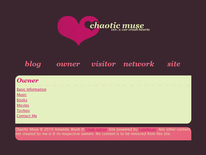
I've worked the kinks out of my little project. Well, most of them. Under the cut is an image, and that's how it's supposed to look with rounded corners.

If you're using Firefox, Chrome, or Safari, you'll see it the way that you're supposed to see it. If you're using IE, you're not seeing it right. I tried to do a couple of fixes, but in the end, it just made me angry, and that isn't worth it. The problem is, IE does not support all of the CSS coding (what makes my page tick) that the other major browsers do. In the upcoming IE9 update, it's supposed to be updated to fix things like the corners.
Anyway, I thought I'd post the link, and I'm sure you'll let me know if something looks entirely off. It's over here. I guess this one is more of a public blog. I'll still post here a lot, but I decided to do something a little more open.
ETA: I'm actually editing a few things in the layout. It's going to look somewhat different, but I'm keeping the colors and general idea the same.
Whoo! I actually updated my lj yesterday and today! That's two days in a row! I'll probably go a couple of weeks without doing it now...