"The Good People" preview

May 07, 2007 12:20

My younger sister, Tai and myself are going to collaborate and illustrate an urban fantasy comic titled "The Good People". Follow the cut to find the first two pages that I have illustrated, as well as a coloured concept picture for characters. I hope you enjoy and please tell me what you think? :D
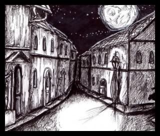

Read more... )

art dump, comic

Leave a comment

Comments 11

tian_shi May 7 2007, 02:42:58 UTC
I really love the atmosphere set up by the first two pages. The buildings were a little too sketchy and unpolished, is my first impression. But the bottom panel of the trowe was perfect. The emotion and the detail and everything. More please!

Reply

straywillowisp May 13 2007, 08:08:46 UTC
Thank you for your lovely comment and for the feedback. It's interesting to know of different people's preferences and such. I will certainly have more up and running soon. :D

Reply


sapphire_pyro May 7 2007, 02:58:28 UTC
Interesting ^_^ I'm curious to what this comic is all about xD And I like the sketchy effect, I see it as a unique style xD Hehe.

Trowe is cute ^_^ Heeheee

I'm interested on the hooded character xD hehe.

Keep up the good work ^_^

Reply

straywillowisp May 13 2007, 08:09:37 UTC
Ahhh, thank you, sweetie! *hugs tightly* You're really lovely! You'll find out more about the hooded character in the next few pages... >D

Reply

sapphire_pyro May 13 2007, 13:20:57 UTC
You'll find out more about the hooded character in the next few pages... >D<----- hurry! xD The wait kills . . hehe xD

Reply


ryokophoenix May 7 2007, 04:45:23 UTC
Whoa.

Jus....whoa.

I am significantly impressed. I'm in love with so many things but especially the girl's trampy outfit, the trowe and, yes, the green hoodie person. XD

<3

Reply

straywillowisp May 13 2007, 08:10:19 UTC
Woohoo! Thank you so much for your awesome comment! I'm really glad you like it. Hehehe, of course! Everyone loves the token emo boy! There shall be lots of him in the pages to come...:D

Reply


redgoldenglory May 7 2007, 12:28:23 UTC
Rach!! These are very well done. The character design for the trowe is both cute and a little bit unsettling - just like your lady-tramp looks pretty, but there's something a little creepy about what's under her scruffiness. Is she the dirty one from the faye story you were telling me about before? I'm intrigued by the pages you've posted so far. If I was in a comic book store and I had the money, I'd probably buy it - and I mean that as a real compliment.

Reply

straywillowisp May 13 2007, 08:13:40 UTC
Hey! Thanks for the really, really awesome comment! I truly appreciate your comment and everything, it's really wonderful to know what you think. :)

The Trowe design is roughly based off of a Brian Froud sketch, I have one of his concept books: "Good Fairies, Bad Fairies", and he has some creepy stuff going down. ;)

The girl is...not quite as she seems, but then again, isn't too deep nor sinister. The Trowe on the other hand...>D

Reply


over_9000 May 9 2007, 01:09:53 UTC
Nice work you guys!
My main issue is with the second frame, is the TMP for temp or is that some sort of footstep noise? because i cant really tell whats going on in that pic right now.
I like the style, can't wait to see more. well done :)

Reply

straywillowisp May 13 2007, 08:15:03 UTC
Hey dude, thanks for the awesome comment! Thanks for the heads-up! The "tmp" I saw in a manga once, but I suppose "tok" or "tak" might have been a better option for creating stepping sound type thingys. :P I'll change them when I can be bothered. Hehehehehe...;D

Reply


Leave a comment

Up