☆ coloring tutorial
Here's the promised tutorial! ... um, I can't say it's very helpful (especially towards the end it just gets messier and messier), but at least you can see how I uh, color... Errr. And I used too big images, sorry if they break someone's computer. |D;;
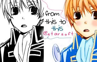
Just for information. I don't color in the same way every time, no, not at all. My coloring style is mostly just "try something & see what happens". XD; AND LOL, I never color this carefully with icons, after all they're only 100x100. XD But I usually do the screening & multiplying parts you can see in this tutorial.
[x] Don't copy exactly
[x] no stealing
Screening part
1. Okay, here we go! This is the image I decided to color because I have colored it before so we can compare them once this one is ready, lols. Normally I wouldn't have wanted to color this since it has this huge part of black -buuut, it's Okita(from a doujin) so I forgive & want to color it. &hearts 8D I cleaned the picture & erased some parts that are annoying to color.
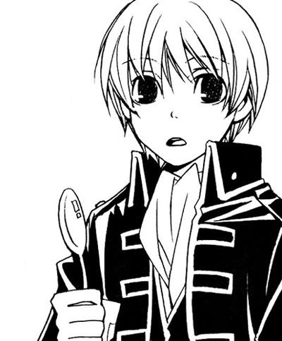
2. We're starting with screening the lines. Dark black lines are no good so~ Let's start with the skin lines since they're the most annoying. Dark brown is good for this. New layer (screen) & we'll decide the opacity later.
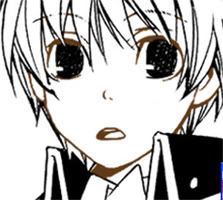
This part is annoying because you can't always know what's skin and what's what so just.. improvise. D; There. Now we change to opacity look good.. let's say, around 50-60% is good. We can change it later. (<- that's why -always use a new layer)
3. Now hair lines. Because I like to screen them. Most of the time. >_> Okita's hair is blond brown so let's use dark brown that's a bit lighter than the one for skin. Be careful not to screen over already screened line (skin line in this case)- the result can be ugly. You don't always notice this until the pic is ready and then you can't do anything about it anymore so.. try to pay attention now. XD; I always fail at this and then later curse myself for being careless. Opacity for this layer: about.. 70-80%
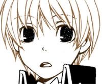
4. Do the same screening (with different colors, duh) with the spoon and that.. scarf .. thing on his neck. I used blue.
5. okay. Now we should decide what the hell to do with that ugly huge black thing that is supposed to his jacket. The canon coloring is dark blue... but dark blue is just horrible - so let's try to make it brighter & happier by screening it with light blue. Idk how it's turning out since we have to use yellow with it later but uhh.. we'll see. Let's just screen now and regret later. DX
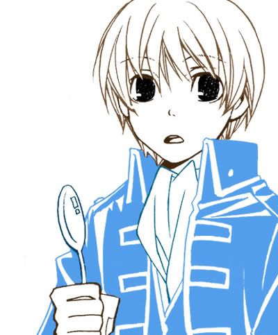
... there. It looks just horrible now, especially where two screened parts meet. I hate doing those parts. Well.. let's just hope no one notices. Changing the opacity might help a bit, opacity for this layer; about 70%
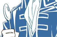
Ok, now the mistakes won't show so well it's starting to look better.
Actual coloring with Multiply
6. OMG we're done with the screening. YESSSSS. I hate that part. Khrm.
Now for the skin. Pick a nice color, new layer on multiply. Then just color. (opacity will be decided later)
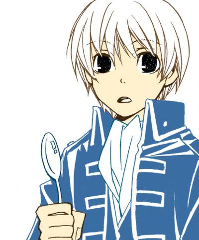
Opacity about 90% might look best.
... the spoon's lines look so messy afgjsh. .___.
7. Now the shadowing of the skin. I have started using air brush so the shadows look... um, softer? Yep. Pick a light brown or something like that, new multiply layer. Then just decide where the shadows might look good.

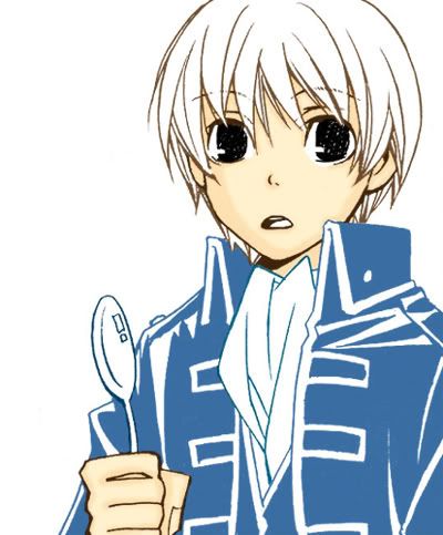
I used to suck at shadowing but then I got some help from my friend (lol thanks) and now I'm starting to get better at it... I guess/hope. In this layer the shadows are larger so let's leave the opacity around 40%
8. More shadows since the skin shadowing is important (or not). New multiply layer and the same color. This time make the shadows smaller and only to the parts where the shadows are at their darkest.


Now, opacity around 60% They don't really show, but we can always hope they do show and make a difference.. uh.. yeah.
9. Now same multiply coloring for the scarf-thing & mouth and spoon. Shadows by making new multiply layers with lighter colors & smaller opacity.
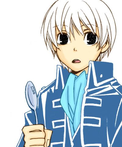
10. .... aaand back to the stupid jacket. I have no idea what to do with it so let's just try something out and see how it turns out. Okay. After trying out stuff, light blue on multiply might look good. We'll go with that.
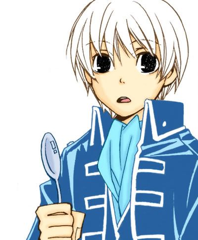
Opacity around 50%
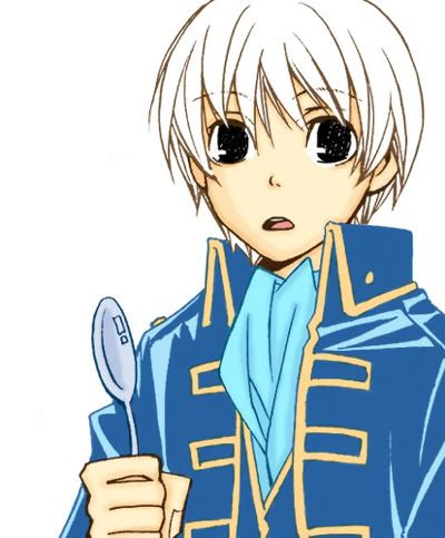
11. Now the yellow parts. New layer on Multiply. The lines look so messy again afgshgx.
12. Finally the hair! Yahoo. Now, pick a color you like and start coloring (multiply layer as before). This will be the base color since we'll be doing many layers for hair.
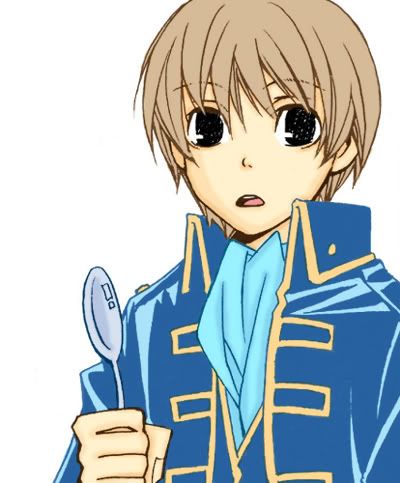
Opacity around 80%, depends which color you use, as always.
13. Shadow time again. Pretty similar how we did the skin shadows. This time use many different colors and layers and opacities and see what happens. I usually leave all of the layers on multiply. Soft Light & Linear Burn can look good as well.
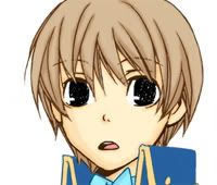
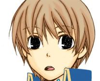

I created three (multiply) layers and used different shades of light brown.
14. That should be enough of shadows. Now some light! Pick a light brown (or yellow etc), new layer and set it on soft light. Color some parts where do you think it looks good and then set the opacity around 40%
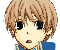
This doesn't show anywhere so let's add one that shows more. New soft light layer, pick brighter color. About the same opacity. But this time add the color on the parts that you already soft lighted, not everywhere, just to the places you want to be the lightest parts. Buuut I still want to add one more. I added that stupid shaped thing... whatever. XD (it shows better since the opacity is bigger)

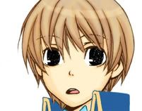
15. Now we're starting to be finished with the actual coloring... but I still think we should do something about the eyes. Just black is no good. Ok, we should have done this earlier but lols didn't so let's do it now. New screen layer and screen the eyes with dark brown. Leaving this layer with big opacity makes him look like he's blind so let's reduce the opacity to 30%- it looks like nothing happened but maybe the next step will make the eyes look better.
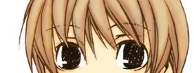

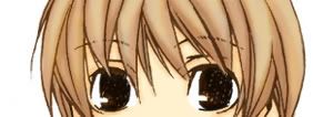
New multiply layer, add some dark brown on the eyes. Still no good, so new layer (soft light this time) and light some parts with lighter brown. Better, yes?
16. Okay the jacket really pisses me off. It has to be shadowed. New multiply layer and let's add some light blue as shadows. I reduced the opacity really small so they don't show too much.
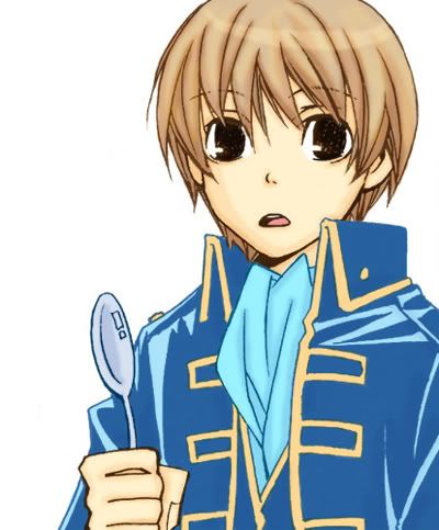
17. Okay now what? Background. I don't want to color it since it's troublesome so let's just add a texture on multiply and erase the parts on the actual coloring. I used a part of this texture (jounins) but it doesn't look that good. Oh well.
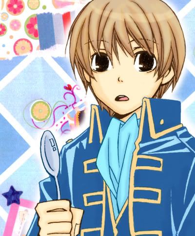
Do something and see what happens- part
18. We're done with the coloring. Now starts the part "do something and see what happens"!
Let's get it shine. Using Levels at first. move the middle arrow in RGB a little bit to the left until the pic looks lighter. Now. Go to Layer - Flatten Image. Now you have one crappy layer. Duplicate it. Now, you have two. Set the new one on soft light and Ta-ta!
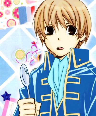
But like this is too bright & light, so reduce the opacity.
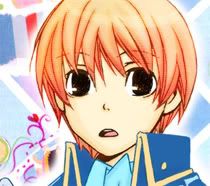
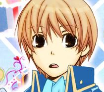
19. I don't know what to do next. Let's play with overlay! Pick a nice texture. (I always use this one) Put it on the picture so it makes the pic look more alive. Set on Overlay. Erase the parts where it doesn't look good. I want the hair to look different so I placed it on the hair. Now it looks funny, play with the opacity until it looks good.
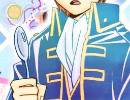
20. Let's do the same with the jacket. Pick a texture and put it on overlay on the jacket. I used the same texture. Change the opacity this time as well.
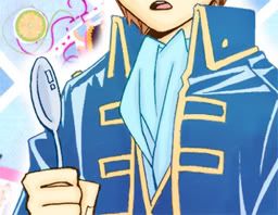
21. Okay, we're done with the overlays. Now, let's play with Levels. And you know what, I'm not going to teach you for that since there are many tutorials just for that, but let's just say that by using them I added some more red and blue. Looking better.
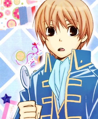
22. Now, Selective colors.
Reds: +Cyan, +Magenta, +Yellow
Yellows: -Cyan +Yellow
Cyans: +Cyan, +Magenta, -Yellow
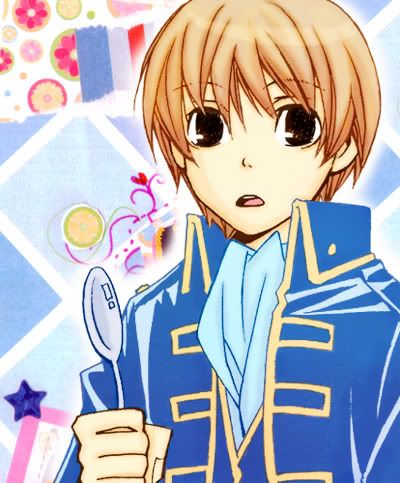
You can do wonders with selective coloring, I think.
23. Then I used some more Levels, made the picture darker.

24. Now, Saturation (Hue/Saturation)! Add a lot of that.
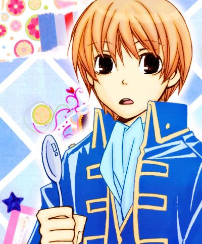
I also reduced a bit of magenta with Selective coloring.
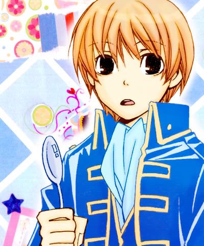
25. And whoops. D; I forgot something. Cheeks. Cheeks are important. Go to the duplicated soft light layer of the pic, and create multiply layer on it. Now add some pink to the cheeks and play with opacity. I added some pink on the nose as well, kufufu. And add a normal layer if you want to add white spots on them to make Okita have shota cheeks. Kufufu.

26. Now it's starting to be ready. Add light textures, cute text or whatever you want to distract the viewers from noticing the phailed coloring. 8D Add extra saturation if you want to blind someone.
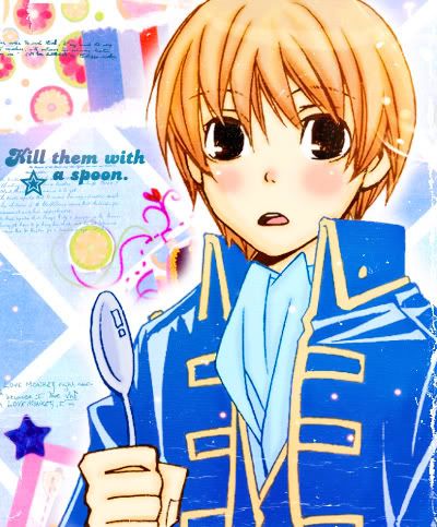
And we're done. I think it turned out pretty well, maybe a bit too bright and the background doesn't fit. I have a habit of adding too much everything which makes colorings look guhhh. D;
If you want, you can compare it with the same coloring of it (made in September):

You can see that my coloring hasn't gotten any better, I have just learned to use the equipment of the "do something & see what happens" stage better.
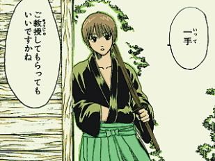
And for laughs, Okita I colored in April 2007. XDDD (with Corel PHOTO - PAINT)
If you have questions (sorry this tutorial was so messy T_T;) I'm happy to answer (if I can).

Just for information. I don't color in the same way every time, no, not at all. My coloring style is mostly just "try something & see what happens". XD; AND LOL, I never color this carefully with icons, after all they're only 100x100. XD But I usually do the screening & multiplying parts you can see in this tutorial.
[x] Don't copy exactly
[x] no stealing
Screening part
1. Okay, here we go! This is the image I decided to color because I have colored it before so we can compare them once this one is ready, lols. Normally I wouldn't have wanted to color this since it has this huge part of black -buuut, it's Okita(from a doujin) so I forgive & want to color it. &hearts 8D I cleaned the picture & erased some parts that are annoying to color.

2. We're starting with screening the lines. Dark black lines are no good so~ Let's start with the skin lines since they're the most annoying. Dark brown is good for this. New layer (screen) & we'll decide the opacity later.

This part is annoying because you can't always know what's skin and what's what so just.. improvise. D; There. Now we change to opacity look good.. let's say, around 50-60% is good. We can change it later. (<- that's why -always use a new layer)
3. Now hair lines. Because I like to screen them. Most of the time. >_> Okita's hair is blond brown so let's use dark brown that's a bit lighter than the one for skin. Be careful not to screen over already screened line (skin line in this case)- the result can be ugly. You don't always notice this until the pic is ready and then you can't do anything about it anymore so.. try to pay attention now. XD; I always fail at this and then later curse myself for being careless. Opacity for this layer: about.. 70-80%

4. Do the same screening (with different colors, duh) with the spoon and that.. scarf .. thing on his neck. I used blue.
5. okay. Now we should decide what the hell to do with that ugly huge black thing that is supposed to his jacket. The canon coloring is dark blue... but dark blue is just horrible - so let's try to make it brighter & happier by screening it with light blue. Idk how it's turning out since we have to use yellow with it later but uhh.. we'll see. Let's just screen now and regret later. DX

... there. It looks just horrible now, especially where two screened parts meet. I hate doing those parts. Well.. let's just hope no one notices. Changing the opacity might help a bit, opacity for this layer; about 70%

Ok, now the mistakes won't show so well it's starting to look better.
Actual coloring with Multiply
6. OMG we're done with the screening. YESSSSS. I hate that part. Khrm.
Now for the skin. Pick a nice color, new layer on multiply. Then just color. (opacity will be decided later)

Opacity about 90% might look best.
... the spoon's lines look so messy afgjsh. .___.
7. Now the shadowing of the skin. I have started using air brush so the shadows look... um, softer? Yep. Pick a light brown or something like that, new multiply layer. Then just decide where the shadows might look good.


I used to suck at shadowing but then I got some help from my friend (lol thanks) and now I'm starting to get better at it... I guess/hope. In this layer the shadows are larger so let's leave the opacity around 40%
8. More shadows since the skin shadowing is important (or not). New multiply layer and the same color. This time make the shadows smaller and only to the parts where the shadows are at their darkest.


Now, opacity around 60% They don't really show, but we can always hope they do show and make a difference.. uh.. yeah.
9. Now same multiply coloring for the scarf-thing & mouth and spoon. Shadows by making new multiply layers with lighter colors & smaller opacity.

10. .... aaand back to the stupid jacket. I have no idea what to do with it so let's just try something out and see how it turns out. Okay. After trying out stuff, light blue on multiply might look good. We'll go with that.

Opacity around 50%
11. Now the yellow parts. New layer on Multiply. The lines look so messy again afgshgx.

12. Finally the hair! Yahoo. Now, pick a color you like and start coloring (multiply layer as before). This will be the base color since we'll be doing many layers for hair.

Opacity around 80%, depends which color you use, as always.
13. Shadow time again. Pretty similar how we did the skin shadows. This time use many different colors and layers and opacities and see what happens. I usually leave all of the layers on multiply. Soft Light & Linear Burn can look good as well.


I created three (multiply) layers and used different shades of light brown.
14. That should be enough of shadows. Now some light! Pick a light brown (or yellow etc), new layer and set it on soft light. Color some parts where do you think it looks good and then set the opacity around 40%

This doesn't show anywhere so let's add one that shows more. New soft light layer, pick brighter color. About the same opacity. But this time add the color on the parts that you already soft lighted, not everywhere, just to the places you want to be the lightest parts. Buuut I still want to add one more. I added that stupid shaped thing... whatever. XD (it shows better since the opacity is bigger)


15. Now we're starting to be finished with the actual coloring... but I still think we should do something about the eyes. Just black is no good. Ok, we should have done this earlier but lols didn't so let's do it now. New screen layer and screen the eyes with dark brown. Leaving this layer with big opacity makes him look like he's blind so let's reduce the opacity to 30%- it looks like nothing happened but maybe the next step will make the eyes look better.


New multiply layer, add some dark brown on the eyes. Still no good, so new layer (soft light this time) and light some parts with lighter brown. Better, yes?
16. Okay the jacket really pisses me off. It has to be shadowed. New multiply layer and let's add some light blue as shadows. I reduced the opacity really small so they don't show too much.

17. Okay now what? Background. I don't want to color it since it's troublesome so let's just add a texture on multiply and erase the parts on the actual coloring. I used a part of this texture (jounins) but it doesn't look that good. Oh well.

Do something and see what happens- part
18. We're done with the coloring. Now starts the part "do something and see what happens"!
Let's get it shine. Using Levels at first. move the middle arrow in RGB a little bit to the left until the pic looks lighter. Now. Go to Layer - Flatten Image. Now you have one crappy layer. Duplicate it. Now, you have two. Set the new one on soft light and Ta-ta!

But like this is too bright & light, so reduce the opacity.
19. I don't know what to do next. Let's play with overlay! Pick a nice texture. (I always use this one) Put it on the picture so it makes the pic look more alive. Set on Overlay. Erase the parts where it doesn't look good. I want the hair to look different so I placed it on the hair. Now it looks funny, play with the opacity until it looks good.


20. Let's do the same with the jacket. Pick a texture and put it on overlay on the jacket. I used the same texture. Change the opacity this time as well.


21. Okay, we're done with the overlays. Now, let's play with Levels. And you know what, I'm not going to teach you for that since there are many tutorials just for that, but let's just say that by using them I added some more red and blue. Looking better.

22. Now, Selective colors.
Reds: +Cyan, +Magenta, +Yellow
Yellows: -Cyan +Yellow
Cyans: +Cyan, +Magenta, -Yellow

You can do wonders with selective coloring, I think.
23. Then I used some more Levels, made the picture darker.

24. Now, Saturation (Hue/Saturation)! Add a lot of that.

I also reduced a bit of magenta with Selective coloring.

25. And whoops. D; I forgot something. Cheeks. Cheeks are important. Go to the duplicated soft light layer of the pic, and create multiply layer on it. Now add some pink to the cheeks and play with opacity. I added some pink on the nose as well, kufufu. And add a normal layer if you want to add white spots on them to make Okita have shota cheeks. Kufufu.

26. Now it's starting to be ready. Add light textures, cute text or whatever you want to distract the viewers from noticing the phailed coloring. 8D Add extra saturation if you want to blind someone.

And we're done. I think it turned out pretty well, maybe a bit too bright and the background doesn't fit. I have a habit of adding too much everything which makes colorings look guhhh. D;
If you want, you can compare it with the same coloring of it (made in September):

You can see that my coloring hasn't gotten any better, I have just learned to use the equipment of the "do something & see what happens" stage better.
And for laughs, Okita I colored in April 2007. XDDD (with Corel PHOTO - PAINT)

If you have questions (sorry this tutorial was so messy T_T;) I'm happy to answer (if I can).