My first tutorial.
Hey.
so...I come bearing a tutorial. At the begging of one named Sugah....she came bearing my favorite cookies so I couldn't resist.
I couldn't remember how I did the first icon...some of you reading this may have noticed it before. I made it similar, but now it's crisper..and it's sorta reminding me of the coloring used in the movie 300.
Here we go...please bear with me.
We'll be going from

to
or
Includes Brightness/Contrast, Hue Saturation, and an optional Selective Layer
*Before I go on...I'll let you know what I do to 98% of my icons. ALWAYS.*
I always screen two layers from bases, and adjust as necessary. Then I do a color fill of a dark navy blue, and set it to exclusion 100%. Then duplicate the base that wasn't screened and bring it to the top and place it on soft light, and I play around with that layer's opacity settings. It gives this nice contrast, and smoothness to the icon.
1. Resize, crop, sharpen...whatever.
2. Duplicate base, Screen 100%. Do this twice if it's still too dark.
3. Fill with #070A45 and set to exclusion.
4. Duplicate base, bring to the top and set to Soft Light 100%
5. So...If you like the yellowish hue in the first icon example you see above, use these settings for selective color
RED : +14, -35, -1, -13 YELLOW : -19, -41, -35, -33 NEUTRALS : +2, -7, -27, -16
Drag this layer to just below the exclusion layer.
If you can't get your mind wrapped around selective color, which I am still sorta...you can skip this step.
6. Add a brightness/contrast layer, and set +19 Brightness, and -9 Contrast.
7. Add a hue/saturation layer, and set +11 Saturation, and +5 Contrast. Leave Hue at 0
*NOTE, if you're NOT using the selective color layer, set the saturation to -20.
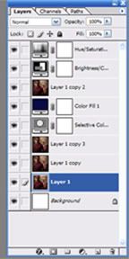
Here's what my layers look like...with the selective color.

Confused yet?? Sorry. Again, this is my first tutorial. I would love to see your results here, or at DLC.
so...I come bearing a tutorial. At the begging of one named Sugah....she came bearing my favorite cookies so I couldn't resist.
I couldn't remember how I did the first icon...some of you reading this may have noticed it before. I made it similar, but now it's crisper..and it's sorta reminding me of the coloring used in the movie 300.
Here we go...please bear with me.
We'll be going from

to

or

Includes Brightness/Contrast, Hue Saturation, and an optional Selective Layer
*Before I go on...I'll let you know what I do to 98% of my icons. ALWAYS.*
I always screen two layers from bases, and adjust as necessary. Then I do a color fill of a dark navy blue, and set it to exclusion 100%. Then duplicate the base that wasn't screened and bring it to the top and place it on soft light, and I play around with that layer's opacity settings. It gives this nice contrast, and smoothness to the icon.
1. Resize, crop, sharpen...whatever.
2. Duplicate base, Screen 100%. Do this twice if it's still too dark.
3. Fill with #070A45 and set to exclusion.
4. Duplicate base, bring to the top and set to Soft Light 100%
5. So...If you like the yellowish hue in the first icon example you see above, use these settings for selective color
RED : +14, -35, -1, -13 YELLOW : -19, -41, -35, -33 NEUTRALS : +2, -7, -27, -16
Drag this layer to just below the exclusion layer.
If you can't get your mind wrapped around selective color, which I am still sorta...you can skip this step.
6. Add a brightness/contrast layer, and set +19 Brightness, and -9 Contrast.
7. Add a hue/saturation layer, and set +11 Saturation, and +5 Contrast. Leave Hue at 0
*NOTE, if you're NOT using the selective color layer, set the saturation to -20.
Here's what my layers look like...with the selective color.

Confused yet?? Sorry. Again, this is my first tutorial. I would love to see your results here, or at DLC.