Fan Art : Smoke & Lightning - A Real Wild Child
Fan Art : Smoke & Lightning - A Real Wild Child

****
THE ART
Full size version available here : img829.imageshack.us/img829/8194/sllight.jpg
****
RANDOM QUESTIONS
What's the concept ?
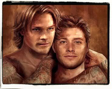
This is an illustration art for a J2 RPF AU called Smoke and Lightning, written by Misses shotgunpoetry and eviltwin . In this story, tattoos and bod mod have an important place so I thought that showing a little bit of the boys' flesh ink wasn't a bad idea. I conceived the art like a book or a magazine cover.
If you want to know more about the Smoke and Lightning Verse you can check :
1) The fic Master Posts :
- Book One (Complete) : http://community.livejournal.com/arealwildchild/9553.html
- Book Two (Complete) : http://community.livejournal.com/arealwildchild/27680.html
- Book Three (In Progress) : http://community.livejournal.com/arealwildchild/52119.html
2) shotgunpoetry 's great photomanips on her Deviant Art page here :
http://bloodyadorable.deviantart.com/
Why did you post this fan art in this account and not on your main one ? It's not erotic at all, no need to "hide" it!
Honestly ? It's just for the silly pleasure to update smallworld_inc
I love the layout and I wanted to add one more drawing to the Fan Art Master Post (childish and ridiculous, I know...
)
Where did you get the inspiration from ?
I went to a tattoo convention in Tokyo last week, King of Tattoo 2010, and bought there a fantastic book by artist Shawn Barber. It made me feel like drawing hot boys with tattoos again and a fan art for arealwildchild community and for Smoke and Lightning was just perfect. Not to mention that it's a phony pretext to draw the boys together, a thing I've never had the occasion to do for this fic.
Just so you can have an idea, you can see below one of the most famous portraits by Shawn Barber

A portrait of Kat Von D (High Voltage Tattoo) - oil painting on canvas
A pencil sketch for this drawing ?
Nope. An ink sketch actually, it was definitely quicker. However as it was just a try, I didn't bother to draw the tattoos. Starting with this kind of draft is actually pretty useful because it gave me the possibility to realize 3 things :
- the typo wasn't really adapted. I needed something more "old school" and less "graffiti"
- the position of Jensen's left hand, the one behind his head, was a little bit weird anatomically speaking (I changed it on the final version)
- the blue/purple palette doesn't work that good so I finally choose to use sepia and brown instead of blue and magenta.

Favorite thing to draw ?
The tattoos and Jensen's chest, definitely.
Most boring ?
The typo. It's not my cup of tea, honestly, but it's an important part of the picture so....
Reference pictures ?
Of course :
- Jared : i217.photobucket.com/albums/cc27/petite_madame/2nv7xtv.jpg
- Jensen : i217.photobucket.com/albums/cc27/petite_madame/unknownjax2.jpg
Softwares ?
Photoshop CS - Painter Essential 3
CG Painting (with paintover on some of the tattoos)
****
Voilà!
See you soon

****
THE ART
Full size version available here : img829.imageshack.us/img829/8194/sllight.jpg
****
RANDOM QUESTIONS
What's the concept ?
This is an illustration art for a J2 RPF AU called Smoke and Lightning, written by Misses shotgunpoetry and eviltwin . In this story, tattoos and bod mod have an important place so I thought that showing a little bit of the boys' flesh ink wasn't a bad idea. I conceived the art like a book or a magazine cover.
If you want to know more about the Smoke and Lightning Verse you can check :
1) The fic Master Posts :
- Book One (Complete) : http://community.livejournal.com/arealwildchild/9553.html
- Book Two (Complete) : http://community.livejournal.com/arealwildchild/27680.html
- Book Three (In Progress) : http://community.livejournal.com/arealwildchild/52119.html
2) shotgunpoetry 's great photomanips on her Deviant Art page here :
http://bloodyadorable.deviantart.com/
Why did you post this fan art in this account and not on your main one ? It's not erotic at all, no need to "hide" it!
Honestly ? It's just for the silly pleasure to update smallworld_inc
I love the layout and I wanted to add one more drawing to the Fan Art Master Post (childish and ridiculous, I know...
)
Where did you get the inspiration from ?
I went to a tattoo convention in Tokyo last week, King of Tattoo 2010, and bought there a fantastic book by artist Shawn Barber. It made me feel like drawing hot boys with tattoos again and a fan art for arealwildchild community and for Smoke and Lightning was just perfect. Not to mention that it's a phony pretext to draw the boys together, a thing I've never had the occasion to do for this fic.
Just so you can have an idea, you can see below one of the most famous portraits by Shawn Barber

A portrait of Kat Von D (High Voltage Tattoo) - oil painting on canvas
A pencil sketch for this drawing ?
Nope. An ink sketch actually, it was definitely quicker. However as it was just a try, I didn't bother to draw the tattoos. Starting with this kind of draft is actually pretty useful because it gave me the possibility to realize 3 things :
- the typo wasn't really adapted. I needed something more "old school" and less "graffiti"
- the position of Jensen's left hand, the one behind his head, was a little bit weird anatomically speaking (I changed it on the final version)
- the blue/purple palette doesn't work that good so I finally choose to use sepia and brown instead of blue and magenta.

Favorite thing to draw ?
The tattoos and Jensen's chest, definitely.
Most boring ?
The typo. It's not my cup of tea, honestly, but it's an important part of the picture so....
Reference pictures ?
Of course :
- Jared : i217.photobucket.com/albums/cc27/petite_madame/2nv7xtv.jpg
- Jensen : i217.photobucket.com/albums/cc27/petite_madame/unknownjax2.jpg
Softwares ?
Photoshop CS - Painter Essential 3
CG Painting (with paintover on some of the tattoos)
****
Voilà!
See you soon