Geeking about Wonder Woman art
a.k.a. further development of my giant crush on Diana
Comics Dungeon had a big sale last weekend, so I picked up a bunch of trades, including some old X-Men books to round out my collection. zinjadu also pointed me to the Greg Rucka run on Wonder Woman, so I grabbed those and so far I've read through Down to Earth and part of Bitter Rivals.
The trades are awesome, buuuuut the one thing impeding my enjoyment was the fact that every time I pulled out Down to Earth to read, I saw this. Why, why, why did DC decide to put Greg Land's fugly drawing on the cover of the trade? Why not keep the cover from the first printing? Why do we have to see Diana all pouty-lipped and vacant-eyed, with poorly drawn anatomy and ridiculously "windswept" hair? She has no ribcage. Her thighs are as wide as her head, with no visible muscle. The pose is static and boring; there's not even tension in her figure to make the picture interesting.
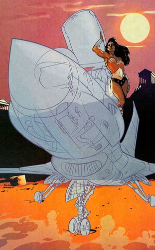
On the other hand, included in the trade is a pin-up by Stuart "Nextwave" Immonen that shows Diana standing still without looking boring at all. There's confidence in her pose, a sense of potential power and movement in both her and the jet. Unlike Land, Immonen knows what it means to be a storyteller with art (his pencils in Nextwave are really great, and worked even when Warren Ellis didn't include any dialogue).
Luckily, the rest of the covers in the trade are not by Land. Most of them are by J.G. Jones, who is a far better artist. I still have a nitpick with him, though, because in the covers for #200 (the image used for the first printing of the trade), #201, #202, #203, Diana's body is always twisted oddly, so her torso never faces the same direction as her legs. (In #202, it's not so bad, but her body is still tilted off balance, whereas behind her Veronica Cale's is not.) It doesn't make much sense, especially when I found this version of the cover of #200, which looks like the exact same image but with Diana turning to her left. This version is much improved, because at least her body doesn't switch directions twice. For the most part, Jones' paintings are good and he draws Diana with a reasonable (for a superheroine) body. It's just that one quirk.
Finally, I have to highlight this pin-up by Steve Rude, which was also included in the trade and is one of my favorite pictures of Diana ever. It's vibrant, detailed, and just happy. (Also, as ratzeo points out, that black kitten on the right can only tell the truth now. XD)
Comics Dungeon had a big sale last weekend, so I picked up a bunch of trades, including some old X-Men books to round out my collection. zinjadu also pointed me to the Greg Rucka run on Wonder Woman, so I grabbed those and so far I've read through Down to Earth and part of Bitter Rivals.
The trades are awesome, buuuuut the one thing impeding my enjoyment was the fact that every time I pulled out Down to Earth to read, I saw this. Why, why, why did DC decide to put Greg Land's fugly drawing on the cover of the trade? Why not keep the cover from the first printing? Why do we have to see Diana all pouty-lipped and vacant-eyed, with poorly drawn anatomy and ridiculously "windswept" hair? She has no ribcage. Her thighs are as wide as her head, with no visible muscle. The pose is static and boring; there's not even tension in her figure to make the picture interesting.
On the other hand, included in the trade is a pin-up by Stuart "Nextwave" Immonen that shows Diana standing still without looking boring at all. There's confidence in her pose, a sense of potential power and movement in both her and the jet. Unlike Land, Immonen knows what it means to be a storyteller with art (his pencils in Nextwave are really great, and worked even when Warren Ellis didn't include any dialogue).
Luckily, the rest of the covers in the trade are not by Land. Most of them are by J.G. Jones, who is a far better artist. I still have a nitpick with him, though, because in the covers for #200 (the image used for the first printing of the trade), #201, #202, #203, Diana's body is always twisted oddly, so her torso never faces the same direction as her legs. (In #202, it's not so bad, but her body is still tilted off balance, whereas behind her Veronica Cale's is not.) It doesn't make much sense, especially when I found this version of the cover of #200, which looks like the exact same image but with Diana turning to her left. This version is much improved, because at least her body doesn't switch directions twice. For the most part, Jones' paintings are good and he draws Diana with a reasonable (for a superheroine) body. It's just that one quirk.
Finally, I have to highlight this pin-up by Steve Rude, which was also included in the trade and is one of my favorite pictures of Diana ever. It's vibrant, detailed, and just happy. (Also, as ratzeo points out, that black kitten on the right can only tell the truth now. XD)