Yeah, the more people comment and the more I look at it, the more I realize this lighting didn't really work for her in that shot. It's a shame because I think t would have been a great shot otherwise.
Glad that 2 & 3 are hot though. That's what we were going for ;-)
Thanks about 2 & 3. I'm a bit hesitant to use three in my port, even though I really like it because I think it's so similar to the one I have of Kiara on the chair. I don't know. Maybe not though and I shouldn't worry that people will think I love getting women on their backs? ;-)
Mmm. They get better as they go along! Nicely done.
It's the lighting on the face in the first one that's throwing people; she looks a little sick. The face looks great in the other two, however.
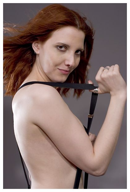
The composition also gets stronger as we go along; the dramatic foreshortening in the third is the most dynamic by far. The second is beautifully playful, but it's a rather stiff composition.
The composition in the third is the strongest, though even here I'd like to see it pushed a bit. Give her torso a twist, play up the controposto. She is at an angle, but her body still just diagonally splits the frame in two. Maybe think about that old "All four corners, all four edges" idea?
Ahhh...it was something my design and color theory professor drilled into us...maybe this was just our prof., though?
It's about composition: in laying out the piece, you have to consider all four corners, and all four edges. Which is not to say you need "stuff" in them all. But negative space is just as important as positive. People--especially illustrators like me--tend to head straight for the middle of the canvas, and put our subject there...
So probably simpler than I had made it sound: empty spaces (especially corners) should not be neglected, so much as carefully and self-consciously left empty.
I agree that the first one makes me think she's ill. She's very pale and slender which I think makes the first one a bit tricky. The second and third are beautiful, though. I love the color splash of her tie in the last one.
Ugh, I had such a hard time chosing a tie. I think the lady in the store must have thought I was nuts! In the end though I think it was just right. It's that bit of brightness needed amongst all the b & w.
Yeah, the more I look at one I realize I lit her all wrong there and it kind of ruined what otherwise was a really great shot. Who knows. Maybe I'll try photoshopping it a bit more to see if I can fix that.
Not to sound as totally out if it as I am right now, are you talking about the model or the way a shoot them/themes in regards to "interesting subjects"?
Ha, that's cool. I mainly just work with what I can get, minus of course the people that I've known for years but yeah, all my new models are just people who have contacted me.
Comments 29
Reply
Reply
Glad that 2 & 3 are hot though. That's what we were going for ;-)
Reply
The 2nd and 3rd ones are wonderful - especially the 3rd!! :)
Reply
Reply
Reply
Reply
It's the lighting on the face in the first one that's throwing people; she looks a little sick. The face looks great in the other two, however.
The composition also gets stronger as we go along; the dramatic foreshortening in the third is the most dynamic by far. The second is beautifully playful, but it's a rather stiff composition.
The composition in the third is the strongest, though even here I'd like to see it pushed a bit. Give her torso a twist, play up the controposto. She is at an angle, but her body still just diagonally splits the frame in two. Maybe think about that old "All four corners, all four edges" idea?
As ever, thanks for sharing!
Reply
Reply
It's about composition: in laying out the piece, you have to consider all four corners, and all four edges. Which is not to say you need "stuff" in them all. But negative space is just as important as positive. People--especially illustrators like me--tend to head straight for the middle of the canvas, and put our subject there...
So probably simpler than I had made it sound: empty spaces (especially corners) should not be neglected, so much as carefully and self-consciously left empty.
Reply
Thanks for commenting lately btw! Good stuff.
Reply
Reply
Yeah, the more I look at one I realize I lit her all wrong there and it kind of ruined what otherwise was a really great shot. Who knows. Maybe I'll try photoshopping it a bit more to see if I can fix that.
Thanks about the second and third.
Reply
i love the last one. the soft focus on her breasts and the accent of the blue tie is great
Reply
Thanks about the last one. Yeah, I'm a fan.
Reply
Reply
Reply
Leave a comment