★ 002.
an icon post is coming soon, i promise~ ♥
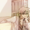
but for now, a tutorial featuring masuda takahisa of j-pop group news, ha ha :'D
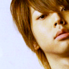
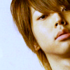
going from
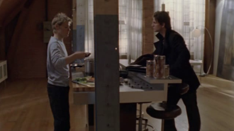
to

.
notes
★ medium difficulty if you know what you're doing, harder for those who don't. :'D
★ made in photoshop cs2
★ uses curves, levels, color balance, (optional) channel mixer, photo filters, and (optional) gradient map. yes, i am crazy :|
★ doesn't work with every image! for lighter and less yellower images, tone down the channel mixer and gradient map; if it's still too washed out, then take them both out! ♥
01. open up your base and crop it! for mine, i was experimenting around with crops so it looks totally not my style, har har :'D go to image > adjustments > auto color if you really need it but i didn't use it.
02. since my base's darker colors were a little bit stronger, i used a dark brown exclusion layer (#1f1109) set at 41% opacity, washing out a little bit of massu's hair - it makes a tiny difference right now but ends up making the end result prettier~
03. the almighty curves layer! i suppose you could just duplicate the base and screen it but it doesn't give depth to the icon like the curves layer does, ha ha D: the input and output numbers depend on how dark your base is so experiment a little! mine was looked something like this:
point one - 194, 217
point two - 38, 41.
04. anyone who's known me for a looong time knows that i abuse levels so much! ;A; however, without the levels layer, the end result would look really yellow and dark and gross.
rbg - input: 11, 1.15, 255 | output: 0, 255
red - input: 0, 1.11, 255 | output: 0, 248
green - input: 0, 1.00, 255 | output: 0, 255
blue - input: 10, 1.05, 232 | output: 0, 255
remember to experiment with these because every icon is different!
05. it's color balance tiem bb! this layer brightens up the image and ups the blue in the image - for some icons, the blue should be lower and the yellow higher; for others it would be the opposite~
shadows - +14, 0, -25
midtones - 0, +2, +18
highlights - 0, +6, +25
and here, you could check preserve luminosity to make it darker but i didn't. :'D
06. channel mixer! truthfully, i don't really know how to use this thing :'DDD this step is totally optional - meaning, don't do this step if you have a really light image! :ooo
red - 96, 0, 0 | 0
green - 0, 100, 0 | 0
blue - 0, 0, 108 | 0
07. make a photo filter layer (layer > new adjustment layer > photo filter); select "yellow" from the drop-down menu. for me, the density was 16% - lower or up it depending how yellow you think your images needs to be~ remember to check preserve luminosity if it isn't checked already! set the layer at 80% opacity.

08. this is the last step but is optional if your image is light already. go to layer > new adjustment layer > gradient map and choose a dark brown color - i used the dark brown from the previous exclusion layer (#1f1109). set this layer to color dodge at 16% opacity.
and now you're done! ♥
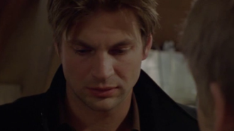
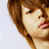
other examples with altered settings:

and
