Tutorial #1: Six Cylon Evolution
:: Application: GIMP (tutorial applicable to other applications)
:: Difficulty level: Medium
:: Brief: This tutorial will use a combination of colour layers and the curves function. No outside textures required. Included are the main steps to iconmaking.
:: Text: X-Files
to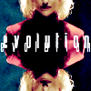
or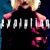
:: To begin, you are welcome to friend this community. Feedback is extremely welcome. I'm happy to answer questions and I'd love to see your creations using this tutorial. ::
Step 1:
(Preparing your base)
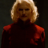
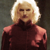
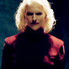
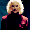
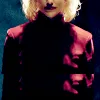
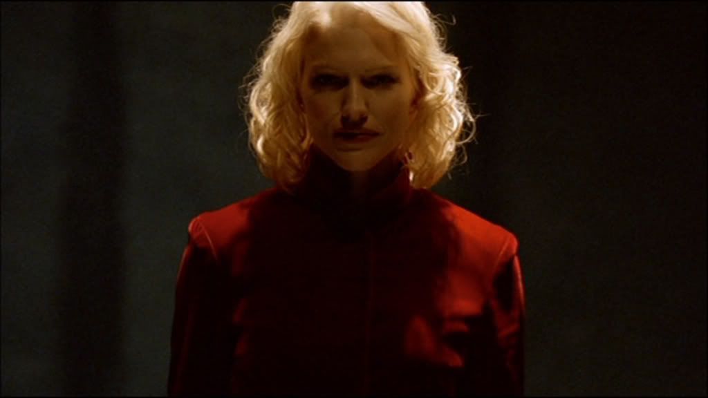
1.1. First, decide on your image. I have chosen this cap from the Battlestar Galactica miniseries. Those who have seen the series may identify it as the first appearance of the Number Six model.
I have decided to crop the image plainly. I normally prefer to crop from the side and 'chop off' some of the face, but I felt this image would be more powerful head-on. I have cropped like so:
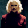
1.2. Let's focus on doing something about the lighting. For that, turn to your curves function. Though the curves function differs slightly between applications, every variant does the same thing. I like to contrast as I lighten. I never follow any set curves pattern because every image is different (especially with shows like Battlestar Galactica, as cap image quality differs throughout seasons). If you are not familiar with curves, I suggest you brief yourself on their function through the help tab on your application, another tutorial, or merely playing around with them (which is how I learnt, so I've always thought they can't be completely rocket science). The appearance of my icon after using the curves function:
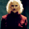
1.3. It looks a little too yellow, doesn't it? To counteract this, I add a desaturated (black & white) layer set to 'screen' full opacity. The result:
I know it doesn't look stunning right now, but not to worry! Move along, move along, to the next steps.
1.4. Using the 'unsharpen mask' tool, I sharpen slightly. Don't go overboard. There's time to polish the icon later.
We now have our base.
Step 2:
(Colouring your icon)
Early on in iconmaking 'career', I always used the 'screen' and 'overlay' modes for colour layers. I have since found that they do not give the vibrant colouring I desire, so instead, I turned to the 'burn' mode. The genius mode. What makes it so good? You'll see :).
2.1. Create a new white layer and fill with #c6e6ff, which is the following colour:

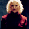
Set this layer to 'burn' full opacity. The result:
2.2. The colours still look a little stale. I could go and play with the curves function again, but I'll shortcut that and fill a new white layer with #b3ab96, which is the following colour:

Set this layer to 'soft light' full opacity. See, if you put that colour on 'burn', it would only increase the darkness of the icon. 'Soft light' brings more colour back to her face. The result:
2.3. I'm not satisfied with the colouring, so I create a new white layer and fill with #f6e4fb, which is the following colour:

Set this layer to 'burn' full opacity. Light pink/purples always do wonders for icons. It add more depth and a more human skin tone shade to the otherwise green and yellow-ish affair. For the most part, stick with light colours. Sometimes there's an opportunity to use a darker colour and pull it off right, but that all depends on your cap and base prep. Here is the result of this layer:
2.4. It's really starting to come together now. I think there's a little too much pink tone on her face, so I create a new white layer and fill with #e5feff, which is the following colour:

Set this layer to 'burn' full opacity. The result:
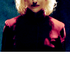
2.5. I return to the curves function and lighten/contrast the icon like so:
We now have our coloured icon.
Step 3:
(Rearranging your icon or adding 'special effects')
If you're satisfied with your icon as is (particularly the cropping), you can skip this step. I've decided to move the icon around so it doesn't show anything above her nose. I have decided on two very different layouts. First, we will focus on the first layout, with the end result as:
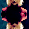
3.1. Drag your icon upwards and position half of your character's face off the canvas, like so:
3.2. Duplicate that layer and flip vertically. Position the duplicate as you did with the original so as to create a 'mirror' image, like so:
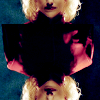
3.3. As you can see, the two images do not blend. Take your eraser tool and erase slowly until the images appear to merge. Since I know I am placing text in the middle, it does not matter if one half of the mirror is a little larger than the other half.
The first layout is now finished.
The second layout doesn't rely on mirroring, but rather traditional repetition. The second layout:
3.4. Duplicate your icon and move the layer as described in step 3.1. You're done. Easy as pie and always a nice effect.
Step 4:
(Adding text to your icon)
This is always an optional step. Some images simply don't need text. When you first start iconmaking, you will feel the need to put text (and often, a sometimes ghastly black border) on your icon to make it look complete. Textless icons are lovely on their own, so don't force text on your creation.
Both versions of the icon use the same text. For this step, I will be using the first layout. I knew I wanted a font that 'stood out' and looked powerful. I usually turn to the X-Files font (if you want to download, a Google search will send you in the right direction). I also wanted to repeat my text.
4.1. I start by typing 'evolution' in X-Files font, size 15. This is the smaller font layer. I then play around with the character spacing so the letters aren't squished. I place the text in the middle of the icon. The result:
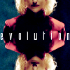
4.2. I duplicate that layer and increase the font size to 21. You may need to play around with your character spacing so all your letters are on the canvas. So people can actually see the repetition, I have moved the larger text just above the smaller and to the right slightly. The result:
We have now finished our text.
Step 5:
(Polishing our icon)
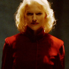
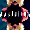
It doesn't matter if the icon looks great to you as is, always go and play with your curves function again. See if you can improve upon the lighting and colours. With this icon, I slightly increased the lighting and the contrast. Next, go and use your 'unsharpen mask' and 'sharpen' tools. I can't tell you the levels to use because every icon is different. Go with what looks right to you. Finally, use your blur tool wisely. I blurred Number Six's cheeks slightly because they looked a little pixel-y, but that's all up to interpretation.
And with that, you have your icon.
|
Feel free to snag this icon with credit (either shadowserenity or serenehorizon is fine). Thank you for reading my tutorial. I hope you are able to put it to use. I really do appreciate people taking the time to comment.
:: Difficulty level: Medium
:: Brief: This tutorial will use a combination of colour layers and the curves function. No outside textures required. Included are the main steps to iconmaking.
:: Text: X-Files
to
or
:: To begin, you are welcome to friend this community. Feedback is extremely welcome. I'm happy to answer questions and I'd love to see your creations using this tutorial. ::
Step 1:
(Preparing your base)
1.1. First, decide on your image. I have chosen this cap from the Battlestar Galactica miniseries. Those who have seen the series may identify it as the first appearance of the Number Six model.
I have decided to crop the image plainly. I normally prefer to crop from the side and 'chop off' some of the face, but I felt this image would be more powerful head-on. I have cropped like so:
1.2. Let's focus on doing something about the lighting. For that, turn to your curves function. Though the curves function differs slightly between applications, every variant does the same thing. I like to contrast as I lighten. I never follow any set curves pattern because every image is different (especially with shows like Battlestar Galactica, as cap image quality differs throughout seasons). If you are not familiar with curves, I suggest you brief yourself on their function through the help tab on your application, another tutorial, or merely playing around with them (which is how I learnt, so I've always thought they can't be completely rocket science). The appearance of my icon after using the curves function:
1.3. It looks a little too yellow, doesn't it? To counteract this, I add a desaturated (black & white) layer set to 'screen' full opacity. The result:
I know it doesn't look stunning right now, but not to worry! Move along, move along, to the next steps.
1.4. Using the 'unsharpen mask' tool, I sharpen slightly. Don't go overboard. There's time to polish the icon later.
We now have our base.
Step 2:
(Colouring your icon)
Early on in iconmaking 'career', I always used the 'screen' and 'overlay' modes for colour layers. I have since found that they do not give the vibrant colouring I desire, so instead, I turned to the 'burn' mode. The genius mode. What makes it so good? You'll see :).
2.1. Create a new white layer and fill with #c6e6ff, which is the following colour:
Set this layer to 'burn' full opacity. The result:
2.2. The colours still look a little stale. I could go and play with the curves function again, but I'll shortcut that and fill a new white layer with #b3ab96, which is the following colour:
Set this layer to 'soft light' full opacity. See, if you put that colour on 'burn', it would only increase the darkness of the icon. 'Soft light' brings more colour back to her face. The result:
2.3. I'm not satisfied with the colouring, so I create a new white layer and fill with #f6e4fb, which is the following colour:
Set this layer to 'burn' full opacity. Light pink/purples always do wonders for icons. It add more depth and a more human skin tone shade to the otherwise green and yellow-ish affair. For the most part, stick with light colours. Sometimes there's an opportunity to use a darker colour and pull it off right, but that all depends on your cap and base prep. Here is the result of this layer:
2.4. It's really starting to come together now. I think there's a little too much pink tone on her face, so I create a new white layer and fill with #e5feff, which is the following colour:
Set this layer to 'burn' full opacity. The result:
2.5. I return to the curves function and lighten/contrast the icon like so:
We now have our coloured icon.
Step 3:
(Rearranging your icon or adding 'special effects')
If you're satisfied with your icon as is (particularly the cropping), you can skip this step. I've decided to move the icon around so it doesn't show anything above her nose. I have decided on two very different layouts. First, we will focus on the first layout, with the end result as:
3.1. Drag your icon upwards and position half of your character's face off the canvas, like so:
3.2. Duplicate that layer and flip vertically. Position the duplicate as you did with the original so as to create a 'mirror' image, like so:
3.3. As you can see, the two images do not blend. Take your eraser tool and erase slowly until the images appear to merge. Since I know I am placing text in the middle, it does not matter if one half of the mirror is a little larger than the other half.
The first layout is now finished.
The second layout doesn't rely on mirroring, but rather traditional repetition. The second layout:
3.4. Duplicate your icon and move the layer as described in step 3.1. You're done. Easy as pie and always a nice effect.
Step 4:
(Adding text to your icon)
This is always an optional step. Some images simply don't need text. When you first start iconmaking, you will feel the need to put text (and often, a sometimes ghastly black border) on your icon to make it look complete. Textless icons are lovely on their own, so don't force text on your creation.
Both versions of the icon use the same text. For this step, I will be using the first layout. I knew I wanted a font that 'stood out' and looked powerful. I usually turn to the X-Files font (if you want to download, a Google search will send you in the right direction). I also wanted to repeat my text.
4.1. I start by typing 'evolution' in X-Files font, size 15. This is the smaller font layer. I then play around with the character spacing so the letters aren't squished. I place the text in the middle of the icon. The result:
4.2. I duplicate that layer and increase the font size to 21. You may need to play around with your character spacing so all your letters are on the canvas. So people can actually see the repetition, I have moved the larger text just above the smaller and to the right slightly. The result:
We have now finished our text.
Step 5:
(Polishing our icon)
It doesn't matter if the icon looks great to you as is, always go and play with your curves function again. See if you can improve upon the lighting and colours. With this icon, I slightly increased the lighting and the contrast. Next, go and use your 'unsharpen mask' and 'sharpen' tools. I can't tell you the levels to use because every icon is different. Go with what looks right to you. Finally, use your blur tool wisely. I blurred Number Six's cheeks slightly because they looked a little pixel-y, but that's all up to interpretation.
And with that, you have your icon.
|
Feel free to snag this icon with credit (either shadowserenity or serenehorizon is fine). Thank you for reading my tutorial. I hope you are able to put it to use. I really do appreciate people taking the time to comment.