tutorial;
TUTORIAL #10
HOW TO VOTE AT LIMS CONTESTS.
*with made up and real life examples
*work in progress
introduction
i trust you all are familiar with LIMS (Last Icon Maker Standing) competitions. basically people sign up and each week they're presented with a picture (or several) which they have to icon. they have to enter each week or they'll be eliminated. in most communities there are also skips which mean you can skip a challenge and not be eliminated.
then the voting is posted where people have to vote for icons they think are worst and also give reasons. usually you also have to vote for your favourite icon where a reason is optional.
there are sever LIMS competitions that are having trouble with people not knowing how to vote, because they forget that at a LIMS competition you can't vote an icon off, because you simply don't like it. you have to give a legitimate reason. that's where this tutorial comes in. i will try my best to explain and clarify how the voting process works.
a bit further down there are also examples and icons and you can donate your own icons with reasons you got for it, either good or bad.
basics
- the most important thing to remember is that you CANNOT use personal opinion!! to avoid using it, just stray away from anything considering the word 'I' as in 'I think' or 'I don't like'. yes, in the real world having a personal opinion is crucial and very much encouraged, but in this case, whatever happens, you should stay objective.
- try to give constructive criticism! don't just diss an icon, try to suggest things that person can do better, for example- 'i like this effect, BUT you could try this instead'
- lose all 'safe' adjectives like nice, good, bad, boring, interesting, funny etc. those don't actually give any information, they just describe your reaction. try to elaborate a bit more.
for example- bad colouring: in what way, what makes it bad? doesn't work with the picture maybe?
- SO, WHAT SHOULD I PAY ATTENTION TO?
well, when you first look at an icon, you get an impression, you either like it or you don't. now try to examine the icons a bit closer.
*colouring- too bright? too dark? is there one colour dominating (yellow, green, blue, red)?
this is probably the first thing you notice and can be the easiest to assess.
*cropping- too close, too far? hard to tell what's on the icon?
also, since in most cases there is a picture given in LIMS challenges so do no say- 'the crop is bad because i can't tell who is on the icon'. that's not a legit reason.
*sharpness- oversharpened? blurry?
- TEXT
*font- does it fit with the coluring/style of the icon? colour?
*content- sometimes people make spelling mistakes and it is ok to vote someone off because of it, but try not to be very harsh. also i've come across people voting off icons because the text had explicit content in it (references to sexual orientation etc) but that's up to a specific community and what kind of rules they have for that.
*effects- pixelated? hard to read? too tiny? too big?
NB! saying 'the font is too over-used' etc. is also a form of personal opinion, thus not allowed!
NB! vol2 tiny text is not meant to be read, so don't say 'tiny text is hard to read'
- OVERALL FEEL OF THE ICON
*effects do all the textures go together? too much random stuff piled up on the icon? does it feel finished?
*originality- is it original, has something like this been done before? eyecatching? a new approach to something old? maybe they've tried, but it didn't quite come out the best.
NB! saying 'that particular icon trend is too over-used, boring, common' is again personal opinion. instead try to assess how that person has managed to interpret that trend.
examples
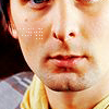
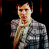
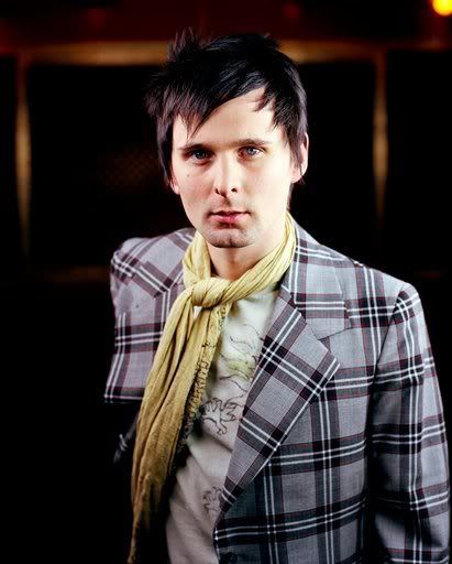
i made 8 icons out of this image of matthew bellamy (sorry for butchering you like that, matt!!) using different techniques and stuff. i basically went crazy. lol. each icon might seem normal but at closer look, a little something is off. let's see what would be the things to say about these icons-
#1
#2
#3
#4

#5
#6
#7
#8

good examples
icon #1
- the crop is odd, his eyes are half there, half gone. unflattering.
- the tiny text is placed in a waeird way, it distracts from the image
- it's a bit oversharpened
+ original crop
+ the colouring fits the image well
icon #2
- the colouring is very light, almost washed out
- the duplicated image makes it hard to see what's on the icon
- the text is absolutely unreadable
- very odd cropping on both pictures, if i didn't know it's matt, it would be hard to guess who's on the icon
+ nice bright colouring
+ great idea, very original
icon #3
- the image is too yellow
- the exclusion layer makes the image too yellow and the desaturated part doesn't fit the rest of the icon
- the tiny text in the box is too 'clean/pixelated' and doesn't match the rest of the icon
- the two images being in different sizes is disturbing and unflattering
- the desaturated part is cropped very poorly
+ the heart brush is nicely placed
+ good idea, lovely use of effects
icon #4
- there are too many textures wich are suffocating matt
- the colouring is very washed out, his features aren't very distiguishable
- the parts cut out look messy and random, looks like it was done in a hurry
- the dark texture is too much, it doesn't add to the icon
+ nice use of textures
+ very creative
icon #5
- a bit oversharpened and yellow
- the font is too big and the pink border is distracting
- the font doesn't match the image very well
+ cool cropping
+ good colouring, though it's a bit oversharpened
icon #6
- it's very hard to see matt on the icon, because the texture covers most of him
- the textures are overpowering the image
- the idea is very original, but the execution isn't the best
- the textures clash with the image and each other
- the image is too small, it's hard to make out his face
+ very original, colourful
icon #7
- it's very dark and oversharpened
- the text is very hard to read, because it's too small and pixelated
- it looks grainy and the font clashes with the picture
+ i like the cropping
icon #8
- the textures cover his face, which is very unflattering
- the crop is bad, because his head looks like it's just floating there
- the white border only looks good on white background, otherwise it would look odd
- the image is a bit blurry
- the colouring is green-ish which makes him look sickly
+ nice clear image
bad examples
- i don't like that colouring
- i hate the cropping
- i think the text looks boring
- i really don't see the point of those textures..
- 'cause i think it's ugly
EXAMPLES FROM REAL LIFE
bad votes

by arbuus for tennant_lims round #1 challenge #3
comment: Compared to others up for voting, this one is blah and uninspired
in what way? was the first question that came to mind.. i for one thought it was quite 'inspired' i liked how it looks like there's a scribbling under his feet (if it hadn't been a hush challenge then i would have added doctor who under his feet..)
good votes

by shizukuchan for doctor_who_lims round #1 challenge #5
comment: The coloring of the image is rather nice (soft and faded, very pretty!), but the text and the brush are too bold and in too contrasting of a color to be effective here. They don't look purposeful... the effect is very unharmonious, unfortunately. It also seems that the brush was chosen haphazardly, and it makes no sense in relation to the icon.
(the bit about the haphazardly chosen brush is actually pretty much true, and I like that the person also said what he/she liked about the icon^^)
***
of course this doesn't mean i know everything there is to know about voting at a LIMS contest, but i try my best.
also, these voting examples aren't meant to be followed religiously, just try to understand what it's about and how to approach certain situations.
please feel free to 'donate' your own icons that perhaps got weird or unusual or lovely comments at some LIMS contest and that you'd like to share so people could see what's nice and what's not. maybe/hopefully we can compile a list or a gallery of icons and example votes to which people can refer to.
this is a very raw outline of my idea of an ideal LIMS voting guide, hopefully we'll get more examples to improve this 'tutorial'.
HOW TO VOTE AT LIMS CONTESTS.
*with made up and real life examples
*work in progress
introduction
i trust you all are familiar with LIMS (Last Icon Maker Standing) competitions. basically people sign up and each week they're presented with a picture (or several) which they have to icon. they have to enter each week or they'll be eliminated. in most communities there are also skips which mean you can skip a challenge and not be eliminated.
then the voting is posted where people have to vote for icons they think are worst and also give reasons. usually you also have to vote for your favourite icon where a reason is optional.
there are sever LIMS competitions that are having trouble with people not knowing how to vote, because they forget that at a LIMS competition you can't vote an icon off, because you simply don't like it. you have to give a legitimate reason. that's where this tutorial comes in. i will try my best to explain and clarify how the voting process works.
a bit further down there are also examples and icons and you can donate your own icons with reasons you got for it, either good or bad.
basics
- the most important thing to remember is that you CANNOT use personal opinion!! to avoid using it, just stray away from anything considering the word 'I' as in 'I think' or 'I don't like'. yes, in the real world having a personal opinion is crucial and very much encouraged, but in this case, whatever happens, you should stay objective.
- try to give constructive criticism! don't just diss an icon, try to suggest things that person can do better, for example- 'i like this effect, BUT you could try this instead'
- lose all 'safe' adjectives like nice, good, bad, boring, interesting, funny etc. those don't actually give any information, they just describe your reaction. try to elaborate a bit more.
for example- bad colouring: in what way, what makes it bad? doesn't work with the picture maybe?
- SO, WHAT SHOULD I PAY ATTENTION TO?
well, when you first look at an icon, you get an impression, you either like it or you don't. now try to examine the icons a bit closer.
*colouring- too bright? too dark? is there one colour dominating (yellow, green, blue, red)?
this is probably the first thing you notice and can be the easiest to assess.
*cropping- too close, too far? hard to tell what's on the icon?
also, since in most cases there is a picture given in LIMS challenges so do no say- 'the crop is bad because i can't tell who is on the icon'. that's not a legit reason.
*sharpness- oversharpened? blurry?
- TEXT
*font- does it fit with the coluring/style of the icon? colour?
*content- sometimes people make spelling mistakes and it is ok to vote someone off because of it, but try not to be very harsh. also i've come across people voting off icons because the text had explicit content in it (references to sexual orientation etc) but that's up to a specific community and what kind of rules they have for that.
*effects- pixelated? hard to read? too tiny? too big?
NB! saying 'the font is too over-used' etc. is also a form of personal opinion, thus not allowed!
NB! vol2 tiny text is not meant to be read, so don't say 'tiny text is hard to read'
- OVERALL FEEL OF THE ICON
*effects do all the textures go together? too much random stuff piled up on the icon? does it feel finished?
*originality- is it original, has something like this been done before? eyecatching? a new approach to something old? maybe they've tried, but it didn't quite come out the best.
NB! saying 'that particular icon trend is too over-used, boring, common' is again personal opinion. instead try to assess how that person has managed to interpret that trend.
examples
i made 8 icons out of this image of matthew bellamy (sorry for butchering you like that, matt!!) using different techniques and stuff. i basically went crazy. lol. each icon might seem normal but at closer look, a little something is off. let's see what would be the things to say about these icons-
#1
#2
#3
#4
#5
#6
#7
#8
good examples
icon #1
- the crop is odd, his eyes are half there, half gone. unflattering.
- the tiny text is placed in a waeird way, it distracts from the image
- it's a bit oversharpened
+ original crop
+ the colouring fits the image well
icon #2
- the colouring is very light, almost washed out
- the duplicated image makes it hard to see what's on the icon
- the text is absolutely unreadable
- very odd cropping on both pictures, if i didn't know it's matt, it would be hard to guess who's on the icon
+ nice bright colouring
+ great idea, very original
icon #3
- the image is too yellow
- the exclusion layer makes the image too yellow and the desaturated part doesn't fit the rest of the icon
- the tiny text in the box is too 'clean/pixelated' and doesn't match the rest of the icon
- the two images being in different sizes is disturbing and unflattering
- the desaturated part is cropped very poorly
+ the heart brush is nicely placed
+ good idea, lovely use of effects
icon #4
- there are too many textures wich are suffocating matt
- the colouring is very washed out, his features aren't very distiguishable
- the parts cut out look messy and random, looks like it was done in a hurry
- the dark texture is too much, it doesn't add to the icon
+ nice use of textures
+ very creative
icon #5
- a bit oversharpened and yellow
- the font is too big and the pink border is distracting
- the font doesn't match the image very well
+ cool cropping
+ good colouring, though it's a bit oversharpened
icon #6
- it's very hard to see matt on the icon, because the texture covers most of him
- the textures are overpowering the image
- the idea is very original, but the execution isn't the best
- the textures clash with the image and each other
- the image is too small, it's hard to make out his face
+ very original, colourful
icon #7
- it's very dark and oversharpened
- the text is very hard to read, because it's too small and pixelated
- it looks grainy and the font clashes with the picture
+ i like the cropping
icon #8
- the textures cover his face, which is very unflattering
- the crop is bad, because his head looks like it's just floating there
- the white border only looks good on white background, otherwise it would look odd
- the image is a bit blurry
- the colouring is green-ish which makes him look sickly
+ nice clear image
bad examples
- i don't like that colouring
- i hate the cropping
- i think the text looks boring
- i really don't see the point of those textures..
- 'cause i think it's ugly
EXAMPLES FROM REAL LIFE
bad votes
by arbuus for tennant_lims round #1 challenge #3
comment: Compared to others up for voting, this one is blah and uninspired
in what way? was the first question that came to mind.. i for one thought it was quite 'inspired' i liked how it looks like there's a scribbling under his feet (if it hadn't been a hush challenge then i would have added doctor who under his feet..)
good votes
by shizukuchan for doctor_who_lims round #1 challenge #5
comment: The coloring of the image is rather nice (soft and faded, very pretty!), but the text and the brush are too bold and in too contrasting of a color to be effective here. They don't look purposeful... the effect is very unharmonious, unfortunately. It also seems that the brush was chosen haphazardly, and it makes no sense in relation to the icon.
(the bit about the haphazardly chosen brush is actually pretty much true, and I like that the person also said what he/she liked about the icon^^)
***
of course this doesn't mean i know everything there is to know about voting at a LIMS contest, but i try my best.
also, these voting examples aren't meant to be followed religiously, just try to understand what it's about and how to approach certain situations.
please feel free to 'donate' your own icons that perhaps got weird or unusual or lovely comments at some LIMS contest and that you'd like to share so people could see what's nice and what's not. maybe/hopefully we can compile a list or a gallery of icons and example votes to which people can refer to.
this is a very raw outline of my idea of an ideal LIMS voting guide, hopefully we'll get more examples to improve this 'tutorial'.