Tutorial 001
From 
to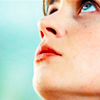
Requested by mistress_triple
I should be ashamed of that one because really, easy peasy. It is the perfect example on how it's easy to have a great coloring when you use awesome caps. It's not even a tutorial to be honest, thought I managed to transform ii in a novel with my babblings xd
Tools used on Photoshop CS5:
- Vibrance
- Brightness/contrast
- Brush
- Gaussian Blur
Layer List:
here In each step I'll say which layer is concerned.
Textures:
by skydawnjade
How to:
1/Layer 5: Resize your cap and choose your crop. I wanted to first to keep her lips only but as she's looking up, the icon seemed more interesting when you keep her whole face.
2/Layer 5 copy: I wanted to reveal a bit the original colors of the caps. As I suck at Curves, I simply duplicate layer 5 and set it so screen. As you can see, it's away too bright (which is always the trouble with screened layers in my opinion) so I set the opacity to 27%.
3/Vibrance 1: If you want to reveal the color of an icon and make powerful colors, it is TEH tool to use. I'm in love with it at the moment. Though, you'd bette ruse good caps with it or the result will look like crap. So open a vibrance layer:
Layer -> New Adjustment Layer -> Vibrance
Vibrance: +34
Saturation: +28
The vibrance is for "low tones" whereas the saturation is for the colors in the shadows. (sorry for my non use of technical words, I don't know them xd)
The result so far: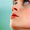
4/Brightness Contrast 1: I'm satisfied with the colors so now it is time to put more light in the icon. Open a brightness/contrast layer:
Layer -> New Adjustement Layer -> Brightness/Contrast
Brightness: 23
Contrast: -19
Why minus in the contrast? Because each time you increase the brightness, you increase the contrast and the result will look ugly in my opinion. I lvoe bright icon but you shoudl still be able to see what is on it and not only huge bright white areas. Never be afraid to play with the settings when you open a layer.
5/Brightness Contrast 2: I always rather prefer add another brightness/contrast layer than going crazy in the charts of only one. I think it's easier to control what's going on in the icon. Open a new Brightness/Contrast layer:
New Adjustement Layer -> Brightness/Contrast
Brightness: 13
Contrast: 11
6/Layer 8: I needed something in the background. I found it empty and wanted to brighten the blue a bit. I opened a new layer:
Layer -> New Layer
Then, I used the paint brush in white, size 6 or 7, and draw a point on the top left and a line on the bottom left. After that, I used the gaussian blur:
Filter -> Blur -> Gaussian Blur
You'll have to choose the radius (aka how much you want to blur the things you draw) It is as you wish (okay I confess I don't remember the radius I used) Keep in mind that PS keeps in memory the last radius you used.
Keep in mind too that you, if you make a mistake, you can always go to
Edit -> Go Backward
As I wanted her face to stay as clear as possible, I used an eraser tool on the layer and erased the blur on her face.
7/The end: You're done! Now, merge all your layers. When I'm done with an icon, I always sharpen it a bit.
Filter -> Sharpen
As I hate oversharpened icons (it fits sometimes, but not all the time), I go to
Edit -> Fade sharpen
and modify it a bit.
Result:
- Tutorials masterlist
- Don't even try to ask for a .PSD.
- Fell free to ask all the questions you want!
- You can ask a tutorial of everything posting in that comm.
- Sorry for any spelling mistakes, no existant grammar in some sentences.
- Keep in mind those settings may not work on your pictures!
- Credit if you snag the final icon or any textures

to

Requested by mistress_triple
I should be ashamed of that one because really, easy peasy. It is the perfect example on how it's easy to have a great coloring when you use awesome caps. It's not even a tutorial to be honest, thought I managed to transform ii in a novel with my babblings xd
Tools used on Photoshop CS5:
- Vibrance
- Brightness/contrast
- Brush
- Gaussian Blur
Layer List:
here In each step I'll say which layer is concerned.
Textures:

by skydawnjade
How to:
1/Layer 5: Resize your cap and choose your crop. I wanted to first to keep her lips only but as she's looking up, the icon seemed more interesting when you keep her whole face.
2/Layer 5 copy: I wanted to reveal a bit the original colors of the caps. As I suck at Curves, I simply duplicate layer 5 and set it so screen. As you can see, it's away too bright (which is always the trouble with screened layers in my opinion) so I set the opacity to 27%.
3/Vibrance 1: If you want to reveal the color of an icon and make powerful colors, it is TEH tool to use. I'm in love with it at the moment. Though, you'd bette ruse good caps with it or the result will look like crap. So open a vibrance layer:
Layer -> New Adjustment Layer -> Vibrance
Vibrance: +34
Saturation: +28
The vibrance is for "low tones" whereas the saturation is for the colors in the shadows. (sorry for my non use of technical words, I don't know them xd)
The result so far:

4/Brightness Contrast 1: I'm satisfied with the colors so now it is time to put more light in the icon. Open a brightness/contrast layer:
Layer -> New Adjustement Layer -> Brightness/Contrast
Brightness: 23
Contrast: -19
Why minus in the contrast? Because each time you increase the brightness, you increase the contrast and the result will look ugly in my opinion. I lvoe bright icon but you shoudl still be able to see what is on it and not only huge bright white areas. Never be afraid to play with the settings when you open a layer.
5/Brightness Contrast 2: I always rather prefer add another brightness/contrast layer than going crazy in the charts of only one. I think it's easier to control what's going on in the icon. Open a new Brightness/Contrast layer:
New Adjustement Layer -> Brightness/Contrast
Brightness: 13
Contrast: 11
6/Layer 8: I needed something in the background. I found it empty and wanted to brighten the blue a bit. I opened a new layer:
Layer -> New Layer
Then, I used the paint brush in white, size 6 or 7, and draw a point on the top left and a line on the bottom left. After that, I used the gaussian blur:
Filter -> Blur -> Gaussian Blur
You'll have to choose the radius (aka how much you want to blur the things you draw) It is as you wish (okay I confess I don't remember the radius I used) Keep in mind that PS keeps in memory the last radius you used.
Keep in mind too that you, if you make a mistake, you can always go to
Edit -> Go Backward
As I wanted her face to stay as clear as possible, I used an eraser tool on the layer and erased the blur on her face.
7/The end: You're done! Now, merge all your layers. When I'm done with an icon, I always sharpen it a bit.
Filter -> Sharpen
As I hate oversharpened icons (it fits sometimes, but not all the time), I go to
Edit -> Fade sharpen
and modify it a bit.
Result:

- Tutorials masterlist
- Don't even try to ask for a .PSD.
- Fell free to ask all the questions you want!
- You can ask a tutorial of everything posting in that comm.
- Sorry for any spelling mistakes, no existant grammar in some sentences.
- Keep in mind those settings may not work on your pictures!
- Credit if you snag the final icon or any textures