Tutorial #02
From 
to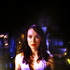
Tools used on Photoshop CS5:
- Color balance
- Vibrance
- Gaussian Blur
- Channel mixer
- Brightness/contrast
- Smudge tool
- Paint brush
Textures:
by nodazzle

by skydawnjade
Layer list HERE. The name of the layer is written in each step.
How to:
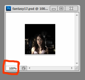
1/Layer 2: Resize the picture (Image -> Image size). Open a new file, size 100*100 pixels. Slide the image you just resized to the 100*100 base. Use the smudge tool to extend the top if the icon. I advise you to use the smudge tool with a strength of 40%, no more than 50 and a size around 6. The effect will look smoother than a 100% strength. To use the smudge tool, I always increase the picture to 300% in order to be more precised. Click on "100%" at the bottom of the little window where your base is (check the image below) and change it to "300%".
2/Vibrance 1: It is time to work on colors. Open a vibrance layer.
Layer -> New adjustments layer -> Vibrance
Saturation will color the colors in the shadows whereas the vibrance is for the "general" colors. I always begin by playing with the saturation because it is the easiest way to see the main colors of the picture (and also the fastest way I have found to have colors).
Vibrance: +37
Saturation: 100
3/Brightness/Contrast 1: Now, we need a bit of light around. Open a brightness/contrast layer
Layer ->New adjustements layer -> Brightness/Contrast.
I always begin to work with the brightness because I think it increases the contrasts. Always be careful with the contrasts too because when you will play with them, it will modify the brightness too.
Brightness: 64
Contrast: 19
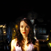
Result so far:
4/Color Balance Layer 1: As the icon looks a bit too yellow, I decided to add more colors. Open a color balance layer
Layer -> New adjustments layer -> Color balance layer
I always begin by the midtones, then with the highlights and if needed, the shadows.
Midtones: -90, -100, -34
Highlights: 0, 0, +44
As you can see now, it is red/purple/pink/blue now.
5/Channel Mixer 1: I wanted to make the colors pimp more and the background to be more visible. To achieve this effect, I added a channel mixer layer.
Layer -> New adjustments layer -> Channel mixer
Blue: -24%, -49%, +200%
I rarely modify the green and red channel, mainly because they don't help to have a coloring that I like.
6/Vibrance 2: Not bad right? But, a bit more yellow would be great. As we have seen before using the first vibrance layer, yellow is the color which pimp the most so I created another.
vibrance layer Layer -> New adjustments layer -> Vibrance
Vibrance: +26
Saturation: +9
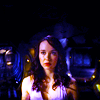
The result is that the icon looks more colorful with some yellow and red added.
Result so far:
7/Layer 3: The icon looks too sharpen to me. Contrasts are a bit too high. Create a new layer.
Layer -> New -> Layer
Use a paint brush in white, size 6. Draw a line from the left bottom corner of the layer to the middle of the top. Then another one to the bottm right corner to the top middle border. Then, be sure your layer is selected. Go to
Filter -> Blur -> Gaussian Blur
Move the radius until you have a result you like. This is the easiest way to create either a blurry effect either to have a light texture. It is also a great and discreet way to add light in an icon.
My result

The difference between your layer and mine is that mine has a black background, yours has a transparent one.
8/Layer 4: I decided to add more effects in order to enlighten the icon more. I added THIS TEXTURE made y nodazzle and set it to screen.
9/Layer 2 copy: Now the icon looks too blury. Select the base (Layer 2), click right and then on "duplicate layer". Move the new layer (It was named "Layer 2 copy") to the top of the layers and set it to soft light.
10/Color balance 2: As you can see, the soft layer covered many of the colors. Open a color balance layer
Layer -> New layer -> Color balance layer
Midtones: +12, 0, -36
And the colors are back!
11/Final "touch": Merge all the layers. Go to
Filter -> Sharpen -> Sharpen
Then, click on
Edit -> Fade sharpen
And fade the sharpeness. I don't like oversharpened icons (with a few exceptions) but I don't like blurry ones either so I always spend a bit of time playing with the "fade sharpen". Usually, I fade it between 5 and 20. It really depends on the icon.
Final result

- Tutorials masterlist
- Don't even try to ask for a .PSD.
- Fell free to ask all the questions you want!
- You can ask a tutorial of everything posting in that comm.
- Sorry for any spelling mistakes, no existant grammar in some sentences.
- Keep in mind those settings may not work on your pictures!
- Credit if you snag the final icon or any textures. Be sure to credit the right maker!

to

Tools used on Photoshop CS5:
- Color balance
- Vibrance
- Gaussian Blur
- Channel mixer
- Brightness/contrast
- Smudge tool
- Paint brush
Textures:

by nodazzle

by skydawnjade
Layer list HERE. The name of the layer is written in each step.
How to:
1/Layer 2: Resize the picture (Image -> Image size). Open a new file, size 100*100 pixels. Slide the image you just resized to the 100*100 base. Use the smudge tool to extend the top if the icon. I advise you to use the smudge tool with a strength of 40%, no more than 50 and a size around 6. The effect will look smoother than a 100% strength. To use the smudge tool, I always increase the picture to 300% in order to be more precised. Click on "100%" at the bottom of the little window where your base is (check the image below) and change it to "300%".

2/Vibrance 1: It is time to work on colors. Open a vibrance layer.
Layer -> New adjustments layer -> Vibrance
Saturation will color the colors in the shadows whereas the vibrance is for the "general" colors. I always begin by playing with the saturation because it is the easiest way to see the main colors of the picture (and also the fastest way I have found to have colors).
Vibrance: +37
Saturation: 100
3/Brightness/Contrast 1: Now, we need a bit of light around. Open a brightness/contrast layer
Layer ->New adjustements layer -> Brightness/Contrast.
I always begin to work with the brightness because I think it increases the contrasts. Always be careful with the contrasts too because when you will play with them, it will modify the brightness too.
Brightness: 64
Contrast: 19
Result so far:

4/Color Balance Layer 1: As the icon looks a bit too yellow, I decided to add more colors. Open a color balance layer
Layer -> New adjustments layer -> Color balance layer
I always begin by the midtones, then with the highlights and if needed, the shadows.
Midtones: -90, -100, -34
Highlights: 0, 0, +44
As you can see now, it is red/purple/pink/blue now.
5/Channel Mixer 1: I wanted to make the colors pimp more and the background to be more visible. To achieve this effect, I added a channel mixer layer.
Layer -> New adjustments layer -> Channel mixer
Blue: -24%, -49%, +200%
I rarely modify the green and red channel, mainly because they don't help to have a coloring that I like.
6/Vibrance 2: Not bad right? But, a bit more yellow would be great. As we have seen before using the first vibrance layer, yellow is the color which pimp the most so I created another.
vibrance layer Layer -> New adjustments layer -> Vibrance
Vibrance: +26
Saturation: +9
The result is that the icon looks more colorful with some yellow and red added.
Result so far:

7/Layer 3: The icon looks too sharpen to me. Contrasts are a bit too high. Create a new layer.
Layer -> New -> Layer
Use a paint brush in white, size 6. Draw a line from the left bottom corner of the layer to the middle of the top. Then another one to the bottm right corner to the top middle border. Then, be sure your layer is selected. Go to
Filter -> Blur -> Gaussian Blur
Move the radius until you have a result you like. This is the easiest way to create either a blurry effect either to have a light texture. It is also a great and discreet way to add light in an icon.
My result

The difference between your layer and mine is that mine has a black background, yours has a transparent one.
8/Layer 4: I decided to add more effects in order to enlighten the icon more. I added THIS TEXTURE made y nodazzle and set it to screen.
9/Layer 2 copy: Now the icon looks too blury. Select the base (Layer 2), click right and then on "duplicate layer". Move the new layer (It was named "Layer 2 copy") to the top of the layers and set it to soft light.
10/Color balance 2: As you can see, the soft layer covered many of the colors. Open a color balance layer
Layer -> New layer -> Color balance layer
Midtones: +12, 0, -36
And the colors are back!
11/Final "touch": Merge all the layers. Go to
Filter -> Sharpen -> Sharpen
Then, click on
Edit -> Fade sharpen
And fade the sharpeness. I don't like oversharpened icons (with a few exceptions) but I don't like blurry ones either so I always spend a bit of time playing with the "fade sharpen". Usually, I fade it between 5 and 20. It really depends on the icon.
Final result

- Tutorials masterlist
- Don't even try to ask for a .PSD.
- Fell free to ask all the questions you want!
- You can ask a tutorial of everything posting in that comm.
- Sorry for any spelling mistakes, no existant grammar in some sentences.
- Keep in mind those settings may not work on your pictures!
- Credit if you snag the final icon or any textures. Be sure to credit the right maker!