#71 - Tutorial 01 - Clary Fray
Over at the Ask the Maker meme, hosted by icon_talk a couple people asked for some tutorials for recent icons of mine. This one was requested by adriftingsea.
We're gonna go from
to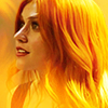
It's been a few years since I've done a tutorial so bear with me! I don't give out exact values of brightness/contrast, curves, vibrance, etc because they'll never work the same way on another image so what's the point? This is merely to help break down any mystery behind the icon and maybe there's a step here you've never thought of employing yourself but now you might! I love bright, vibrant icons most of the time so I'm always trying to get the best quality colour I can.
After some digging I tracked down the texture and its creator to this post at dailyinspired. I made the icon for that post, obvs.
I started out with this cap from Screencapped, which is the only place I've seen thus far that's capped Shadowhunters, at least in completion.
The colouring of the texture led me to think immediately of Clary's hair, which is why I picked her.
01) I started out by sizing and positioning the cap until I got this result:

02) I duplicated the layer and set it to screen, which seems to be my default when I'm working with SH caps:

03) Often times I'll have two screened duplicate layers with a soft light duplicate layer sandwiched in between. The soft light layer is usually what I filter (sharpen or some Topaz filter of some kind, either between cartooned, crisp style or curly smooth). More often than not there's always a screened layer as my last duplicate layer to soften the darker contrast of the soft light layer.
Anyhoodle, the soft light layer and the next screened layer:

-->
Long story short: base --> screen --> soft light with filter --> screen
04) I like the light of the icon here. Usually I'd play around with some gradient map layers here but since I was going to try out the texture I didn't bother for the moment since I didn't know what was going to work or not.
I used fassy's texture set to screen.

-->
05) Flamey, amirite! This was honestly one of those happy accidents where the texture worked out perfectly with the colouring and subject of the icon. Sometimes, no matter how badly I want a texture to work, it just doesn't happen. Some people can take the most complex and bold textures and make art out of them. I often feel like I don't have enough creativity to see beyond the texture itself.
Anyway, I wasn't a big fan of all the texture on her face so I masked it off super lightly, enough that she wasn't obscured so much because her expression is important.

06) I probably could have left it like that but I wanted to play with the contrast and try to even out the colours of her face. I used a gradient map set to soft light but again masked off just a bit from her face to reduce the yellow.

-->
07) I wanted to accentuate some of the details of the icon so I used a curves layer and probably used the "auto" button for it because if left to my own devices I just muck it all up by making the contrast too much.

08) Finally, I made the colours look a bit richer and brightened it up by adding a contrast/brightness layer. I reduced the contrast some and raised the brightness without losing any of the quality of the icon. The two layers don't look very different here but when I toggle the final layer off and on with the layer palette there is a noticable difference, but you'll just have to take my word for it. To my eye it also smoothed out the overall look so I called it done!

Here's the list of layers if it helps clarify anything.

Have any questions or need more info just ask! I have three more icons to do tutorials for, as well, so watch for those! Want to request your own tut? Comment here or check out all the other makers who are offering to explain their work, too!
We're gonna go from

to
It's been a few years since I've done a tutorial so bear with me! I don't give out exact values of brightness/contrast, curves, vibrance, etc because they'll never work the same way on another image so what's the point? This is merely to help break down any mystery behind the icon and maybe there's a step here you've never thought of employing yourself but now you might! I love bright, vibrant icons most of the time so I'm always trying to get the best quality colour I can.
After some digging I tracked down the texture and its creator to this post at dailyinspired. I made the icon for that post, obvs.
I started out with this cap from Screencapped, which is the only place I've seen thus far that's capped Shadowhunters, at least in completion.
The colouring of the texture led me to think immediately of Clary's hair, which is why I picked her.
01) I started out by sizing and positioning the cap until I got this result:
02) I duplicated the layer and set it to screen, which seems to be my default when I'm working with SH caps:
03) Often times I'll have two screened duplicate layers with a soft light duplicate layer sandwiched in between. The soft light layer is usually what I filter (sharpen or some Topaz filter of some kind, either between cartooned, crisp style or curly smooth). More often than not there's always a screened layer as my last duplicate layer to soften the darker contrast of the soft light layer.
Anyhoodle, the soft light layer and the next screened layer:
-->
Long story short: base --> screen --> soft light with filter --> screen
04) I like the light of the icon here. Usually I'd play around with some gradient map layers here but since I was going to try out the texture I didn't bother for the moment since I didn't know what was going to work or not.
I used fassy's texture set to screen.
-->
05) Flamey, amirite! This was honestly one of those happy accidents where the texture worked out perfectly with the colouring and subject of the icon. Sometimes, no matter how badly I want a texture to work, it just doesn't happen. Some people can take the most complex and bold textures and make art out of them. I often feel like I don't have enough creativity to see beyond the texture itself.
Anyway, I wasn't a big fan of all the texture on her face so I masked it off super lightly, enough that she wasn't obscured so much because her expression is important.
06) I probably could have left it like that but I wanted to play with the contrast and try to even out the colours of her face. I used a gradient map set to soft light but again masked off just a bit from her face to reduce the yellow.
-->
07) I wanted to accentuate some of the details of the icon so I used a curves layer and probably used the "auto" button for it because if left to my own devices I just muck it all up by making the contrast too much.
08) Finally, I made the colours look a bit richer and brightened it up by adding a contrast/brightness layer. I reduced the contrast some and raised the brightness without losing any of the quality of the icon. The two layers don't look very different here but when I toggle the final layer off and on with the layer palette there is a noticable difference, but you'll just have to take my word for it. To my eye it also smoothed out the overall look so I called it done!
Here's the list of layers if it helps clarify anything.
Have any questions or need more info just ask! I have three more icons to do tutorials for, as well, so watch for those! Want to request your own tut? Comment here or check out all the other makers who are offering to explain their work, too!