Tutorial - How to use text. Wooow!
just_discover asked me for a sort of tutorial on how to work with the text and so these are my two cents on, great discover, use of text. The examples are all from some old batches of mine or from the latest one, anyway the ones for which I had the psds that also could be used to show more than one way; of course, it's all purely subjective and meant to be kind of a guide line ;)
Examples used:

I'd start with the premise that text is probably the thing I find more difficult to do well when iconing/using photoshop/whatever and it took me months to arrive to a decent use of it; which means, the more you have practice, the better you'll be at it. For all the following examples, I'll also try to show my train of thoughts when I actually decide how to put text on those icons, hopefully making sense. Of course, the most important thing is choosing a clear and readable font. Fancy fonts are nice and all, but IMHO I think that they're better suited for headers, if you want your text to be readable. If you don't it's another question ;)
I personally use mostly Bloc, Cairo, Accidental Presidency, Times New Roman when it strikes me, 4990810, Violation and You Are Loved. IDK for other programs, but if you use photoshop, always check the alias box of the text. About which alias to use, I prefer the crisp, but it depends on the font.
Anyway, I'd say to go and see icon #1.
1) Stroking.
I'll use a Jack/Juliet icon from this batch first.
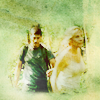
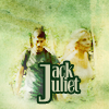
So, since I have absolutely no fantasy for lyrics and catching quotes (unless I'm iconing Sawyer and then it's only Springsteen quotes), I decided to go and write both of their names on this. But anyway, while doing it, I think it's nice if you try to do something a little peculiar instead of plainly writing Jack and Juliet, or Jack/Juliet, or Jacket (god forbid!). So, since their names both start with the same letter, I decided to write a bigger J and then their names using it for both. Now, it has a very clear background and doing it in plain white makes it difficult to read. So I went and decided that it was better to strike it. The font I chose in this case was Bloc. The J should be about 30 points of size, while the rest of their names should be 18 points. The position it's also quite important; in this case I left my text on the center of the icon in order not to cover them too much and to give it some emphasis at the same time. When doing things like these (aka putting together words in different sizes) it'd be better to do a separate level for each word (in this case one for the J, one for the ACK and one for the ULIET). That said, I have my text in plain black, put in the right position.
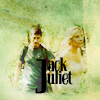
Now, that is very ugly. To improve it, after rasterizing the text layers and having them as one layer altogether, go on the blending options. In this case I went first on Color Overlay, where I chose a light green from somewhere in the icon (cfd0af, FYI) for the actual text. Then I went on Stroke, where I put the following inputs: position -> outside, a darker green color (0a3212) set on normal, and then made the stroke 2px. Et voilà, here you have the first icon.

Now, when using the strike technique, I'd say it'd be better to choose a darker color and a lighter one, both possibly from the icon, or anyway two different shades of the same color. Looks better. And of course here I put all the options on normal, but you can have very nice effects also if you put the strike on Overlay or Soft Light or Color Burn or whatever.
Other examples with the striking:



2) Drop Shadow + Textures
Ok, two in one. Wow! For this, I'll use this example, from the same batch of the previous one.

In this case I always used Bloc, but with the caps lock on. When I have an icon like this, with a good portion of the subject's face, I usually put the text in the lower part or anyway where it doesn't cover the subject's face, and turn it around a bit to make it less static. In this case, my first result was this.

Ewww, unreadable. I therefore go to my blending options as usual and first thing, Color Overlay. In this case, I chose a dark red from somewhere in the icon, and so it looked like this.

Better, right? But it still was unreadable and so I did another thing, which is one of the most useful I learned while searching for tutorials and stuff, right now I can't remember where I found the actual tutorial for this but anyway, here it is.
Go again on the blending options and then on Drop Shadow; then search for a color that contrasts with your font's (if the font is dark, choose a light color; if it's light, choose a dark one) and put the shadow at Normal, 100%, Distance 1, Spread 0, Size 1. In this case I used a light yellow.
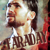
Much better, y/y? But, here's another trick. For this icon I had made a shitload of layers and stuff because I was experimenting around with textures, blending options and such. And when you have more than one layer, bringing the text under them can always have some good results. For example's sake, the icon above has the text layer on top. On the definitive one, my layer palette was like this:
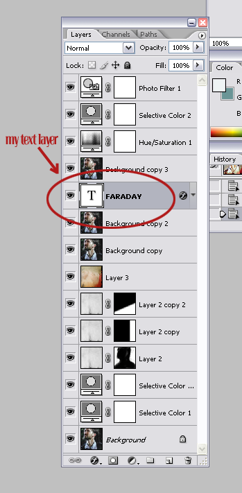
with this result:

While if I put the text under the second soft light layer the result was this:
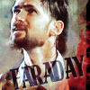
And all that jazz. This to say that having your text layer on top is not always the best option. This of course depends on how you did the coloring and everything. Other Drop Shadow examples (first two from this batch :

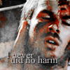
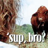
3) Blending Options all the way!
Of course, there are also simpler ways of doing nice text. Let's see what happened with this icon from this batch:

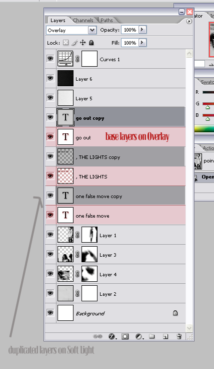
Now, that batch was a nightmare to put text on, but anyway, the target was to put a quite long-ish quote in an icon which was quite crowded to start with. When the situation is like that, I prefer to use fonts which are readable in a small size. Of course, using different fonts (in this case You Are Loved and Accidental Presidency) works better if you want to make it more interesting. With b/w icons it's also nice to play with the blending options since the text is usually more readable than in colored icons, but that's just me. In this case I took the lyrics, divided it into three lines, wrote everything in black and (NOT merging the layers) arranged as it seemed more fitting. Then I set each layer on Soft Light OR Overlay, sometimes duplicating them to make the text stronger. Always for examples sake, this was the way the icon was like when I had all of the text on Overlay.
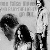
Then I duplicated each overlayed layer and had all the duplicates on Soft Light, which brings us to the first result:

And to be clear, this is the psd:
4) Text icons and Outer Glow
Last thing! So, when doing text icons, I usually choose a kinda not too grungy gray texture as a base and then color it with a plain fill layer put on color burn or soft light or whatever it looks better. In this case I had a grey icon from mizzybox which I made green. Then chose a font, Carnevalee Freakshow, which is kind of fancy but readable at the same time, and wrote what I had to write in a dark green. Then did the Drop Shadow trick with a white shadow and voilà (icon from this batch:

While on this one, from the Confirmed Dead batch, I did another thing altogether:
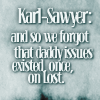
Now, I wanted to have the text in white, but the Drop Shadow wasn't enough to make it readable; so I went and checked the Outer Glow option instead. Wait, isn't it the one that makes all the text glow in yellow? Sure, but I didn't put it on screen but on Normal (Multiply is fine, too) and chose a darker blue at 100% opacity, then tweaked around with the spread, range and size settings. This actually is very helpful when you have dark text on a dark background or clear text on a clear background because it's way softer than the stroke and more, uhm, coherent or cohesive than the drop shadow, hoping I make sense.
5) Shapes
Well this really isn't a very tricky way to make things readable, I use it as the last resort, but it can be handy ;) when I really can't find a way, I take the shapes tool, draw a rectangular shape making it black or white or some other color and then write on the shape with a contrasting color. To be clear, like this:
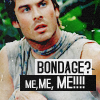
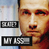
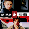

It's all black and white because I like them to be black and white, but I guess it'd work also with other colors.
6) The amazing Character Palette
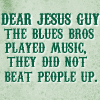
And last thing, I'd say one could have a look at some general settings which facilitate life kind of some. First thing of all, as I said before, ALWAYS check the anti-alias. Otherwise, not pretty. Then click on the button with the sheet on, or however it's called, in order to make the magic layer palette show up. The one used as example is for the Jesus Guy icon.
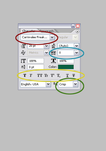
Now, excuse me for the lack of technical terms but I never knew how 90% of the things there are called and English being not my native language I don't know how to put it. So I put it in colors ;)
Red: obviously, that's where you choose your font. Alright, you do it also from the upper bar, but you do it here, too.
Blue: if you highlight your text or set it before, it makes the letters shrink closer or have more space between them, depends on the setting. Very helpful if the font is too big to fit all in one line.
Yellow: the first two options are, as you'll have probably guessed, to make the text bold or italic; the third one transform everything in caps lock, while the second does the contrary; the other two kind of make the text shrink in the upper or lower corner, while the last two are to underline and strike.
Green: the anti alias. If you didn't check it before, you can do it here ;) I usually prefer the crisp option because IDK but my text always looks better with it, though it really depends. Up to you ;)
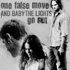
Then there were specific question on how to make the text work when it's very centered or covering part of the subject's face. About that, but it's my personal way, if I put text over someone's face, I do it to emphatize something or if the icon is meant to be crack. In the case it's a crack icon I think it's good to have a big font and colors that contrast since the text should get attention as much as the pic; if it isn't crack, I usually try with a smaller font in order not too cover it too much and then go under the before shown drill until I find a solution that I like. For example:
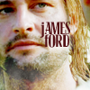
Here I chose a dark color because the background was very light, but also tried to keep it mostly on Sawyer's cheek in order not to cover his eyes; and here, too.
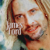
In this last one I think the text was also under the texture in order to blend it better. In general, when putting the text over someone's face, I tend to do it on his/her cheek or to choose a very near crop and put it under the eye or something like that.
7) Last random tips
Uhm, this is really random, but anyway.. when positioning the text, it's always good to rotate it or tweak it; horizontal is fine, of course, but sometimes it can help. About the positioning, it really depends on the pic but the only thing that matters IMHO is not to cover the thing you want to put emphasis on.

^ in that particular case, the text is centered enough to convey the point of the pic IMHO (aka, Sayid is very pretty), but if I had put it right over his face thus making a very centered crop, you'd be asking me what the hell are you swooning on? And so on. (btw, in this case I just left it plain white; but it works when the background is dark enough without being really dark).
Uhm, okay, so these are my two cents. Of course everything is subjective and it's meant more as a guide than a real tutorial but still, hope it's helpful ;) anyway, if you want tutorials for singular icons shown here, ask away.
So, happy texting? ;) if I didn't make sense or you have a question or anything ask, I'll answer sooner or later... ;)
Examples used:


I'd start with the premise that text is probably the thing I find more difficult to do well when iconing/using photoshop/whatever and it took me months to arrive to a decent use of it; which means, the more you have practice, the better you'll be at it. For all the following examples, I'll also try to show my train of thoughts when I actually decide how to put text on those icons, hopefully making sense. Of course, the most important thing is choosing a clear and readable font. Fancy fonts are nice and all, but IMHO I think that they're better suited for headers, if you want your text to be readable. If you don't it's another question ;)
I personally use mostly Bloc, Cairo, Accidental Presidency, Times New Roman when it strikes me, 4990810, Violation and You Are Loved. IDK for other programs, but if you use photoshop, always check the alias box of the text. About which alias to use, I prefer the crisp, but it depends on the font.
Anyway, I'd say to go and see icon #1.
1) Stroking.
I'll use a Jack/Juliet icon from this batch first.

So, since I have absolutely no fantasy for lyrics and catching quotes (unless I'm iconing Sawyer and then it's only Springsteen quotes), I decided to go and write both of their names on this. But anyway, while doing it, I think it's nice if you try to do something a little peculiar instead of plainly writing Jack and Juliet, or Jack/Juliet, or Jacket (god forbid!). So, since their names both start with the same letter, I decided to write a bigger J and then their names using it for both. Now, it has a very clear background and doing it in plain white makes it difficult to read. So I went and decided that it was better to strike it. The font I chose in this case was Bloc. The J should be about 30 points of size, while the rest of their names should be 18 points. The position it's also quite important; in this case I left my text on the center of the icon in order not to cover them too much and to give it some emphasis at the same time. When doing things like these (aka putting together words in different sizes) it'd be better to do a separate level for each word (in this case one for the J, one for the ACK and one for the ULIET). That said, I have my text in plain black, put in the right position.

Now, that is very ugly. To improve it, after rasterizing the text layers and having them as one layer altogether, go on the blending options. In this case I went first on Color Overlay, where I chose a light green from somewhere in the icon (cfd0af, FYI) for the actual text. Then I went on Stroke, where I put the following inputs: position -> outside, a darker green color (0a3212) set on normal, and then made the stroke 2px. Et voilà, here you have the first icon.

Now, when using the strike technique, I'd say it'd be better to choose a darker color and a lighter one, both possibly from the icon, or anyway two different shades of the same color. Looks better. And of course here I put all the options on normal, but you can have very nice effects also if you put the strike on Overlay or Soft Light or Color Burn or whatever.
Other examples with the striking:


2) Drop Shadow + Textures
Ok, two in one. Wow! For this, I'll use this example, from the same batch of the previous one.

In this case I always used Bloc, but with the caps lock on. When I have an icon like this, with a good portion of the subject's face, I usually put the text in the lower part or anyway where it doesn't cover the subject's face, and turn it around a bit to make it less static. In this case, my first result was this.

Ewww, unreadable. I therefore go to my blending options as usual and first thing, Color Overlay. In this case, I chose a dark red from somewhere in the icon, and so it looked like this.

Better, right? But it still was unreadable and so I did another thing, which is one of the most useful I learned while searching for tutorials and stuff, right now I can't remember where I found the actual tutorial for this but anyway, here it is.
Go again on the blending options and then on Drop Shadow; then search for a color that contrasts with your font's (if the font is dark, choose a light color; if it's light, choose a dark one) and put the shadow at Normal, 100%, Distance 1, Spread 0, Size 1. In this case I used a light yellow.

Much better, y/y? But, here's another trick. For this icon I had made a shitload of layers and stuff because I was experimenting around with textures, blending options and such. And when you have more than one layer, bringing the text under them can always have some good results. For example's sake, the icon above has the text layer on top. On the definitive one, my layer palette was like this:

with this result:

While if I put the text under the second soft light layer the result was this:

And all that jazz. This to say that having your text layer on top is not always the best option. This of course depends on how you did the coloring and everything. Other Drop Shadow examples (first two from this batch :


3) Blending Options all the way!
Of course, there are also simpler ways of doing nice text. Let's see what happened with this icon from this batch:

Now, that batch was a nightmare to put text on, but anyway, the target was to put a quite long-ish quote in an icon which was quite crowded to start with. When the situation is like that, I prefer to use fonts which are readable in a small size. Of course, using different fonts (in this case You Are Loved and Accidental Presidency) works better if you want to make it more interesting. With b/w icons it's also nice to play with the blending options since the text is usually more readable than in colored icons, but that's just me. In this case I took the lyrics, divided it into three lines, wrote everything in black and (NOT merging the layers) arranged as it seemed more fitting. Then I set each layer on Soft Light OR Overlay, sometimes duplicating them to make the text stronger. Always for examples sake, this was the way the icon was like when I had all of the text on Overlay.

Then I duplicated each overlayed layer and had all the duplicates on Soft Light, which brings us to the first result:

And to be clear, this is the psd:

4) Text icons and Outer Glow
Last thing! So, when doing text icons, I usually choose a kinda not too grungy gray texture as a base and then color it with a plain fill layer put on color burn or soft light or whatever it looks better. In this case I had a grey icon from mizzybox which I made green. Then chose a font, Carnevalee Freakshow, which is kind of fancy but readable at the same time, and wrote what I had to write in a dark green. Then did the Drop Shadow trick with a white shadow and voilà (icon from this batch:

While on this one, from the Confirmed Dead batch, I did another thing altogether:

Now, I wanted to have the text in white, but the Drop Shadow wasn't enough to make it readable; so I went and checked the Outer Glow option instead. Wait, isn't it the one that makes all the text glow in yellow? Sure, but I didn't put it on screen but on Normal (Multiply is fine, too) and chose a darker blue at 100% opacity, then tweaked around with the spread, range and size settings. This actually is very helpful when you have dark text on a dark background or clear text on a clear background because it's way softer than the stroke and more, uhm, coherent or cohesive than the drop shadow, hoping I make sense.
5) Shapes
Well this really isn't a very tricky way to make things readable, I use it as the last resort, but it can be handy ;) when I really can't find a way, I take the shapes tool, draw a rectangular shape making it black or white or some other color and then write on the shape with a contrasting color. To be clear, like this:


It's all black and white because I like them to be black and white, but I guess it'd work also with other colors.
6) The amazing Character Palette
And last thing, I'd say one could have a look at some general settings which facilitate life kind of some. First thing of all, as I said before, ALWAYS check the anti-alias. Otherwise, not pretty. Then click on the button with the sheet on, or however it's called, in order to make the magic layer palette show up. The one used as example is for the Jesus Guy icon.

Now, excuse me for the lack of technical terms but I never knew how 90% of the things there are called and English being not my native language I don't know how to put it. So I put it in colors ;)
Red: obviously, that's where you choose your font. Alright, you do it also from the upper bar, but you do it here, too.
Blue: if you highlight your text or set it before, it makes the letters shrink closer or have more space between them, depends on the setting. Very helpful if the font is too big to fit all in one line.
Yellow: the first two options are, as you'll have probably guessed, to make the text bold or italic; the third one transform everything in caps lock, while the second does the contrary; the other two kind of make the text shrink in the upper or lower corner, while the last two are to underline and strike.
Green: the anti alias. If you didn't check it before, you can do it here ;) I usually prefer the crisp option because IDK but my text always looks better with it, though it really depends. Up to you ;)
Then there were specific question on how to make the text work when it's very centered or covering part of the subject's face. About that, but it's my personal way, if I put text over someone's face, I do it to emphatize something or if the icon is meant to be crack. In the case it's a crack icon I think it's good to have a big font and colors that contrast since the text should get attention as much as the pic; if it isn't crack, I usually try with a smaller font in order not too cover it too much and then go under the before shown drill until I find a solution that I like. For example:

Here I chose a dark color because the background was very light, but also tried to keep it mostly on Sawyer's cheek in order not to cover his eyes; and here, too.

In this last one I think the text was also under the texture in order to blend it better. In general, when putting the text over someone's face, I tend to do it on his/her cheek or to choose a very near crop and put it under the eye or something like that.
7) Last random tips
Uhm, this is really random, but anyway.. when positioning the text, it's always good to rotate it or tweak it; horizontal is fine, of course, but sometimes it can help. About the positioning, it really depends on the pic but the only thing that matters IMHO is not to cover the thing you want to put emphasis on.

^ in that particular case, the text is centered enough to convey the point of the pic IMHO (aka, Sayid is very pretty), but if I had put it right over his face thus making a very centered crop, you'd be asking me what the hell are you swooning on? And so on. (btw, in this case I just left it plain white; but it works when the background is dark enough without being really dark).
Uhm, okay, so these are my two cents. Of course everything is subjective and it's meant more as a guide than a real tutorial but still, hope it's helpful ;) anyway, if you want tutorials for singular icons shown here, ask away.
So, happy texting? ;) if I didn't make sense or you have a question or anything ask, I'll answer sooner or later... ;)